Watch Me Fix a $19.3B Fintech's Design in 86 Mins
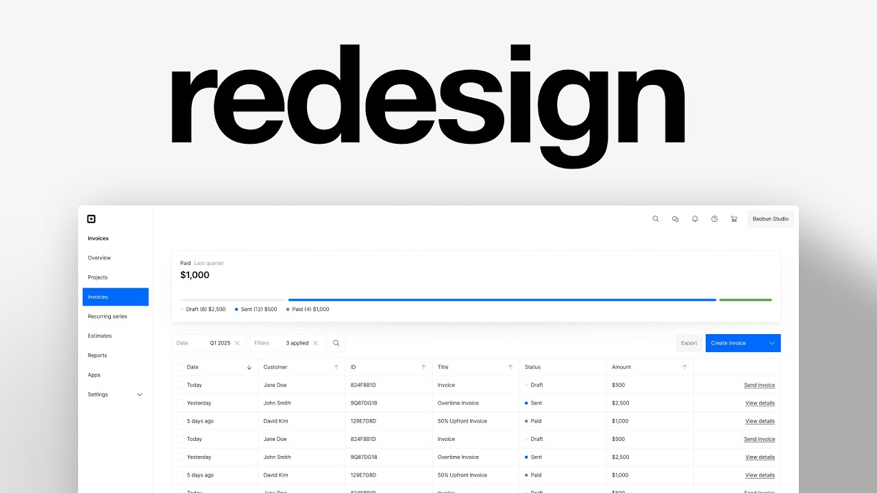
Charles Postiaux redesigns a fintech invoice dashboard from scratch in Figma, building reusable components, testing color contrast for accessibility, and iterating on table layouts and status badges. He shows how to prioritize the send invoice button, organize filters, and extract SVG assets directly from the web.
Chapters
I'm going to find a random screen online and redesign it. And I'm going to walk you through my exact design process that I'm using with companies that I work with that are worth over $160 billion. All right, first let's try to find a screen that's good. So we have a couple of options here. I'm trying to find a screen where there is potential. I don't want to redesign something that already looks good and feels good, but I don't want also something So complex that I'm going to spend, I don't know, six hours on it. That could be a nice one to do. Tables are always a little bit tricky, in my opinion. I think that could be an interesting idea because we have sort of like a sidebar. We get a top bar here. We get these. I don't really know what these are. Is there a way to see more flows? I kind of like the concept of that. And I think we don't really need other screens to give us context. So we might actually focus on this one. Our filters, dates, written invoices, probably like I don't know, other actions to do. You can export it. This is, I mean, there's potential on this. So I'll probably try to use this one. Let's copy it and go on Figma. All right, here is the design. I'm using this free library called Icons, which you can find on Figma. And probably use that for the icons here. I'm just checking the icons to see what we need. We just need one search hamburger. The logo, it's okay. I can just put a square. Then we have some arrows up and down for filtering, a plus customize, a chevron, a couple of here. But that's it. All right. So what I want to do is a very like, like a kind of like I want to separate the background from the main screen or component. So like, this would be like the background. And then I would probably want to have like something here. And so if we do that like this, you could probably do something like that. Where it kind of like jumps out a little bit. And I kind of like this style right now. So I think that's probably what I'm going to do. I like this idea. So this way we can, and I'm not sure, but I'm afraid it looks a little ugly because of the unevenness, but I think it's, I think it should be fine. This is going to look a bit better with context. There's like content inside. So basically, we're going to have this app bar here, we're going to have the sidebar right there, like here maybe, and then we're going to have the content about just to separate so you can see, but right there. And then the content itself is probably going to be I want to have those packed together, like inside of like a frame, a container. And then search invoice. I'm wondering what the main action here is. How many invoices? I guess there are a lot of invoices. So Searching might make sense. I'm wondering if filtering and dates are more important, if searching is more important. And maybe looking at this, it's not enough. Like maybe filtering might, I don't know, maybe filtering has more options, right? Like maybe it's invoices, but maybe it's also our customers. So I'll probably still do like filtering with all invoices. I felt like that could be based on the status, like draft, and then all invoices would be like draft, sent. I would ask the CTA, send now is a CTA. Okay. For me, that's a little weird to put it, to put CTA so, so to make it so unimportant. Usually the CTA, I want it to be especially sending a An invoice. It's like, you know, especially for business owners, like I want the invoice to be sent. I would probably put it there. Like it would be like three dots and a CTA. Like send invoice could be there. I'm not sure. Can customize it too. I don't want to dive into customization, but we need to keep it in mind. Now, do we want the customers to be here or to be there? Not sure. But I still like this idea of having this top bar being price, like paid, and then having a representation of the amount. I like this idea. I don't know if we have other ways to visualize that. Maybe not from them, but like from other products. Let's see, what do we want? We want, let's remove those because we kind of know the layout we want. Now wondering how to get there. So the only thing I want really is maybe like filtering, like seeing how maybe tables, seeing how other products do tables. I already have an idea of what I want, but I think I still think that it's a good idea to always Whenever you start a project, it's always a good idea to reference, to have references and to explore other products and see how they do it and try to create guesses as to why they did it this way. And that's probably what I want to do here on that. And then I want to see like other options for this because I'm wondering what other ways we could do that. What is this one? So we're going to search for filter, but we're doing flow so I can get a better idea. I don't want the complex one. And I ideally want, okay, so that's squares. So that's pretty good because now we can see what it is about. And that's pretty weird. It's not about customers, but it still gives us an idea of like what to expect. What does Sana do? Just a dropdown. Reset filter. That's interesting. I don't know if we You see, that's an interesting design because let's put it, let's use this one because we kind of are in this situation where they put search invoices so importantly because usually the most important buttons or elements are at the beginning and the end. That's it. And you can see that if they basically the 2 main things that they want users to do is to search invoices and create invoices. And so I'm wondering if we could have this kind of design where it's like the search bar is so, so much more important than, than this. But does it hold value in it? Like, is the user going to really like, do people search for invoices? Or do they just quick filter? Or is it just like, I feel like just sorting it by date makes the most sense, or at the least by status. I would only search for specific ones like, and not even ID or amount, because I couldn't probably not remember. Dates, I can just use the arrow. So I would probably just search for customers. So then it's like, why do I need the search bar so, so much when the only search I could use would be a filter itself, right? Like I could just have a filter with all the names of customers and maybe inside of that, when I open it inside, there could be a search for quickly finding the customers, but That's it. So I don't probably don't need that big of a search bar. Maybe it could just be just a button, you know? Probably not that, but I still like the idea of reset filters. The only problem with that here is that we still both need like those 2 buttons. Anything else before I search for That's an interesting one too. It goes, the search is on the right and then the filters are on the left. Interesting. So they do search like that and then export a new client and then view, change the view. Don't really have filtering except on the columns themselves. Like this, we could have a more prominent search bar. It could be like some of like 2 rows instead of 1. But I'm afraid that it's going to drop the list so below. Because we already have like, depending on it, it will be like this for the visualization of data, then this row for buttons, and then another row for buttons, and then the filtering for the table, and then the table itself is like Do we need to have so many roles? But I kind of like that. That would probably also enable us to have maybe like customizable filters, like, or maybe not customizable, but that could be based on the user or like. Yeah. Most frequent buyers, new buyers, these kind of things. And I think that could be an interesting layer to the invoices because then invoices is always, you know, like you look back at your business, you look back at the customers you've had and you're having right now, you look at the churn. And so in this sense, being able to quickly scan through probably, I don't know, thousands or hundreds of invoices, it would make sense to have like this easy custom access. Or it doesn't need like a toggle, but this is interesting. The menu would probably not be needed. I feel like export is still a very important part of it. You want to export easily for accounting. Filtering, filtering, search. Like search for, I think that's a good thing. Like search invoices probably. I think it still makes sense because you can search anything, but I would maybe focus on a specific action because You can already filter anything you want via the columns or via the filtering buttons here. So you don't have much to search for in the search bar except customers. That's actually interesting, like actions and add enrichment. Like this actions dropdown could be export and we could replace the create invoice with like actions here. I don't know if our break— I don't know if that's useless or not, but I like the idea because create invoice, there are multiple actions, but the main goal might probably still be to create an invoice and the rest could just be dropdown. So you kind of sacrifice the one-click away from export, but you add simplicity to the creation of invoices and you also still like pitch the other options available available with the action. I don't know, probably, maybe. I'm going to keep it. So I've got a couple of inspirations here for that. I just want to find quickly. Oh, what's this one? Interesting. Is it not really, it's like the CTA is above, like the button is aligned with the headline, but we cannot really do that. Or is it even useful to do that? Because maybe like invoice is here, right? But invoice could also be up here, bigger. And then the button create invoice would be here. What do they have then? Reorder. I don't know what that is. Oh, okay. Ascending. Search for courses. So yeah, and filter there. But then, like, literally, it could just be creating voice, like the same thing, export here, or like the, like this one here, actions, ad enrichment, like here. Then it's visualization here. Then it's filtering, like the filtering system with the button, like maybe like this set. They did filter a search bar and then some extra like dates and stuff. Like dates and forgot the other one. Dates and we don't really need that many filters. But that could be an interesting option too. It would be far away, but they don't really do the same thing. This is just action buttons and this is filtering for the table. And then the table will be right below it. So like the table will be right here. I would prefer to have the filters closer to the table than closer to the CTA. But I like that idea. I'm going to copy that, add it to my YOLO collection now. And I still need to look for those visualization. How could I say visualization? Data? And dashboard. Oh, and graph. Charts. That's the word, charts. So we're not going to look at square, but yeah, you can see that they indeed do different colors and shades of blue. Okay, they keep the same filtering system all around. And invoices is right here. So you need to click on invoices, which opens a submenu. Okay. Is this accessible? Like, holy moly, that's a really, a really light blue. That really doesn't seem accessible. Well, we're going to find out. So to find out if something is accessible, you can like create like, this is an example, right? But you would have like a button inside of a design, inside of something. And then we're going to use a plugin called Contrast. And you can see that usually if it's above 5 of contrast ratio, you're good to go. If it's below 5, not really. So you can see that it's really, really low. So probably not very accessible, this one either. And this one is barely like 5. It's not even 5. So like, that's, yeah. But this is, again, this is like the show for text. So it's a little different because it's not really a text, but yeah, it would still be, you know, Careful. Cool. So at least we have another example of what it will look like. Interesting. Because here they have like those icons, but they don't have it on the one we want. Oh, this one's nice. Actually, this could work. This could work maybe in terms of like, I like the frame, the container, but that's it. So I don't know. This is nice too. I like the idea of Do we need it to be this big? I get it that it's part of the brand and it's like always pretty, pretty big, but I don't know. I like the sleeker, more like cleaner versions of that. Okay, I think we're— we've gone through enough. Now it's time to actually do the work. So for that, I'm just going to Put this over my screen so that I get the copy and the icons right. But do I want— what is that? Like, literally they all have the menus, so— and the, like, the account is there, so that's still all right. I don't know, I don't want to— I I don't want to add it. So I'm just going to write that stuff. I'm going to use multiples of 4, which is what I most of the time use. Sometimes I might not, like sometimes I might do like 12, 14, and then 16. But yeah, usually it's multiples of 4. I like 140% because that gives us plenty of spacing for most elements. Paragraphs may be a bit more like 148%, but overall it's pretty good. And the height also, I want it to be a multiple of 4. And so 140 usually gives us a good number. Except here, it's not a good number. This is a good number. This is not a good number. It's all right, but it's not a good number. But yeah, for this, I would probably just either put it in, like it would be inside of a button. So I would change the button usually. So it's good for now. Overview. Actually, something I'm wondering is I saw that I think on Dropbox. I need to check Dropbox real quick. I think the navigation— yay, like this! They put this, so this back button. So I feel like we could include that here. That would be pretty different for the thing. But like, do we need that though? No, I think I kind of like this layout. So we probably would— well, okay, okay, one step at a time. First, we need to change those. So probably 16. I think that's nice. And then I'm going to use that reference to make the button. That's really big. Holy moly. Okay, I'm going to keep it at 40 for now. I think 40 is pretty nice. So I'm going to press Shift+A, select each individual layer, press Shift+A, and then create an auto layout for each of them. This will have the chevron, so I'm still thinking about it. But yeah, then I'm going to select all of them and height should be 40. This one so far, it's still work in progress. I'm not sure. Square, I'm going to try to— let's try to take their icon. There's one here, but I don't know if the— oh yes, the whole logo. Oh, maybe not. So what I do usually is like I Press right-click, inspect, then press this little thing here, go up there. Oh, is that the whole logo? Then I'm going to right-click there, copy, copy element, back to Figma and press it. And we got it in SVG, which is awesome. But also it's okay. I'm fine with that. I can also just select the SVG and remove it, but I need to think about it first. But that's a quick tip for you if you want to get most of the logos out there for your projects. Also, we got that. Then I'm going to try to— first, I'm going to copy for the user like that. Cool. I'm going to move it for now. Then I'm going to just find— I don't care if it's not accurate. I'm just going to find some. Then I'm going to select all of them, remove the fill color, put the black color here, center them. Then I don't know for now, 24. You can see they're a bit bigger, but I'm not sure if we want to do that yet because I'm not sure of the sizes of the heights. Cool. So we got the overall structure. What to do next should be, I think we want to, I want to try to do the navigation. So I'm going to remove that for now. Then have those be inside of another layout. So Shift+A again. I'm going to change the spacing to be 20 for now, but I might change that later. Then invoices, put it up there. And then square, put it up there as well. Remove those 2. Then what I want to do is, it's a good question, I'm going to put 12 of paddings. Press that there. Then this is fine as 20. This probably should be lower, like 14. Like that. Then I'm going to press, remove those 2. Then press Shift+A again for auto layout this one. This one I'm going to put 4. And that's not really big, so 24 maybe, 24 here. And I'm going to put it at the bottom of it. And then I'm going to constraints and select top plus bottom, which means that, and also anchored on the left, which means that if I change that, well, I cannot see it, but okay, let me. If I put auto layout here and this has the constraint top and bottom, then as I scale up and down, it also scales. And same for here as well, it doesn't move. So that's why. Cool, so now I'm just going to do that. Probably 200 for now. And then I'm going to change that to be an alignment on the left so that everything stays on the left, unlike what you just saw where recurring service moved. And that's so especially helpful when we want to make those auto layouts the same, right? We want them to be consistent. So fill container and they're all good. And we want invoices. I'm going to use the blue that they have. Like that. That looks like Webflow. So we kind of have a problem here where these, these are, we need to change those. What's the size? Actually 10. Okay. I'm going to put 8 and 8 so it's better. And then auto, no. And it has the settings that had the, yeah. Settings. I'm going to take a chevron, chevron down, put it in settings. Watch that 20, so I'm going to put it at 20 as well so it stays consistent and nice. Put 1, that's what I've used so far. Change it to 1 off-white. That's a little big, so I'm going to change that to 16. Keep it centered as well, like it's left aligned and centered, and then I'm going to auto layout it. So it's nice and clean like that. Oh, maybe 20 was better. Let's keep it at 20 for now. But I'm just going to change those because I prefer when it's a little bit more like spaced. And then actually, since it's like that, what if I do that? 36, perfect. That is perfect. 36 is good. You can see that it's all weird here. So I'm going to put them inside of frames, auto layout. So I just select it, Shift+A, auto layout. Create a container, align it on the left. And I'm going to— how much is that? 36. I'm going to do pretty much the same, 36 and then 12. And same here. Already added. Well, do we need that here? Probably not. We're going to put 22 for it. Why does it do it? Okay, no wonder. Okay, slightly changed. What if I Just do that. That's it. Okay, cool. Just going to improve the height. So now it's all good and nice. I'm going to fill container as well. Keep it aligned on the left in the middle. And now it's probably a little bit cleaner. Yeah. And then just change that for 12. Maybe make that medium. I'm not a big fan. What if I put it there? Maybe, maybe I'm not sure. I feel like Ionic Trial. We might change the fonts. We might change it. Okay, let's remove that for now. What if we just put it at Pauline as well? Is it going to be weird? I like it. And do we need to remove I like it. I like it this way, actually. Nice. Cool. And then we could have a back to settings at the bottom. So I'm going to just Shift+A. We do a lot of Shift+A around here. Auto layout. Then I'm going to auto this one to have unlimited spacing. And here we're going to do— what did they do? Did I put it there? No. They do back to Dropbox, so we can do back to homepage, back to home, back to home, and then I'm going to change the icon to be bubble dot. 20, change that. 1, remove this one. Nice. I like that. Looks very clean. Cool. So now we have that. I'm going to change those to be 20 as well because I just want to stay consistent. I'm going to use that because it's super cool. The aspect ratio, so when I change the width or the height, the other changes as well. And I'm going to select each of them with Command and then Shift. You select one and then you press Shift and still hold Command both. And you just select the outline of each icon and then I'm going to change the height, the weight to 1. So it looks clean and similar to what we have here. Nice. So usually these should be like buttons inside of a container. It should not be just standing out alone like that. And that's why on hover, usually it's inside of a frame. So I'm going to just, whoops, if I can grab it, I'm going to press Option and drag it out so that it duplicates it. I'm going to copy and paste the search icon there, change the width to be similar to the height, so 36. Perfect. And then I'm going to just duplicate that for each icon. Perfect. And that should also technically be a button. So I'm just going to use that because it's perfect. There we go. Bounce Studio for the user or a company name. Going to have content. Good. And then we're going to just select all of those. Shift+A for auto layout. And probably 8. I went to do 4 to stay consistent with what we had. Here, this 4 as well. This should probably be— oh, it's going to change, but yeah, it should probably be aligned like that. Or maybe they should be spaced because it's a bit different. It's like these are icons and this is like content. So I'm going to again select them. Another option you can do is select one, then Command+A to select all, and then Shift to remove one. And then Shift+A. And then I'm going to— how much is the— it's 94. It might be too much. Maybe not. Maybe it's not too much because we have also spacing here. So it's nice and even. And it's in that I'm wondering, should we really do the— is it the right space? Okay. Is it the right height? It's not the right height. Holy moly. Okay. Could we really do the one, the thought I had of making it stand out like that? I don't know. Because it's kind of, it looks pretty clean like this. I like that. So that's pretty sweet. Maybe not 24, maybe it should be 12. And I'm going to align it on the right so that it doesn't move when I change that, right? Is it— does it work? Yes, it works perfect. I want to also add invoice here. That's a lot of invoices. I don't know, maybe not. Seems a little weird. Maybe not bold, maybe regular. Maybe regular. Yeah, cool. Nice. So we've got a pretty cool looking design here on our hands. So now I just want to focus on the 3 things. Filter, Right. So again, I thought about the idea of having, you know, like the headline here, invoices, super big, but it's like already have like 1, 2 invoices. So having a 3rd one, it's a little overkill. I'm probably going to do the, probably going to do the table first. So the table, what I usually like to do is put them inside of Auto layouts. Yes. As usual, some people like to do like I don't know like John Smith and then they just change the the text itself, which is totally reasonable like that and they can center like here alignment be in the center and that works. You know, I just prefer. 2 of the auto layouts, it gives me a bit more room because it doesn't depend so much on the text and just the auto layouts. I can just focus on that. And that itself can become a component because usually, usually tables are just components, right? Like this is, it depends, but like that could be one component. That could be one component or like a variant. So one variant could be this and one variant could be that without the checkbox. Or another option would be to just have this be a variant and just all of this is the same thing, right? So they all come from the same thing. And this could be like a variant when there is no, where there is no like icon. So like you could just be like a toggle on your design system where it's just like icon, no icon, and then you can toggle it on and off. And that's pretty much it. And this is like the same thing here, right? It's the same thing. This could be like the variant that's bold. This could be like the multi-line variant. And then this itself could just be like colored and not colored or some whatever it is. So you can see that it's just reusing the same components over and over again. That's why tables seem Might seem complicated. I know for me it seemed very challenging in the beginning, but it's actually just oh right. It's actually just a few components that you reuse and create variants of. So for that, I'm just doing actually. I don't know why I can just center it. Press the. Paragraph? It's not a paragraph. It's like for this thing on the keyboard. And you can like, actually, maybe you can see it here, like bring to front, bring to back. Yeah, this stuff. I'm not going to bother so much with, should I? I like the icons actually, the arrow. This, where is it? There. Nice. I want the checkbox too to be like 20. This should probably maybe 20, maybe not. Duplicate customer. I don't care so much about the right sizes right now. I just care about having the content laid out. Do we really want customized? I don't like it. Ah, so actually this is not— I think this is not part of the role. I feel like this is part of the customize, maybe. I don't know, it seems very confusing. It's the same color. I'm not going to do it. I'm not going to include it. I'm just going to add I'm going to add, now my choice. Because there is a checkbox, I think the 3 dots are not needed because it's pretty much the same thing. When you click on the checkbox, something is going to happen, like a menu is going to show up, like maybe here. Like here, you're going to have options like Export, download, I don't know, details. So these kind of do the same thing. So I don't need that. And I actually, I want to use that space to do the send now here. Like there is like a power, like action that they can do within the table without having to like click on it or view details or anything. I think that's really important step. And that could change, right? Like if it stands, then it could be like, you receive or, you know, download. That could be cool. But yeah, cool, nice. So I don't want that. I'm just going to have an item, um, an item, a button, CTA. Now how do I want to do that? Do we have examples here? Down there? We don't. We have here. They're part of it, which I think is very fair. And here? Also okay. I think I agree with that. I don't think we need the differentiation to be that big. Cool. So one thing I'm going to do is probably to include that here because I'm a bit lazy. And then I just want to have a reference of what the things below are. So move that today, and then the amount will be 500 because it's much cooler than 50 cents. And here we would have, uh, send Invoice. Send now seems a little weird. Am I sending this? Am I sending the details? Am I sending— I don't know what I'm sending. So send invoice is a bit more accurate. Always when you have a button like this, always try to make it as clear as possible as to what it is and what to expect by clicking on it. Cool. So now we have the rough outline. So we have this. Interesting. Oh yeah, right. So we need to change those. So we're going to select, trying to find the icons. Again, remove that, press 1, 1. Perfect. What's the filters on? Okay, so all of them are up except this one. So I'm really going to Select, oh, icon and I have double here. What's going on? Why is there— what? Oh, okay. Cool. Keep them like this. And this is clearly too, too far away. So I'm just going to change that. Well, it is 12. 12. I think 12 is nice. I'm okay with that. I might— maybe I'm not okay with that. 8 could be nice. Wait, so now what do we do? What do we do? What do we do? We need also to have auto layout on those. We need 2 auto layouts on this one because it's a button inside of a thing. I like this, 36. So I'm going to select all of them and do— what's that? It's 40. Let's do 36 for now. Oh, this one too. This one should be 36. And then this should be, okay, normal. Oh, and this should be 36 too. Maybe we don't need a button. Maybe the text could be a button. Like maybe even actually it could be like the color, like this or a bit darker. Or this could also just be this, very simple. And you already know you can click on it because it's an underline. Nice. So I'm just going to— I always say I'm just going to, even though it's always the same. And I'm going to add one that we're not going to see so that it's a bit easier to I'm really going to do like a button and I'm going to hide it so that it's well balanced. It's like a grid with this and same here. Now the question is, how do we want it to be spaced? We want it, we want this element to be like kind of like similar to that. So I'm going to have 0 of spacing. Oh, Why is it selecting that? Like this. Okay. 0. Then I'm going to do fill container. I'm not sure again about the spacing here that I want, but yeah, I'm just going to expand that for now. And it's not perfect, but it's all right. Also, we got those and we're going to do pretty much the same thing here. Fill container, align here, 8 here, and here is going to be 0. And why is it different? Oh, because it's not the same. So perfect. And I'm going to put 0. Wait, no. No, no, no, probably not 0. And you see, this is where components are so useful is that this is pretty much almost the same, right, everywhere. So I could just select one component, update it, and everything else would change. But I really do not want to do that today. 8 would be... Is 8 all right? Probably. And this should be both actually, even if we don't see it, it should be anchored on the other side. Nice. Cool. So we've got the table. That's it. We're just going to again Shift+A, Auto Layout, 0. And then I can duplicate it 3 times just to get something different. Perfect. Invoice, this could be 0.5, and this could be 1. So we show that it's not related to that. Today, yesterday, 5 days ago. Why is date the first thing we show? Why isn't it customer? I'm still, I don't know why I'm like, I feel like customers is so much important compared to dates, but dates also make sense if you have a lot of volume, thus being able to customize it. But I don't want to do it. Cool. So now I'm just going to, and maybe I should have done this before. Could I do like select all with the same properties? Does it work? Hopefully it does. Like this. I'm just going to optimize that and then stroke ed 1. And what we want to do is probably remove the one from the top and the one from the— oh, the right. Perfect. Like that. This one too, we want that. Okay. Fail. No, it's not fail. Why? Oh, okay. I'm just really not smart. And we're just going to change that. Put one here. Select all of those. Custom, add one up there like this. I think that's pretty standard. We can try other heights. 48. The problem with 48 is that we need to also change maybe the spacing here. And you see the problem is that it didn't hug the content. So now it's good. And then let's do 14. So 14 is not exactly a multiple of 4, but I'm fine with that. I can live with that. Perfect. Looks pretty cool. I kind of like the idea of having it very, very sharp, like no corner. Ready. So for the filtering, oh, also something we need to change is the icons color because these are not selected. Like that. Yeah. This is interesting. I mean, it's kind of, it's the same pretty much. It's interesting that it's actually not the same. This is much smaller. What happened? Anyway, I kind of like that, but I don't know if we want to do that. Okay, maybe I have an idea. I want to mix it up. Mix it all together. I like that too. So I'm going to try to do all of those. Maybe not. Because filtering is about accessing information very quickly. How do I get to my information as fast as possible? What information do I need? I need invoices. And ideally, usually if I need an invoice, it's because I either want to track it, Like here, or my accountant wants it. And usually the accountant wants from the quarter, not from a specific date. They want it from a specific timeframe. So it shouldn't be dates, right? Like, I don't know. Like it could be like this, like from this time to this time, 3 filters are applied. Sorting can be done via that. So it's okay. Actually, while I'm at it, why can't we do auto here? That seems more actionable, right? So that should also be the same. And this should be the, uh, it be like that. So let's do that. Let's do, uh, let's do this thing. Let's get it over with. So we probably just need that. So I like the idea of having a date and then from January 1st to March 1st. It is April 1st. I don't know. 2025. Let's do it like this. I don't know why I'm overcomplicating it. Could just be that. Oh, could just be that. Turn off those. Auto layout. That's nice. Then I can just change that maybe to this. Put it there. I might change the dimensions because it's not perfect because the board is— Okay, nice. Yeah. And you can see it's so cool. And what we can do is For this, does it work if I did it now? Or is it— oops. It does not because I need to seal it and then truncate it. Perfect. So we can do that to be extra detailed, you know? Like what happens if it's like super small? Then there you go. That's what happens. It's pretty nice. Perfect. So we just need that. Then what else? 3 filters, right? Could we do like this? Filters 3 applied. And then would we need a cancel? Close. Would that work? We both need to be up, then 20. Change that. Oh, also we might need to change it to a lot less significant. We just want the focus to be on The date. And this should be close together. Maybe not so close, but 8 would be probably nice. A content. Could we change that to just be like Q1? Like, that's the same thing. And it's a lot easier for me who doesn't know what the specific dates are. Okay, that's pretty nice. And you can easily cancel it. You just press the X and that's it. Nice. And then what else do we need? So we got that solved. The search could still be there, but what do they all— what do the other one do like that? A weird search here. Search here. We continue the buttons. I like this actions and, but I don't know if it works because I think if they put it there, it's because it could be related to invoices. So probably I won't do that. There we go. So it would be create invoice. I'm going to remove that here. I think we have one. Yeah, the chevron. Let's put it there. I will change that later. And then we need another one for— oh, for Export. There should be maybe more. Maybe not. And then search could just be an icon. It's a bit different, but Okay, we start. Did it work if I tap search? Yes, it works. Bring it there. Again, change it to 20. Change that 1, 1. Select this, remove. Create both. Perfect. Oh, that looks clean. I kind of like it. It looks a lot like Squarespace now I think about it, but it looks like a mix of Squarespace and Webflow. Nice. So I want to— 8 might be too— no, actually no, it's not too small. Nice. And then again, it's a lot like— it's like Shift+A, Shift+A, and then both the girls Shift+A and with an auto spacing. Oh, nice. That looks really cool. Shift+A again for that. And then do we want it to be slightly different interval spacing, or do we want it to be very close like this? That seems too close. 16 would be nice. It's like a duplicate of 8. Nice. So we got a cool table. This is before. This is after. I didn't really add colors. I feel like we could, but I'm not sure. It would probably be like, actually for draft and incent and paid, it would probably like, we could have a little bubble, whatever that's called. Like draft could be stop. God. Terrible selection. Draft could be gray. Maybe not that gray. Is it too? I think that's all right because it's not really text. Sent could be their blue and paid and then declined would be probably red and then sent would be like a green. I know. That looks pretty sleek. Cool. Send invoice. View details. View invoice. View details. And view details. I think that's a good mix. That looks really cool. This should be the same size, maybe 200. Yeah, I'm okay with that. And this should be also, I like this actually. I like the dropdown like this. I think it's just, it makes a lot more sense than a A button. So again, I kind of want, like, we have a lot of room. Like, we have maybe probably too much room. It's too big, which is a good thing. I think it's always better to make it work with little space than with a lot of space. Man, that looks so cool. Oh yeah, maybe that should be different too. Maybe that should be F6 and probably this should be maybe 6. I got— we can do a check. Plugin, color contrast. No, that's not what I want. I want the text. Okay. 5.3, it's perfect. 4.7, it's not the best, but I will accept it. And should this be 48 may be way too big. You know, I'm not against it. For now, let's keep it this. Maybe it should be 48 too then. Oh, maybe not. Yeah. And this should probably— actually, this could— because it's so big, it could just be part of it. Maybe. And then we do 12. And this should also be 48. L14. Poor little guy down there. How did they do? Oh yeah, that's what I thought. I feel like it's a little weird that it's like that. It'd be like this. Maybe I will see later. But yeah, like it's probably 48 for everything. So these Maybe it should also be 48 at the ratio or— and this also 48 and 14 and 12. Nice. Oh yeah, that's cool. For this specific screen, I think it looks good, but it still doesn't solve that problem of the visualization of the graph. So I want to kind of like that. I think a mix of that. I kind of like this idea of having those 2 little things separated. So I'm going to reuse that. How to do it? How to do it? We need— what do we need? We need a way to tell what it is what and have the number paid. Paid. Let's just do— so this would need to be there. Remove that. Paid last 30 days like this. And then this would be paid 1,000, 1,001. And then we can increase a little the size to be cooler. I don't know. Should we remove that? I'm not sure. It doesn't look as cool as I thought it would be. Okay, let's still stick to that for now and we'll Adjust if we need to. And then we could also very well use that here. And then, oh, perfect. That's okay. I just thought about, I don't know, maybe I unintentionally thought about that dot here, but cool. Oh, that's perfect then. I hope it just works together. So we got Oh yeah, we just basically need to do all of those. Right, that's pretty much that. Nice, we removed those 2. Cent, we're just going to space it a bit more. We need the percentage 2 or 3? Okay. Cent 1. Craft 1 and paid 1. And what's the other stuff? The price. Okay, we're going to duplicate it. I think it would be better. 500, 2.5, and then 1,000. I'm going to probably test it. That, maybe. And we need to definitely space it a lot more now. I'm okay with it. I'm not a big fan, but I'm okay with it. So we need to do... I'm going to do 8 for now, corner radius 100. And the key to do that like in a good way is to— I'm going to remove the auto layout for now, select it, and we're going to find a plugin that's called Split Shape. You can just break it down without having to do the math, which is awesome. Actually, I'm— it doesn't even matter because it's the same here. But yeah, I think it's a cool plugin overall, but actually it still works because we can just 3 times that, then select all of them, Shift, and then horizontal auto layout, then have maybe, I don't know, 8. And that's it. It also solves the problem. But now you know. Like that. And maybe draft should be the first. Cool. Nice. I mean, it's all right. It's not really good. So I'm just going to iterate on that. What if we remove this? Oh, it didn't work because I select again fill. Okay, if we remove the paddings, If we make this 8, what happened? I figured out. And the problem is that it just looks weird. So I guess what they try to do is like, we can just put the height to fill container and then change the container itself. We can also container for that. And this, we could try to increase it. That doesn't— ah, that looks so bad, man. I'm not a big fan of this. I think the container doesn't really work so much for that. Oops, let's remove that. Then let's do 4. What about 2? Okay, I'm going to push the extreme. No, 8 was all right. Well, we don't really notice it. I'm fine with that. Maybe 6. I know it's a little unconventional, but well, we may need to center that. That looks so bad. That looks so bad. I'm really going to make it Even by increasing the height of that and keeping it, I don't know where it is, at the top here, alignment. So that it's aligned. Could this be smaller too? I don't know if I would say okay with that, but still, this should be tag, and we probably could have like that. And I'm just going to duplicate those 2. Oh, but I need to change that to— it's okay, just ignore the fact that the filtering doesn't really apply, please. Okay. Okay, what could be a nice idea for that? Like this would be the very basic version, right? These, all of these connect, like all of these are, this could be connected to the filter here. I know it's a little unorthodox, but. But it could make sense, right? Like the date could just be related to the, or the number here could be related to the date. So we don't really need that. We need still that, but I don't know. Yeah, I think we don't need. Let me just change the one above. We don't need that. Remove frame. Could it be like that, Pete? Do we need that? What are other ways to show that? This could be a way. And this isn't— oh. Let me think. Let me think. We could do that actually. Let's do that. I think that's a good idea. I hope that's a good idea. One idea was to actually do like super big, super big one. Like this could be a version of it. We could have like something that's like super big. They have like a cool font with it. Problem is that it doesn't really look impressive. It looks all right, but I don't know. I'm not a big fan of it. This will be an option, but I don't really like it. Or we could do all wrapped together like that. So the price could be there. This would be at the bottom. Why is there— okay. And I'm going to put that at the same thing, like here. I don't want to have it again. Is it 1? Yeah, okay. Then 24, and then I'm going to wrap it up again. Yeah. Nice. Okay, I like this one. I like this one. Yes. Actually, maybe, I don't know. Is it too much? I like it. Okay, let's do a couple of different things to vary a little. 12 and 4. How do we do that now? I am going to call to do what's called improvising, which is not going to be accurate. But we do not care. And this one, probably roughly the double of that. So 140, 280. And we will call it a day. Okay, let's remove that. I usually, every variation, I try to put them above or around it so that it's a lot clearer. Like, okay, I know that, you know, I know that I still have other backup plans in case I'm not satisfied with this one, but it usually is fine. Okay, 24 is all right, but maybe we need 48. 48 is nice. The large looks really cool. Just going to select all and fill container so that it's all nice and clean. Again, double check fill container. Last, let's do last quarter. Yeah, okay, the price doesn't matter, so it's fine. Cool, that's pretty nice, I like it. Do I need to do anything else? What if I do the send invoice as a blue? I think that's too bothering. Okay, perfect. I'm going to do a final check of like the colors. Make sure you're consistent. Perfect. Cool. So now we have a few options. The option one would be to keep it as is in terms of layout. So I just need to, okay, I need to do just that. Okay, I'm going to do that. So 12, 12 of padding so that I can just put it in the corner, scale that up. To here. Oh, too far. To here. And then I'm going to alignment should be on the right. And now that's nice. What if I— does it work? I'm not sure. I'm going to try. It works. Wow, that's super cool. Nice. So one option would just be to I have a stroke on here, right? And one on the bottom, like here. Is it one? Yeah, cool. And I really think that we would need an invoice, like right here. 28-something Paul. You know, like here. And we could endlessly scale it like that. And that would work. I think that would be fine. We could also remove it and just have it like that, which I think looks really, really good. I think this will look— this looks super cool. And then the thought I had was to Remove that, have this filled as F6, maybe. Then this would be fill, and then I would have like, I don't know, 80 of paddings. And I would stick that to here. Oh, and that, scale it all the way up there. And actually, you probably still have to— you probably have it like that. Let me just duplicate that like that and then bring it to the front, add a soft drop shadow to be 12 and -12, -12, 48. 1, 4%, and maybe like that. Okay, maybe it's ugly. Yeah, that's what— that was my thought. All right, that was what I thought about before we jump into it. It's not bad. I don't think it's great, but— and this should probably be 32 or something. And this could be 40. Maybe not. Maybe 32. Again, that's another option. Yeah, this is too much. But I kind of like that the rest. Maybe also the F6 is Slightly too green. I had one before that I liked, like this one. It's F6. Okay. I'm just going to grab the drop shadows. So it was an F6 indeed. Just going to remove that and put that there. Let's just start it to everywhere. Nice. Let's again like scale that. So that's really how it works, right? As a designer, it's just iterating a lot on these variations and comparing them. And what if I add this here? And then we do 48 here. Okay, and then one more version. Actually, I don't think I'm a fan of this. I don't think it looks I don't feel like it looks like— I mean, the goal is not to make it look like, it's just to get the effect to improve on what it already is. And I feel like having the drop shadow and everything, it doesn't really improve on it. I know I'm saying that, but maybe it would work there. I am not against that. It looks super cool. E2, 100. That doesn't work. Long. That could work. Yeah, I like that. And then we change the letter spacing to minus 1%. Maybe minus 1. And I think I'm going to still keep this one. I think this one is the best. So, uh, I'm just going to remove that. I can probably delete those, bring it up there. Work maybe on the drop shadow. Add another one to suck slightly. Before crazy, we had a big one. Does it work like this, or is it better? Without one. Okay, I think I like with the drop shadow. I think it adds a little bit more style to it. I want to try one where I just remove that and I'm going to add like a— oh no, like a frame or rectangle with one Layer blur. It doesn't really— radial, 1, 0. Then I'm going to do that, ignore the auto layout, put it in the back. And there is no background in this stuff. I need one. And expand that slightly. Oops. Okay. Okay, we need to really expand it to the max. Does it work? Maybe? I think it's a little bit more subtle, but it adds to the story. So could you either have those 2 options? This or that. Oh, holy moly, that's really dark. What happened? Oh, okay, I get it now. Because I didn't have a fill. Let's do the combo. Nice. I'm going to change that real quick. Letter spacing. The big ones we want a bit more. Maybe this. And it'll be 0 because it's— all right. Let's do it like that. Cool. Okay, cool. It's done. We did it. So this is the final or somewhat final. Design version. This is what we had, the inspiration we used, the reference screen that we used. And this is the redesign concept. I really like that version of Square that we came up with today. If you have any other screen ideas, redesigns that you would like me to do, let me know in the comments. And that's it. Thank you so much for watching. Make sure to leave a like and subscribe. Also, YouTube thinks you will like this next video, so, you know, make sure to give it a watch. Bye!










