Watch Me Fix a SaaS Design in 1 Hour (Step by Step)
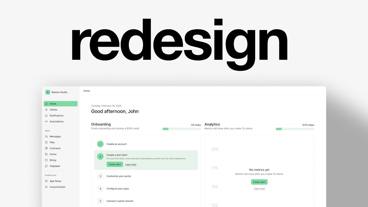
Charles Postiaux redesigns a SaaS homepage in Figma, building reusable button components, establishing spacing conventions with 4-pixel multiples, and creating an onboarding checklist with progress indicators. He emphasizes auto-layout constraints and component libraries to reduce cognitive load and maintain visual consistency across the interface.
Chapters
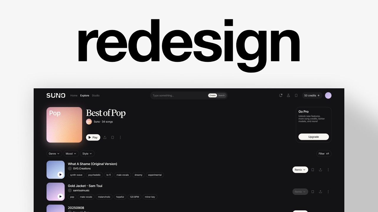
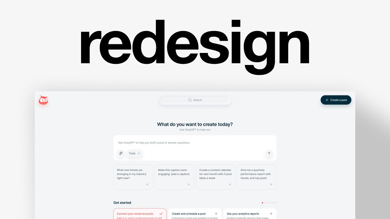
So I'm going to try to find a design here and redesign it pretty much. This one is cool, but I'm not sure if I can redesign it, if it's going to stand out much. I think there's still potential, but I don't know. This one could be nice to redesign because it's very basic in its layout. And so I think there is potential. Let's check the homepage flow to see the content inside. It's mostly cards, some with visuals, some with no visuals, but I think we could maybe improve that to be a bit more flexible or a bit Better looking. Let's copy the flow. Let's jump to Figma and design. All right, so we're in Figma here. I'm going to paste the flow, right? So I've got 3 screens. You get an idea of what's the content. I want to design it, figure out how to do it. But first I'm going to focus on the navbar. I think it's an easy win to work on, and that's going to give us some ideas on how we want to approach the rest of the design. For most of the text, I'm going to use Inter. Regular, probably, maybe medium, and probably -1 or -2 of letter spacing, and then probably 16 and 140% offline height. I'm going to use an icon library called Cool Icons. It's free to use. They also have a pro version apparently, but I'm using the free one. Get all the icons for the screen. Again, it's a redesign and I want to show the process. So I've got my, kind of like my structure, which I will use for all of those pages. And now I want to pretty much create the button. Because every other element in the sidebar, I want to keep the same consistency everywhere. I'll try first with paddings to see if it works. And if not, like here, probably it's going to be 36 of height, but 7 is not really what we want, but it doesn't really matter. So I will just pick 36, no matter the paddings, and 8 on the size. Usually when I'm not sure about the color, fill, or size, I put a stroke around it to make sure the dimensions work. And then I just copy it. Some pages, some designs have spacings, some have no spacing, some have like 2, maybe 4. But yeah, it's good to consider that as well. Now I'm just going to duplicate that, change the name. The spacings, I can not worry so much about it right now because it's going to change when I add the auto layout. I'm going to do the same for the bottom of the sidebar. Now we're going to remove all of those outlines. I think it's good to have 4 of spacing. Usually section titles are a bit smaller. So I'm going to go from 16 to 14, keep 36, check the size here. Good. It's a bit different, but I don't care for now. We can adapt in the future. Right now I want to get the foundations right and we are pretty good. So let's just remove that. Cool. So now we've got the sidebar ready to some extent. Yeah, there's going to be just a spacing between the sections, but overall the whole thing, I'm fine with the whole thing being the same. I don't really want to have so many Auto layouts. So are we going to keep the same spacing for all of them? Probably. I'm going to see how it looks. But yeah, this is a bit different, but we can still work it out by adding another padding around it. I don't know exactly how much it should be. Maybe this is fine. I don't really care about the free trial. I'm going to expand it. Now I need to create some auto layouts inside of it. So we need one here, which is probably 12. Then we need one here, 32. I always try to have multiples of 4. I think it's an easy way to design. Multiple of 2 work too. Sometimes you need to also break the rules, but usually 4 is a sweet spot for me. I'm going to do auto layouts here as well. This is a section, so we need the same. And then we need the spacing here. Auto layout, 12. I'm just going to check if all of them are 4. Nice. And then I'm going to hide that for now, just so you see. And now we can add an auto layout, auto layout here. We're going to add Auto spacing there, put that down and we're going to have constraint from top to bottom so that even if we change the height of a frame, it doesn't change anything for us. Cool. I like the spacing. I think it works well. We're going to add a stroke on the right and we've got our sidebar. I'm just going to update that to be 12 and 12. Yeah, it's fine. I'm happy with that. I'm just going to make sure that all of the colors Are the same. I'm not sure exactly if I want to add some corner radiuses, maybe 8. Yeah, maybe 8. I'm not sure what colors I want for now, but yeah, those 2 should be different. Do 6 for now. And I don't really want to do the icons yet, but we've got the basics of this, so that's already a good thing. Now wondering how I want to approach that. I was thinking about doing half, so like this would be maybe the stats analytics and this would be the checklist. And I feel like later on if the user succeeds, We could have double analytics, which I think would be the best. They don't have that. They just have one analytics. It could be recently visited. I think that would be nice, like a quick access. So we've got analytics here, quick access there. That could be a cool thing. Layout could probably be the same, stay consistent. And then we could have cards that are vertical rather than horizontal like this. Let me think. I think the goal for now is going to be analytics and onboarding. I like the idea of gamifying it with $100 credit. I'm just wondering how we're going to play it out. The benefit of this design is that you can click once and access it. If we break it down, the problem is that we might not be able to show all of that. Maybe we still can and we don't need that visual. I don't think it adds to the goal. Okay, let's try to do just onboarding. I'm going to do that here. Look at what other products do for onboarding. Actually, it's not really onboarding, it's more like checklist, guided tour and tutorial. Is it that? Check progress bar. This is a good one. I think we could actually do that. I like the idea of Making it a list and a call to action. I like this idea of layout within the card. I'm going to remove the card. I'm going to put the stroke here so I know where it is, and then I'm just going to copy what it says. So what I'm wondering is if we could have cards with just the title for all of them except the one you click on. We should have the text and a call to action. You see, the problem here is that you arrive on the page and it's very overwhelming. There is so much information. What I want to do is remove those and just have it like this where it's a lot less complicated. I like this idea of doing that. I don't know if the CTA should. Be at the bottom or not. Okay, let's try it. For the CTA or button, I'm going to use the same thing here. We don't need that. And we are going to visit create client. And we are going to have this subtle link underlined so that you show that it's clickable. There's less cognitive load when you underline it. What's that? Oh, 16 is probably too tall. And now we're going to auto layout those. Maybe 12, maybe 16 actually. Plenty of paddings. I still want here as well. So I'm going to auto layout all of those. Cool. Now what we need to do is maybe have a way to show that it's checked out. Like here, I also like this idea of following the steps and the check mark. And I think that's something that I recommend for everyone to do is just to look at what other designers do. So here we can see the problem. We change that to head content here too. These ones are good, but we're going to change the spacing. Now the problem is that, okay, I mean, it doesn't really matter. Because it's always 12 anywhere. But here we're going to auto layout those so that we can put something here. Probably 40. We want it to be noticeable. What's the size of that? Let's do 46. Or maybe we can change the height to 44. Let's do 44. So it's centered. Then we're going to center here. Maybe remove the layouts, maybe. So pretty much that's the onboarding. That's that. And we've done it. What we can do to change maybe a little bit, and then I want to reuse that like this, maybe use that and mix it with what they have here. And then I want here to have a progress bar. Auto is good. We don't care about the size right now. We just want the content to be somewhat good like that. And that's pretty much the first step of any design is just make the skeleton, figure out the content where it should be, and then you can figure out the rest. Let's try auto for now and fit container and we can change that. That's still ugly. I don't like it. Okay, let's do 8rem and we'll Maybe adapt it later on. What I want to do is probably create momentum. Yeah, create your account. Like that's something I want to do. So first I'm going to auto layout that and we're going to try to do 20 and 20 and 0 of spacing because we already have a lot of paddings. Let's take that and put it there like that. But this one, we'll put it at the top. Then we're going to corner radius. I'm going to find a check and then we're going to probably copy that, add the number. What we want for onboarding or for setting up the account is to create momentum. Ideally, we want them to start on the like second step to get them moving and see how close they are to getting whatever it is that they want to get done. So the first one would be probably create an account. So this way it's like, okay, I'm already done with that. We did there to center it, also centered on constraints with 2 or 5. Perfect. So now we have 6 steps. And one is already done. So you can see it kind of shifts a little bit the story we want to tell here. So now we're done with the onboarding. We can also have analytics here. I'm just going to create a frame per client and we can have it like that. And so that's probably where we want to go with that. Ideally, I would want to have recently visited become get here. And actually I don't think recently visited matters that much for people who are just getting started because they haven't figured out where they want to go. So we get something recommended resources, and then I want to make a card with this. Read the Copilot guide. We got the text and I want to use the CTA I have here. The goal also is to reuse as many components as you can. That's useful for you as a designer, but also for engineers. They can just create a component and reuse it. Perfect. I'm going to add those 2 in advance. You can see the button doesn't move because it's not auto. Let's do auto. And that's probably too small. And this one, we're going to change it to 6. Cool. We could have an icon here at the top, right inside of that. But I really don't want to do that, so I'm not going to do it. But yeah, you could usually have an icon here. I think that's perfectly fine. So let's remove that. 4 might be better. And then we're just going to copy that. I think it's still too small. Like that's way too many. Yeah, like 5 is way too many. Got like 3 or 4, maybe 4 would be nice. Invite team. Perfect. So we're just going to auto layout those. We're going to have maybe 24. Then we want to work a bit on dimension so that we can use this Figma's feature aspect ratio, which I think is pretty nice to get it scaled up. We're going to also change the corner radius to 8 and we can lock it in for now. We're going to see how it looks. Yeah, right. We need to also fill container. Nice. Like this is pretty nice. I think for that, I'm going to check later on, but maybe we want to change that to 24 or even 32. Maybe not 32. Cool. So now we've got kind of like the rough, very rough layout. So I'm just going to duplicate that. We need to lower those and have a header at home here and just look at the bottom. To be the same. There we go. Then home, space it. I don't got a lot of time left, so we might need to rush through that. All right, we need the date. Good afternoon, John. This is really tall, so I don't know if we want that, but let's do 32 for now. We're going to decrease the letter spacing because it's a bit taller. This might need no spacing. Maybe 4. I'm going to put it at 40 everywhere for now. Might change that later. Okay, for this now, what do we want? I'm not sure even about the colors. Like, these are like pretty green. Greenish color, which is fine, but maybe we want something more gray. We have like this. This could just be white, very basic. This would probably be white too. Maybe it's not bright enough. Wall. I want to change maybe the opacity of the rest, but let's see later. It's as good as 6. Then we're going to change the headings to be medium. I'm going to change this to be 100, be rounded, remove that fill. We could use the green here, maybe this. I'm going to add a constraint and anchor it on the left. I don't know the right number here, the right division. Then probably 12. This is too, too high. Probably 16. This could also work as a green, but we need a dark green. So let's reuse that here. New out of steps. This would be the same. I don't know if we want a lot of radiuses. This could either be that, which is nice, but I'm wondering if we should have a more green, greenish one. So let's take the F6 and let's try to find a green. Let's take this green and see where we are. Oh, go ahead. I don't want that. This could maybe be this. To add another corner radius. This instead of brush, no outline. This could be probably white. Do we have a darker version of that? Maybe we could actually use that. Maybe let's do this. Okay, let's do F6. Analytics, I'm not sure what we want. I'm going to do the resources. I think one more like this. Going to remove the stroke, fill, reuse that. Change this to maybe a bit more. Might also change that to make it seem more like a card. Expand that. Talking about spacing, I think we might want to do, let's do 80 on both sides. Fill container, 24 as well. Here, same. We want to have those. It's too much here. 60 is nice. 28. Not sure about the colors though. This I want to try to redo. We even need to try to find a main color because that's not going to cut it. It still works. It's not bad, but it's not really on brand. Even this actually looks pretty nice. Okay, how would we do that analytics? Any lines here? This is definitely not another layout. Let's remove that for now. I'm going to have the same data. I don't really care about the specifics. Now we're going to have the same dimensions for all of them, which should be probably 48 and center it. This way it's a lot easier to balance the auto layout so it doesn't look uneven. I think 24 would be the way to go. There's also the problem of those that are not the same spacing. 24, let's do 24.5. Cool, now we've got that. We're going to need those, so I'm just going to make 3 lines, maybe a bit more. So we're going to space it well, 24. Let's try to do a 48, probably. Do the same color and auto layout. Make sure all of them are fill and yeah, cool. This one can also change that to 8 pixels and then it needs to be auto, 24, and at the top, let's do 40. Perfect. Then we're going to group them together, lock, remove the opacity, CA black, remove that, change that here, metrics yet, this. There, 20, put it together, center, 80s. All right, maybe for that as well here, 24, center it. Pretty good. Maybe a bit darker, a bit less saturated. I still like to stick to the brand to some extent. So it's not perfect, but in just an hour, I think it's good enough. I think it's pretty clean. I still didn't change the icons, but I didn't have time. I hope you liked the video. Make sure to leave a like and subscribe, and I'll see you for the next one. Let me know if you like that kind of video.