Watch Me Fix a SaaS Design in 27 Mins (Step by Step)
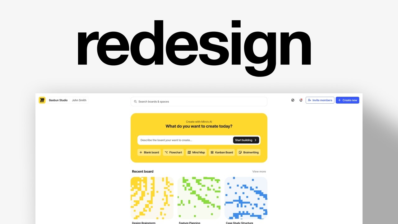
Charles Postiaux redesigns a Miro-style SaaS dashboard in Figma, removing the sidebar, adding a central search field, and introducing an AI quick-start feature. He references Canva, Linktree, and Replit while debating icon shapes, button placement, and a color palette of white, light gray, mirror blue, and yellow accents.
Chapters
I'm going to try to find a random screen online and redesign it in an hour. I didn't plan that, but I feel like this one is not a bad idea to redesign. I feel like it could be nice to do it because we could optimize the sidebar, make it a bit better. These templates, we could improve them, maybe find a different way to do it. We could maybe try to have like an AI kind of quick start on the top as well. So that could be one that would be nice. Otherwise, there's this version of it with the notifications. Okay, so now I can see the sidebar is a bit smaller. Yeah, okay, so it's just dragging that space and dropping it there. It's not so much about those boards. I think I'm having trouble understanding the difference between the boards and the spaces. I guess a space is a group of boards. Is that it? That could be nice. Let's try to find other ones just in case. So what I'm trying to find is that balance between not too much content, enough content to like show how we could work with it, something that looks good but not too good, but that still has that potential to look even better in my opinion. It's just a redesign concept. I'm not suggesting this is the one. Linktree could be nice as well because I feel like their experience is really weird. There's a lot of different styles being mixed together. Like this sidebar does not really work with those buttons. And why suddenly there is a blurred background when you select a tile? And why does this look so weird? I mean, I get it, you're designing for millions and millions of people. So I feel like you have to sacrifice aesthetic for user experience. Here it looks super cool and clean. That's why I'm a bit confused. But yeah, I feel like Linktree could be one to work on one day, but it still looks nice, you know? Yeah, I don't know. I've been searching for a while and there's nothing that interests me much. This one could be interesting just because the colors are not really working well and the buttons are a little— they're too spaced and it's like the background is almost the same as the cards. And so it feels a little not standing out as much. I feel like they should apply like what Linktree has where the background is a little darker and the cards don't need to have a drop shadow if the background is darker. Maybe also the navigation could be different. Let's copy both and we can see. On Figma if there is one that feels better. So we have 2 options here. We can either do this one or I could do both and just have 2 different videos for it. This one is a bit more challenging. This one would be pretty much just refining those things, but not having to change much of it. Like it seems like this is just in the middle of it where probably it should be at the top, like here, and it should be aligned with that one here. But I guess it's never really easy to manage those things and it probably should be good. I feel like it's just the idea of having those also have the same paddings as text. Usually with icons, I think it looks better when it's like the same width and height. So that's probably what I would change. For here, I think we want to— well, I'm not sure what we want. I think what works is— I still like this idea of templates. I think it's cool. I don't know why— I guess this is like an affiliate thing. I don't know why it is there. I really understand Invite Members. I'm not sure about Enterprise Insights, if it should be there. It's also interesting that their logo is here. Usually the logo is At the top there. Let's look at navigation from other products just to see like what they do. Like I was thinking this kind of navigation would work better with that. We can have mirror there. Do we need a search? I feel like search is probably not as important. Yeah. And then we can have like those there. Invite member is still really important, pushing people to invite others because you only invite people when you need to invite them. It's more about letting people know where it is whenever they're ready to invite someone. So it's an easy place to do it. I think about putting it where the search bar is here, but it might be too much in your face. What could be nice would be like if pin space were there and that's like a hover. Maybe spaces are here, you know, maybe this is like your spaces. Then as soon as you hover, you get those cards. That could be interesting to have. I'm going to copy that just to have it. So I think we're going to focus on this one more than the other. The other could be like, you can let me know in the comments if you want to see also this one being redesigned or not. I think it's a lower kind of, it's more like refining the design rather than redesigning it. Although we could probably try as well. But yeah, I really like this. navigation at the top here. Okay. So, 'cause I feel like Miro, like when you look at their navigation, like, so we have a search. Okay. So still, I'm still not quite sure the difference between space and boards are. I feel like it's just an easy way to store, to better store the boards, but like search could be at the top there with the spaces or the cards. It's like they're all packed together, but it's in the search where it's going to be a bit more Granular. And then we still have Explore, Home, Recent, Star. Like even those, I feel like they're like Recent and Star are pretty much Spaces, but like boards. So they all kind of collide together. They all like achieve kind of the same thing. Only Explore is going to be different. So I'm wondering if Explore is the— let's actually try to find it. Explore. What is this about? So click on Explore and you see, yeah, so Space is pretty much a folder. Okay. So Explore is just a landing page pretty much. What about Read View? What does that look like? So I think the goal of redesigns, first of all, have fun. I think that's pretty much the goal is to enjoy still redesigning stuff, but it's also about being opinionated and trying to find a different kind of, you know, it's like Spider-Man in the multiverse. I feel like it's kind of the same thing where it's like, what if in another universe Miro was designed differently? And so instead of trying to stay too related to what they have, I think it would be fun to explore like an alternative universe where we're going to have a search bar that's going to kind of power up. The search experience and the spaces and the boards, and where there won't be a table. And so I think that what we're going to do is instead of having those like grids and categories like that, we're going to shift the focus. I think the focus should be more into getting started as quickly as possible into creating your board, meaning you can either use AI, you can use templates, and it's very easy to figure out, okay, what do I need to do? Also to be very easy to find specific boards, specific spaces, which I think they're trying to do here, but I'm going to try a different way. way to do it. You see, that's also the problem is like, this is supposed to be templates, right? And there is still a button about export templates that's not related to that. It's related to like board of this team. And so that's why I'm like a little confused. And also these are not really templates. They're more like categories of templates, but they feel like if I click on that, I feel like the template's going to pop up. So I feel like there might be a better way to do it. This could be nice too, because all we want is we want 2 things. I mean, I think the goal of the page is 3 things on Miro. It's going to be to create, to invite, And to search. The product only makes sense when you create stuff. So I feel like create is the number one, and then it's going to be the fight between inviting people and searching. I think searching is still number 2 because like, you know that you need, whether or not you are going to invite people, you know it already. It's more about where can I easily invite people rather than being pushed to invite people into the product. So I think it's create, then search, then invite. Like, that's also interesting for the search, for like the call to action to like create. Something. It's like suggestions. I don't know if we want suggestions. I mean, actually we could have suggestions if the onboarding also— like the onboarding probably asks why are you here? What do you want to create? And so there could be this mix of you said you wanted to brainstorm new features for your product. So in the suggestions, it's going to be about that as well. Let's also copy this one. I'm going to mix all of those together. Oh, okay. They have— that's kind of not really what I was thinking about, but this section here could be that. Idea of building your stuff, but smaller because it's mostly about making a board. And Miro is also probably very— it's widely used by a lot of different companies, by a lot of different levels of people who are familiar with technology. And so I'm wondering if that would be like too granular. And so we probably don't need that much of that level of detail and granularity, but I think it's kind of like where I'm going with. And recent, like that's, that's kind of like what they had, but I don't really want that. I want that more of a kind of like Airbnb almost vibe. So maybe that too. And I like that stuff here. It's not really what we want to go with, but I kind of like it. I feel like we've spent what, 20 minutes already on the recording? And it's mostly been just me searching for ideas. That's kind of like what I want to go with. Kind of like Canva, but a bit less colors everywhere. But I think that's pretty much the goal. This would be like the call to action of like, what do you want to create? This could be search your content and canvas, and then you can easily start something. Key actions. So I'm going to take that. I'm going to steal it. I cannot seem to find what I wanted, so I'm going to just go maybe on Replit here. They have it. Nice. I like this idea. It could honestly be like, it could be there. Like if we keep the search bar, I'm not going to, I don't think I want to keep the search bar, but if we keep the search bar, it'll be there. Okay, cool. So I have a lot of inspiration. I'm just going to sort them a bit more. I'm going to create a frame, 1920 by 1200. And what I want to do now, I'm going to find the Miro logo too. So for the logo, you can inspect, then select that. And try to either, yeah, let's pick this whole thing and we can update it if we want. And then you can copy elements. We probably don't need that, although we could. I don't know, I'm going to keep it there. I like this one here, but is this white? Oh, okay, nice. I like this idea of having like a big canva and I like this idea of like sections. Like you have the title here, then you have like the cards there and it just expands. You can see like it's the same here, here. I like this idea of like actions. We are almost at the 30-minute mark and I'm just about to start designing, but it's good. It shows you like it's not all about jumping into the design right away. It's about being strategic about it and knowing the vision and the goal you want to have with the design. You have to prepare, you have to plan before designing anything. Okay, so what do we want? We want that navigation style of having a search, a big search in the middle. We want to have some small icons there, here and there. We want to have maybe the logo here so we keep reusing it. We don't really need that collapse because I want to go with no sidebar. All of those things can be done. At the top. Maybe actually, maybe that icon could be like the explore because I feel like they still want to have it so that it pitches people. I guess the idea is that if you invite someone and they just come here because they've never used the product, but they still collaborate with you and you invite them, then they don't really know the value of Miro. And so you still have to pitch to those new invited users why Miro is the best option for them. And so in this sense, having the explore is like a way to have a pitch and a landing page inside the product so that people who are just invited, they can just already learn about the product without having to go on the landing page and be pitched. So it's like an easy sell for them. So I think that they would still, even in a different universe, they would still want to have a way to do it. I'm not going to have, I don't think I'm going to have the outline, the stroke here. We also have that here, 80. And then I'm going to take that, copy it, and put it behind so they kind of see like what they have to compare it with. This could be included in the dropdown. I get it though. It's like you invite members, but oh, by the way, there is referrals. Enterprise Insight, I wouldn't include it in the Explore. I'm just going to put a stroke, but just to like see where my limits is. Okay. Also, that's confusing. It's like, this is a square, this is a circle. But so this is the company and this is the user. And why do they duplicate that? I get that it's, you know, like, like you can see here from Replit, it's like there's the circle and there's a circle as well. Like it's, they stay consistent with that. I think we would go with the square to stay with Miro and also just, just stay consistent overall. And I think it's nice. There's a 24, maybe it's too much, 20 pixels. 16. Let's do 18, 20. Put it there. I'm going to care about— I'm just going to outline what we need and change over time. So it could be the— this would be the profile and this would be the company, or the opposite. This is a company and this is the profile. I think the company and profile makes more sense just because again, this is mostly used within corporations, within companies. So we want to reflect that in the product. I can use the chevron as well. Chevron right here. Did they use a specific black for that? I usually like— because again, it's a redesign, it's like in my free time, I don't really care so much about about being pixel perfect in terms of colors. I prefer to like go fast and just have to tap 1 on the keyboard and that's it. So I'm going to auto layout those, 12, and then got this one, auto is good. Oh yeah, I wanted to have Miro and I like this 82, but I like the search. So I'm still not sure how that would be. Let's have that, drop it there, put 1, and I'm going to add the compass icon. This would probably be a button. So I'm going to keep it like that for now because I'm not sure what the size would be, probably 40, but not sure. Then we want the search bar. So yep, maybe 40. So then I want to reuse that. Actually, I want to reuse that right here. I just need to see and copy the chevron, remove the auto layout that we had for the whole thing, and then just keep the auto layout between the 2 here. And that's going to be John Smith. Oh yeah, and this is going to be the studio. Then I want to have the bell notification. Invite— should invite be there? Not sure. I think it should be there, but I'm just wondering like if it should be a button or if it should be just like an icon. Let's go with the icon for now. So share, maybe it would be link. I think it's more like sharing and this is more like inviting. So I'm not sure. I'm going to keep both. And then we want that big search bar, not big, just large, I guess. And we want search boards and spaces. Okay, we'll be good enough. We'll have to change the text here to be a bit smaller. But yeah, I think that's pretty much what we want. And why do we need the chevron if there is no menu? You know, doesn't make sense. Let's remove that. Let's have that. And put it there. Don't really care so much about the paddings yet. Do we want to link? Do we want to share or to invite? I think both options make sense. You want to share a board, but you want to invite people to a company or a space. And so sharing might probably be on the board level, like when you're in the board, and inviting might be more on like an account or like home level. So we're going to remove probably share and just keep that. Not sure about the size of that, but it should be still, I think, 40 no matter what. So I'm just going to put those inside. Basically, we don't really want to have the icons just floating around. We want them to usually belong in buttons. And it's also easier to like balance spacings and all of that. Okay, so in this sense, that should go here and that could go here. Miro could either go there or go down there, but let's keep it there for now. And this should be centered here and that should be our navigation and it should just float around like that. All right, so we have that part. Maybe this would be also the— maybe Miro could just be that. I like that. It's pretty cool. So we have that done. We have the navigation done. 20 minutes left to be an hour. Cool. So now I need like that call to action kind of thing. Probably going to use that spacing here, like that width of 800. But I want, I want like something that's a mix of all of that. It's like we need a place to have text. We need that call to action, like call to action slash explanation of what this is. We could have that improve prompt and start creating. I like those as well, like to make it understandable for most people using that product. I like those templates and the, just the file organization, I think is pretty cool. Honestly, that Canva navigation is pretty smart. Create, invite, folders. That's pretty much like what Miro does. So I think Miro should just copy what Canva has for that. And like, if they just copy that, but just all of that space is gone, but they still have all of that space left. I want to brainstorm ideas. I want to do a retrospective. I want to use a Kanban framework. I want to have a mind map. I want to have a flowchart. So that just We could just keep the same things, put them as those. I think the visuals are still helpful to understand what they are. I'm not going to make them because too long, but maybe we could use those icons. Maybe icons could help fix that. That's why I think that's the idea, but they take a lot of space. That should be 800 because that's the width we want to go with. So it would be like that. Then we would have a text that says, do you want to create today? And they have AI, like intelligent create With Miro AI. And then maybe we don't need that level. Maybe we could really need that level here, but still with an icon. I'm just going to use the one icon that we have right now and we can change it later on. Then we could have those connected, maybe 12 and 12 and then 6. Maybe it's a little small. 12 by 12, probably. And it would be flowchart, mind map. And then we might need start from scratch. I think that's a better— maybe like that. I don't know if we want to have the templates first or if you want to have the— your boards first. I think some templates would be nice, but that's kind of like what it does. That's why I'm like, do we really need that though? We'll still have it like templates for you. And then what do they do? Should we do like this or like this? Should be a mix probably. Yeah, we could have that. Then I can use a plugin, split shape, make 3 columns, 1 row, 12 probably, maybe 20 templates for you. And then inside the template we can have Business plan, and then we can have those things like 4K, like 5.4K. And I'm just going to keep this one for now, but that's cool. And then we want to have— I'm even debating if it should be much smaller because it's going to take so much space and we want people to still access either files, or maybe this stays at the bottom like here, and this is where you get the stuff. And this should be smaller to ask something. Describe the board You want to create. And then we want to have recent boards. We want to stay consistent. And do they have anything specific? Just the title. It should be the same. Let's go 252. Just to say multiples of 4. Recent board like that. And then we would have the text. Future planning. This again. Nice. Okay. So I think that's kind of like the design we want to go after. And that's almost an hour. So we've only designed this far. But we've got the structure and I think that's what matters the most. So now we would need to focus down and come up with style and aesthetic we want to have. I think The first question is, do we want to expand this or not? Our design is going to be pretty responsive. So if we need to add another card, increase the width a little bit more, it's not going to change anything much. I'm just going to try to find the colors like this. I like those colors, but it's pretty much like this white and light gray. Do we want mirror? Is it the gradient? No. Okay. We might need a mirror blue. Mirror also has the yellow, right? Yeah. We might want that yellow as well. Maybe we picked our black because now it's not so much about outlining the thing. It's more about designing. We've got our color palette. This probably would be smaller. Cool. So let's remove the stroke here. Let's find all the colors. Yeah, we need to update that. Then this background needs to be not like light gray. Then the buttons here need to be white. Maybe we add like a subtle stroke to it. We might need to add also a drop shadow later on. I'm not sure yet. What about 8 maybe? Then we want to add auto layouts to those. This one we can change it. The black, we can change it to mirror. Change that to— the constraint should On the right. Cool. Then let's add another gray, and maybe we can change the gray for those. Maybe that one is good. EF. Same here. Probably this one we need to change up slightly. The text, it's too ugly. 16, 20. Maybe I'm not sold on yet. I'm not sold yet. Maybe those drop shadows could be nice to make it like subtle but still there. Like, this is pretty nice. Question, should all of those also be like that? Let's go with that for now. And we need to also change this one. So let's do that. Next, we're going to auto 12, maybe 8. This is too big, but I think we should still keep it. So I'm going to add a frame inside of that and then just change it to be smaller. Nice. And expand it back to 800 and change the color. Should probably be a bit bigger, but not sure. So now let's update those. Then we can try to add that to here. It's definitely too big. Oh, but we need those. The buttons as well. That's why is it forty? Oh, okay. To be fair, I think we might need to update those a little bit too. Start building and improve prompt. I like those. Then we can add a chevron here. Start building. Let's change that to one point five. Remove that. Don't remember. We can change later. Okay, it's there. But this is too. It should be inactive. Oh, that looks so bad. That looks so ugly, man. I'm going to keep designing it and see like if we can land on something. Or if we need to like redesign. Let's try 20 and put them in the middle like this. Or maybe you should have that drop shadow and stuff. You see the problem? Like it doesn't look bad, but it doesn't look great. It looks very average and I don't like that. Okay, let's try something different then. It doesn't work. This should probably be— maybe this moves there. There's also a serious problem with it. It's like the buttons, I feel like they're way too small. Then maybe this could go on the other side here and this would be invite members. Is it what they have? Invite members. Okay. Okay, let's remove those. This becomes this. This could go there. I feel like this is still too small. Okay, that's better, I hope. Or maybe this could be an AI chat there and would have the same color but darker with background blur and some drop shadows. That could be, that could be. I'm going to remove it for now and focus on those. We still need the— this one, it's too close enough. This we need to change as well. Yeah, we need something like that that catches the attention. No, not like— I think also there is the clash of I'm using semi-bold here and In those I'm not, so I'm wondering if that's going to change if I suddenly do it. That adds to the character of it. I think that works. I think we need to be bolder on that. And what if we did? What if we removed that? You know, what if we did that? I agree it's a little much, but we need the boldness of Miro. I feel like that could be the solution. You could have one create. What do they have? Create new. We need to make that bigger. Nice. Okay, I think we're getting somewhere. I think we are. We're not quite arrived there yet, but I think we're onto something. This should probably be lighter, or maybe it's just the same. I probably don't need that anymore. I like where we're going. I think it's a lot better what we had. I like the boldness of this. It looked too lifeless. It was just like, well, it looks kind of nice, but it's not super nice. Maybe this is black and white. Oh yeah, I like that a lot more. Maybe we could add that, like those little square to them. Not sure, but I like that idea. Maybe we remove this to be more— what if we change opacity slightly? I like the softness of that. That 12, nice. And let's frame that 60 by 60 or 120. This should be 28, 24, 40. I think that's much, much better now. All right, so we got that solved. Could it be the same size? Oh, I think this looks pretty fun. Yeah, I like that. Let's do that. 802. Perfect. It's almost like what we wanted at the beginning. So let's keep that like structure of boldness. I think that's cool. What could save us. All right, let's work on those cards now. I don't know if we want the same height on that, but I kind of like it. Probably the same. Then 80, 16, 24, or 20, 20 to be semi-bold. This could be maybe 12 or 14, then 8, 4, and we could change those to be 6, or maybe they just go down. What if— because like in the thing, there are like images, right? So They're not really the board. You cannot preview the board. So maybe you could put them inside the card. That could save us a lot of space. Let's use that. I like it. We're an hour and a half into that project. I think we're probably getting hopefully below the 2 hours. And we need the same height as this. Change. All right. Okay. So what we can do is keep that same ratio, fill container. Maybe 6 is better. Cool. Oh, they have the light yellow. So I might keep that for later because maybe we can use that for— and I have one thing here that I did on ChatGPT that we could use to look a little different. I like the idea. I don't know if it works with the text, but I like the idea. So like we could take it, flip it, or maybe just move it like that and then flip it like this. And then we can just change the color, maybe nice like this. That looks pretty cool. I like that. Doesn't work with the text, so maybe we're not going to put the text there. Maybe it's going to stay at the bottom. This could have some paddings as well so that it doesn't look so offset. It looks pretty nice. 32 is too much. I feel like this should belong above. Maybe I'm wrong. Like that, it's pretty nice. Maybe you can just be there. I think it still looks nice, so let's just do that. Nice. Let's do the same for the other ones. Is it 12? Yeah, let's do 12. Hug content. Nice. That looks so cool. I really like that, and I feel like it kind of matches with the brand as well, or at least what we've made of it. Maybe change that to 24, 20. That's 16. Nice. And then we need a— this view more. Should we do like Should we do that or do we just remove the paddings? Yeah, like that is pretty cool. And we probably need paddings as well here. And maybe we'll remove the arrow and just view more. We might revisit it. I don't know. But that's nice. Maybe 16 or maybe 24. 24 might be better. Yeah, let's do like this. Cool. Okay, it's getting into shape. Oh boy. It's taking way longer than I thought it would. I don't really don't know what we want for the templates. What did they— they just have like a very normal one. So I don't know if we want to like keep that same train of thought. I'm probably going to move those, group them. Templates for you, view more. That's probably too dark like that. And have those inside. Nice. Remove those, remove the other layouts for that. So there's only this plan like this, and then we can have those 5.2K, 52.4. I have the plus here. This is— oh yeah, I changed it. So let's do balanced. I'm going to add it here. Change that as well. Where is the heart? This one, maybe like this. I know it's not the fastest way to do it, but change the width, content. Then we're going to place that there. 24 as well. Yeah, maybe not. First, I'm not sure if we want the size like this or not, or if it should be smaller. It should be smaller, definitely. 24. Oh yeah, we need to remove that padding. Maybe it could be this, and then we could have like an icon. It doesn't really matter at this point, but yeah, something a bit bigger. Like that. That's pretty nice. Then brainstorm this 3. Perfect. Maybe we have 2 rows of it. We're just going to alternate them like that. A few more. Perfect. It still doesn't solve the question of the like search. Need the search or it should just be up there. I feel like it could be up there. I don't like the look. Oh, because it's reusing, because it's the old ugly style we went with. I feel like the search is the only thing where it's like we're not really sure what it is, but it looks a little weird. In the design, like everything looks pretty well thought out, but that's the only thing where like why? I still like this better than whatever we had before, so that's still a win. But this one is not bad. I said that every 10 seconds, but this one's pretty good. Now the question is, do we need it to be aligned or can we remove that? Put those where it should be and then put this like 20 as well. We need those at 60. Should it be like that or do we need to put it there? I'm not unpleased with this version. I think it looks pretty solid. I think it's very different from the current product. Maybe that's too big. So this is This is what they have right now, or as far as I know. Then we went into this redesign, which looks pretty similar to what we landed on, but we had this weird like in-between and we landed on this one. And it looks very cool, very unique, but kind of still has that same connection to the brand of Miro. And I think it's pretty cool. I think we did a good job on that. We arrived on the very ugly in-between state and then we landed on a cool one. Right below 2 hours. Perfect. Thank you so much for watching this video. I really hope you liked it. Make sure to leave a like and subscribe. Also, YouTube thinks you will like this next video, so if you haven't watched it already, make sure to give it a try. Bye!










