Watch Me Fix a SaaS Design in 2 Hours (Step by Step)
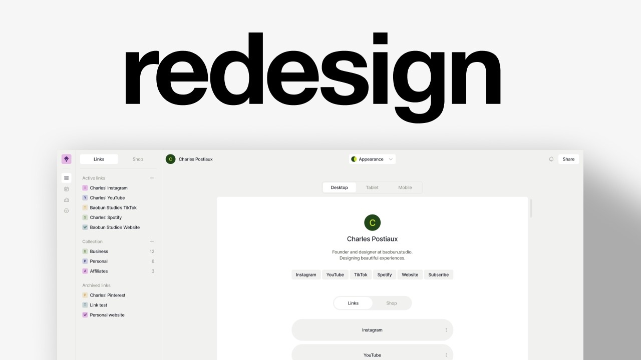
A designer rebuilds a Linktree-style SaaS interface in Figma, moving from a scattered menu to a consolidated sidebar with a Pages hierarchy. He picks icons, defines colors, sets up auto-layout, and sketches features like multi-page profiles and a shop module, ending with a clickable prototype.
Chapters
I'm going to find a random screen online and redesign it to make it look cooler, cleaner, have a different aesthetic to it. I'm on mobbin.com and I can just look for one to make it. ElevenLabs could be cool. I feel like there is the opportunity to make it more of a kind of like Netflix library. That could be an interesting idea to do rather than a music library. Cloudflare could be nice. I think the downside is just it looks very boring. Linktree is nice. Like this is interesting to redesign. I talked about it in previous videos as well. It's interesting because I feel like everybody uses it, but it doesn't look that good. I like the flat design. I like the navigation, the sidebar, but it looks so weird. They have raised $167 million. Isn't it crazy? And you designed that. Let's try to redesign it. I'm not sure what I want to do with that, but I need to take those screens as well. It's still good to have it for context. Then I'm going to just make a frame, 1920 by 1200. So I like the sidebar navigation. Like that's I like that idea. So what do we have? Usually what I like to do first is just understand the experience and look at the structure of the page. So that's like links. So that's pretty much the core of what you have. And this is your account. You can have collections, archives. You can see all the links that you have, how many clicks they got. You have a preview here. Maybe it's notifications or stuff like that. I think it's share the link probably. And also in terms of grouping, why is audience different from analytics? I feel like these are connected. The audience you have is related to the analytics appearance, which I suppose is that. And we have analytics at the top, but we also have it here. So I'm wondering if, is this see more analytics? So this is just an overview, but we also see the analytics here. So why don't we just have those like things that we really care about? And why don't we just put them here? And this could be turned into appearance shop. I don't know. Like, yeah, it's another section. I'm just trying to think about how to optimize the experience and avoid having too many clicks. Because in the same way, links and shop are tabs. So why aren't they tabs here? Because you could add something and that something could be either a link or it could either be an item that you want to sell or I don't know what it is exactly, the shop. Or maybe it wouldn't be called links. Maybe it would just be called like profile and you would have multiple profiles you could have, which I think is really good for upsell and for multiple clients. Or maybe pages. Actually, pages might be the best word because that's a Page, pages. Then inside the pages, you would have the shop, you would have the appearance, then you would have social planner, then you would have analytics, and inside analytics, you would have audience, and then you just need settings and account. And then it's all about redesigning that space. I like this idea of having that at the top. I'm just wondering if it's really if it should be analytics or if it should be appearance. And then I'm not sure what to do with that last column. I'm wondering if it should be more of a inspecting the code. Kind of interface where you can change. Oh, maybe not. I think I just don't like the way it's presented. It's like a super heavy drop shadow. It probably works if it's like a beautiful design, but the design here is not very beautiful. And I think that's also an advantage because you usually tend to design for perfect experiences. But the truth is that a lot of times it's not going to be very good. I don't like the sidebar inside. I would try to maybe put it there. Okay, let's try to do that. First, I'm going to simply copy the sidebar here and maybe try to make it look a bit different. Let's try to grab the logo first. So we just have to click on this, inspect the code, then we try to— oh, this one. Try to get the SVG. Then I can just copy the element, go back to Figma and drop it here. Pages, which would include the shop, the appearance, social planner, analytics, and settings. And then at the bottom, just the icon of the user. Perfect. Let's push that on the side. Let's try to find the icons. Actually, I'm using a free icon library called Cool Icons. Cool, we got the icons. I think for the settings we could actually flip it, be similar to what they have. Pages, probably not. Feels like more like folders, but we could maybe try to have this almost the same. It's not fully the same, but almost. Okay, so that's the plan. Then we need to have the images. Let's try to do 32 for now. 8, maybe 6. 1, 2, 3, 4, Perfect. Let's add the icons inside. I usually center them, so I select the icon inside of the frame, then I press Option, then V and H, and you can see the constraints have changed to be center. So this way when I move them, it stays at the center. There is no auto layout applied and it still stays centered, which is really good. And we might make it round. So that's 32 as well. Okay, cool. Let's remove that for now. We don't care so much about the colors. Yet. Okay, 24 is definitely too big, maybe 20. Then I want to change the stroke to be slightly better. And then we're just going to change the color to just be fill. We might need to change also that one and this one here. Like that. Then we're going to auto layout this with 8 maybe. Then I just want to have one page that is selected, so remove the fill for those. Let's do the color palette now so we don't forget it. Do they have a gray? These kinds of, kinds of feel like, or this one here would be nice. Oh, that's a green. Okay, 32. Good. Let's auto layout this. Should be auto. And then we want to have Maybe 24 of paddings and it needs to hug the content. Oh, because there is no auto layouts for those, which is fine. They should be aligned, hug content. Then we're going to lock it on the sides, change the constraints to be aligned on the left and should be top plus bottom. And we can add just a stroke on the right and we can use dark gray. This one? No, because that's the background. This one, what is it? Probably this one. You can see that it's always useful to have a color palette that you can rely on to make your designs. Let's try to do 36 and reduce it on here, 20. Let's try to change this to 4 and have the— actually, maybe not fill container. We need to center that and change this. I think what we want to do is kind of have it stop around when it starts curving on the corners and then have that. I'm not a fan. Actually, that's nice. 20. So Is it too much if it's 20 here? It's probably too much. This is nice. Let's stick with that for now. We might need to have a lighter gray, but I don't see any, so we might have to do it ourselves. Oh, maybe actually we could use this for our logo. Yeah, let's do that. Looks cool. Okay, so we need a— what is this one? We need another one that's like— that is going to look better. This is cool. 60%. I'm just going to copy this one because you can see that I'm changing the opacity here, but the opacity is going to change the color. You can see this is a different color here than it is here because of the background. We can remove that. We can have the color palette be here, and we already have the navigation, the sidebar, which looks nice. Doesn't take too much space. I'm wondering if we could make it a bit tighter, if it would make sense. I think it does. I think it looks better. That's the current navigation, and that is the concept. So now we need to figure out the rest. And so I have an idea, which is to not do that, but I don't know if that's really helpful or useful because here you get a very granular, very precise control of each link. What is this link? Where does it send you? I don't know what this is. Now what I'm wondering is how useful is it once you have it set up? I just create the link, use it, see like once a week, twice a week how many people clicked on it, and that's it. So I'm wondering how relevant those icons are for the experience. For me, being able to drag and drop them around is really good, and being able to see it reflected on the mobile screen is really good. I'm just wondering kind of What balance do we want to have here? Okay, one idea I have is to have the links on the side. We could have all the links, categories, archived, all here. Kind of like Notion, actually. And then you would be able to— I'm not sure exactly. You would either be able to move them around there, or you could be able— you would be able to maybe drop them on the thing here. And then the rest of the screen is just you visualizing what the page looks like. So how do we want to Do that. We could maybe try to have the same. I don't know if it should be the same size though. We're going to auto layout this. I don't want to, I don't want to have icons. All the company icons, it's, I don't want too much, too much time wasted on that. So it could be Instagram. We could have colors. I think that's also the big strength with Linktree is that they use a lot of colors, at least on their landing page. So we could definitely use that on our platform. So I'm just going to make a square here. This could be slightly curved like that. I like Instagram and maybe change that to 12. Is this good? It's good enough. It's good enough. And we're going to have the fill to be this. Then we can have the category, which would be active, active links, which by the way, should also probably be a category. And then auto layout this. We can have the same paddings as the navigation, 16 and 16. Hug content, constraints top and bottom. Then we can have YouTube inside each one of them. You would be able to see the analytics. All of that, all the things you see here would be accessible here. And then that would be like your page with the, like Notion pretty much. I don't know the size we want to have. Should it be just max based on this? Should we make it just a bit bigger? Give me that. Again, stroke on the right. And I don't remember the color. So that could be active. Nice. Then another one. What do we have? 16 or 4? 4 might not do the trick. I think 16 is— we could have archived like Charles Pinterest. We could have categories. Is it categories that they have? Collection. Collection. We could have business, personal, affiliates. And maybe we could even have how many there are inside so we can group the category with the icon, then auto to make the spacing, and then have 12. Same for the other one. And then I think that's it. Shop. We could have shop as well. Is this It's 36. Why is it not the same? I'm confused. Why is it not? Oh, 38. Oh, that's why. Why is it 38? This? Oh, this. Let's select all of them and we're just going to change the height to be fixed to 36. Okay, cool. So now it should be exactly the same. It's not. Why? Oh, okay. We missed 1 pixel at the top. Now it's the same. Okay, cool. Back to what we talked about. What if we had links and then another one Right here, which would be shop. Shop. Yeah, we probably don't need that. We could do like them. Should we do like them? Let's try for now like this and center it. Have 4. Honestly, it looks pretty cool. That's 16. Maybe 16 is a little tall. Maybe it should be 14. No, maybe not. I'm not sure, but I really like this idea. I don't know if we need that. We probably don't. I will keep it just for now, see if I still like it or not. But you see, we've already saved a lot of space and it still makes sense. It makes sense even for shop. Like you could have this kind of ordering system where, where it's like instead of active links, it's active items. Maybe I'm just going to clean up a little bit, fill the container for all of them. Oh yeah, I didn't do that. Let's try to find other colors. We just have the main color, the car right here, and then copy it, have it pushed here, maybe reduce the opacity until we get something that's kind of similar. Now we can just randomize it a little bit. Perfect. Like that. What does it look like if we select all the text and change to be regular? It looks clean. I'm wondering if it really looks or feels like Linktree. I think we keep it this way. I really like the direction of that. Maybe we could have one at the bottom. And that's just me going on a tangent here. What if we had one here and that's just the trash? Do they have something for trash? They just archive it. Maybe not. You know what? Maybe not. Maybe archive makes sense. You could also like maybe on hover, you could have a you know, 3 dots here to open a menu, and then you could decide to either delete it or archive it. So we have, in this little amount of space, we've covered already all of that. Isn't it crazy? Because it's a valid product. Oh, it's not fully exactly the same. Like here, the question is, well, how do you add more stuff? Well, we can actually— we need to think about that. Where's the plus icon? We could have it right here. 24, isn't it 20? Yeah. 1.25. Active links, we don't really need archive links and collection, we do need it. And actually archive should be at the bottom. Nice. So now it's pretty easy to create new collection. Maybe we should increase that 12, maybe better. So now we need— we don't— I kind of want to ignore that because this is actually— okay, this is that. So we could update it there. I still want to have the share. I don't know what that is. I don't know if it's for the user or if it's for the platform, but we can still a share here. We want to constrain it on the right this time, have a content, and we want to have share. And we might just need to increase that like that. We maybe could have notification 36, maybe this. Then here we could have user here 16 and have it auto layout and auto spacing 16. And actually that is super cool because you can see like whole top navigation, there could just be one, one line. It's a cool detail. I don't think it changes anything. We might need to change the color of the buttons, uh, or maybe just the share. I don't know how much we want share to be at the core because this is more like a one-person thing, right? This is more like, this is my account, these are my links, this is my shop. But what if share was either sharing the link so people could view it or sharing it for other collaborators? And then that would mean You could have another plan for, I don't know if they have that. Do they have that? Can you have collaborators? They don't have it, right? Management? You have admins to manage one Linktree. Yeah, so that could be another plan. That could be like an agency plan or whatever they want to name it. You could manage multiple pages from the same account and invite collaborators, viewers, editors to come in and play around with it. I think they already thought about it, so it's probably not a good idea. I like this idea. I think the only problem with this is that we don't have that top thing here. It wouldn't really work. It kind of ruins the point I made about the top section being the same, but we need to do that. I don't know how much we want there. Desktop, tablet, mobile. Yeah, we might need to do also make a page here so it's easier to center stuff up. We want it to be left and right horizontally. It should be centered. Could we have— so we need the same length here, 172, right? Yeah. Then we want it aligned on the right. And here we would have appearance 20, 125. And we could have the chevron again, same thing, auto, 280. Maybe that could be interesting. And then this would be at the bottom. Maybe not. Anywho, we can try with that so I can reuse this here. We may need to change that. This would be— actually, it can just be the same. Could have something like that. Then we can make these icons Instagram, YouTube, and make it make email subscribe. Then we would have links and shop scrollbar, maybe a bit thicker. Then we can just update that to be the same. I think it would be easier. Let's increase that. Let's increase that as well. 60, probably. Should be bigger. First, we need to make it fill container, and we probably need, I don't know, 80. 60 would be nice. How much was it? Let's solidify that to make sure it doesn't scale with the width. 60 is good. We can make that fill container. We could try to have corner radius, maybe a bit more spacing, maybe even a bit more. We can scale that all the way down. This could be here. I think it's pretty good. Probably this could be Like that. Maybe we don't need that much spacing. Actually, maybe we should do that. Have a padding here, 8. Have it centered at the top. We just need to have the right spacing. Maybe 68. How much do we have here? 64. For consistency, 64. We could have the 3 dots. Same thing, 20. Change that to be that. You can see the problem with these icons is that you can see inside. So I just add a fill and then put the same color. And that's good. And the problem here is You cannot really space it correctly. Like if you do that, it's going to be on the side. So an easy fix is just to duplicate it, put it on the other side and just reduce the opacity to 0 and you got it. Again, 0, select all of them, auto spacing. That's pretty good. I don't like, I feel like we don't really need to add even like drop shadows to those. We can maybe change that. No, no, no, no. Maybe not appearance. I don't know if it's the icon. I think it looks too, too complex for, for it to be appealing. Maybe just An edit pencil. Let's try 1.5 as well. We could also try to have— maybe we could just do that. It's simple, but it works. We need to make a frame, then con-radius, and then have that. That's cool. It's a very minimal way to do it, but— or maybe this, like a dual color. So either we have this one, or we have— already— why, why is it— I think it looks cooler like this. This would probably be more practical, but This looks really cool. Oh, maybe that does not. How much is that? 30? It should not be 30. It should be 28. And this could be 28 as well. Let's do 32. We don't even need drop shadows. To some extent, there is enough contrast between the white and the background to stand out. Thank you so much for watching this video. I really hope you liked it. Let me know in the comments if you prefer this redesign or the current design that they have. By the way, YouTube thinks you will really like this next video. So have a look. Bye.