Watch Me Fix a SaaS Design in 2 Hours (Step by Step)
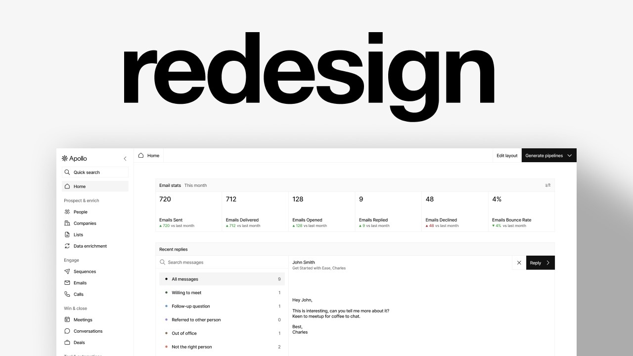
Charles Postiaux redesigns a cluttered SaaS dashboard in Figma over two hours, replacing visual noise with a minimal design system using Inter typeface, 4px spacing multiples, and reusable components. He builds clean stats cards, a card-based inbox with filters, and task lists with clear sorting controls, emphasizing how design-system thinking transforms confusing interfaces into functional ones.
Chapters
I'm going to find a random screen online and redesign it. So let's find something that is interesting, not too much work, and that has the potential to look even better. This one is interesting. I think the design doesn't look super— I'm just wondering if we could make it look better. I think it's a little too complex or confusing. Miro could be fun. This one's already all right, so I don't know. Asana has potential. I think it looks cool. And I can imagine it looks even better when you like have more documents and more blogs. Yeah, I feel like it's all right. People could be nice. There's a lot of stuff, so it's going to probably take a while to like nail it down. And I might not do all the logos, but I kind of like the color. I think there's potential for the stats because like you can see here, it's not really well thought out because it's a very normal large screen and already the content is chunked out. Like you don't even know what it is about. I think I'm just going to focus on like the top ones. Let's try to look at. I don't know if there is like a specific screen, specific flow I could look at. So that's the one we saw. Then they have tasks here. Okay. Some stats, kind of like Google Analytics, and then some like relatively empty states. Let's try. Let's just copy this one, go on Figma and see what we can do with it. All right. So we're on Figma. I have my free icon library as well, ready to use it. And yeah, let's make a screen. Let's do the same as the reference, 1920 by 1200. And already I'm going to try to figure out like, what do we want to do with this? The content is a sidebar navigation. We have a header here, 2 buttons at the top, and then we have blocks. The problem right now is that it's super crowded. There is information everywhere, which is okay. I'm just wondering if there's a way for us to make it feel a bit less cluttered, if there's a way to clean it up and increase the feeling of simplicity, because I feel like, you know, that's what you want with a software like CRM outreach. prospecting, all of that, like you want it to be easy to use, simple, and you want to go straight to the point. You don't want to like waste time trying to understand. And it's not even wasting time. It's just you don't want to go on the product and think, ah, I'm going to struggle with it. I don't want to use it at all. You want people to use the product and be happy with the product. So I think probably the goal will be to do that like whole structure with maybe the sidebar, the header there, and then the kind of structure here. And it's going to be— the content is going to be pretty simple in a way. I don't think we need to be so chunky. Like you see here, it's— I don't know, it makes no sense really. It's like so much space wasted for like those little information. But I, I mean, in a way I get it. Like they want to show like the content of the, of the message sent. All right, so let's do the sidebar, kind of like the whole navigation and structure first. There's a stroke probably, and then I'm going to move that to the right. Then I want to see what's the Text size on those things just to get an idea of what they use. I'm going to just use inter. I don't want to use anything else. Is it 16? Yeah, pretty much fine with that. Maybe we can do -1, -2. And for 16, I'm going to use 20 pixels. And this would probably be medium, but we will see if I want to do that or not. It seems to be. Cool. So it's just a matter of color. Nice. I'm going to write that so that we Have a reference and use it. I think it's, yeah, slightly smaller. It's honestly, it feels the same, but I feel like it's just slightly, so like 15 and keep it at 20. This is 16. So we're going to use a lot 16, 20, which is nice. We don't need to have so many text styles. Seems a little smaller, maybe 14, 16. Do we want welcome? I think we want it for some personalization and there's no other text. So I feel like it also kind of helps to fill the gap. The trick to figure out if it's the right size is to Write a letter that's the same on the design and you can see if it's relatively the same. Seems to be that. So 24 and 28 right there. Cool. So we've got pretty much those. And I just want to check those ones as well. I don't know if we want to use the same font style, but at least it gives us a range of what we need. So I think probably we've got those. Just make it a lot easier for us. We will have 24, 28. So that's a rough tiny little design system, but that's still going to help us go through the— Design a bit faster. Cool. So now I'm just going to remove those text and then I'm going to grab my sidebar and I'm just going to copy the text. I'm just going to copy the text and just get the content right. I'm going to use an icon as well. There's no home. There's a house, 24 pixels, do 1, and we're going to Shift+A to create another layout for this part. I'm going to do 8, maybe not. 36 would be good. It's going to be 36 in height. We want a multiple of 4 ideally, so that's good. Yeah, perfect. So let's do that for now. We don't care about the rest. And I want to do 12 for spacing. I'm not going to ignore this one. I'm just going to remove this, keep it at 36. Yeah, and add and change it from 6 to 8 so that everywhere is 8. And we might add a spacing as well, but I'm not sure yet. All right, perfect. So I've added all of the icons and the text. I'm just going to— there we go. So I'm just going to Add them back to my frame, and I'm going to just clean up a bit the colors. Perfect. I'm just going to change again the categories or the sections color to be slightly faded out. I think it's good enough for now. And also, I don't really want to do that onboarding hub here. Maybe we'll do it, maybe not. But yeah, feels very cluttered here. We need to do that quick search and that call and that logo. So we're just going to add, try to find the logo online. That's cool. They're just. They rebranded, so it's a different logo. I'm going to try to grab it by inspecting the code, trying to grab that SVG if I can. And I'm just going to keep the, the whole Apollo brand. I'm very fine with that. Let's have it here. I don't care yet about the spacing and paddings and auto layouts. Just want to have something. And then quick search. I'm just going to add quick search. I don't really want the call either. So what do we have? 36. Let's do 36 as well. You know, actually let's just remove that and add this one here. Quick search. There we go. Okay, I think it's pretty good, so we can stick with that for now. I'm going to now auto layout the sections. Each section should be one auto layout, like so. Then I'm going to make sure the spacing is correct for all of them. I'm probably going to do 2 or 0, I'm not sure. And those should be separate. Let me— I'm going to add a chevron to close the tab. Oh, it's not in the— is it? Okay, cool. And I'm going to increase it also to 36, so it's the same as those. Perfect. Does the website Have yeah, I think I'm going to use this. I know we had it with the logo, but yeah, I'm probably going to try to use that. I'm being honest, it looks a little ugly. Did they have something else? This one might be better. Yeah, let's do that. I've also increased the size to 40 pixels instead of 36. But yeah, let's just also do that while we're at it with two as well. And we are probably going to do 16. Okay, Shift A. Then we want to combine those together to be. Above and those to be at the bottom. So this, let's do 12 for now. We need to also select all of them with Command+A and then go on Dimensions and select Fill Container. And we want also all of those inside. So again, if you select one inside the container, inside the auto layout, Shift+A to select those within that container. And we want to do the same for all of those. It doesn't really matter in this specific example because none of those are going to really exist ever, but in your designs, you always want them to be the same. And ideally you want those to be a component so you don't have to do what I'm doing right now. You can just do it once, then everything else works. I'm just going to change that to be centered. I actually like this very flat aesthetic, so we might just stick with that. I'm going to also change the constraint for this sidebar to be anchored at the top and the bottom so that it's not going to happen here. But again, like if I want to change the height of the screen, the sidebar is still going to stick with it. Cool. Now auto layout, and this as well, 12. I think it's pretty nice. I need to do 1, 2, 4 here. Like that? Yeah, I'm just, I think I'm going to change the stroke weight of those icons to be slightly thinner so it matches with the text we have. So to do that, because they're all nested, right? You need to do Command to like go into the nesting and then Shift to keep selecting more and more of those icons. 1.5. Perfect. So now we have a pretty good looking sidebar, and I think it looks better than this one. So now we want to do probably this as well. What happens if we add more structure to that? Just to see. That could be nice. And these 2 could maybe be together, like really? No, maybe not. Maybe that's not a good idea. That could work. And I'm going to try. So the solution here, the problem is that you can see like the paddings, they stop these dividers. from reaching both ends of that sidebar. And so maybe what we want to do instead is, and I actually didn't work on the sidebar, on the paddings. So we want to do 0 everywhere, and then we're going to select our, this could be 1 like that, select all of them except the dividers, and we want to add paddings to those. And so in this instance, we just want the paddings to be on the sides except for the first one. So we're going to do maybe 16, 16, and this one just The one at the bottom. I don't know. I think it, I think it's pretty cool, but I don't know if it's worth doing. And also we might need to add actually some paddings here, maybe even more. I'm just going to remove those dividers and we're going to keep it this way. Maybe we're going to change that text to 16 as well and either keep it at 36 or 40. We keep it at 40. I think it's still important to have that. And we're just going to upgrade that padding. Should we do 20 and 20? Does that look good? Yeah, I think it looks good. Let's do that. And here, should we do 16? I think that's okay. Maybe if we remove the spacing here, that feels too cramped. We'll do 2. It's good. Nice. Okay, cool. So we have that. So let's do that at the top. Actually, I have an idea. Let me think. Maybe instead of like the Wacom, Wacom Sam and edit layout, I mean, we can keep those, but instead of, I feel like probably they use that because it's either the home or because there is nothing else that they could add here and they don't want it to be empty. What if instead these were like tabs? From this, because all of those are pretty much like tabs, right? Like they're all sections. So you could easily quickly access those through a tab. So we could try that. So I'm going to have something here, and I'm not sure exactly how we're going to make this happen. Maybe we're going to have to increase those to be bigger buttons. What happens if we increase those to be 40? Pretty much like the buttons for purchasing. Maybe, maybe that could work. Okay, cool. Let's try. We don't know. So I'm going to Remove that 10 here. We're going to, oh, maybe not. Let's do 20. And then I'm going to do the tabs. So stats, there are more stats, right? So let me check back. So what do we got? So that could be also stats or performances. That could be breakdown. Maybe these are like overall stats or emails. It could just be email stats and this could be like breakdown email stats, then recent replies and tasks and sequence performance and leaderboard. There are 2 of them. And then on the other side, it would be generate. Generate pipelines and edit layout. So generate pipeline and edit layout. And I'm just going to add a chevron to the generate pipelines, 1.5 and 1. This would be the main CTA. Selection colors, done. Then we're going to Shift+A to auto layout those. And then we're going to add them all, Shift+A inside that big one here. I'm not sure. And then we're going to reconfirm this here. Home. We're going to remove that fill. Shift+A for those. Then We are going to add a stroke at the bottom here, then a stroke on right, and then we can add— let me think. Okay, we're not going to do that. We're going to add a divider. So divider width 1, height fill container. And the reason I do that is because I just want to reuse that to have stroke at the bottom, show what I'm looking at. I don't know. Option 2 would be to just change this like that. I try to change those to be a bit bigger because they're not Really buttons are more like navigation. The container, so the container 14 and same here 14. That could be nice. I'm wondering, I think it could be interesting to have that, or it can just be, you know, home and those 2 key actions at the top there. That could also work. But let's go with that for now and see like if we can do something about it or if it's something worth, not worth doing. So now email stats, email actions, 20. But then yeah, it doesn't really make sense. I want to have another one this month. Let's pick that. That here, and then we remove the rest. And we can cut, put that here, do that here. That's nice. I like it. Actually, that would be pretty sweet to do like maybe 80. Actually, we need it everywhere. Then we're going to remove that. I need as strong as one at the bottom here. Nice. Actually, we can easily automate that by just doing bottom, this one nothing, and this one the whole model. It is right now. Am I wrong? Why is this? Not doing it. Oh, I think it's because of that. Yeah. Okay. Yeah, that could work. Then we are going to email sent, email open, email received, email bounce rate. How many are there? 1, 2, 3, 4, 5, 6. 1, 2, 3, 4, 5. Oh, okay, cool. All right, so let's try it. So emails, emails sent, emails delivered, and that's not how you write delivered. Emails bounce rate, emails declined. I will just write declined because I cannot see what that would be. So let's do that. Then we want I want to have 7, like the number and percentage. Oh, okay. So there is still a difference between— it's like a comparison between the months before, I guess. Email sent, little one number and from 7 with like— maybe we could do a little triangle. I don't really like the fact that it's like this. I'm just going to press Command+E to like flatten it and it's going to help a little bit like this. And then add a little corner radius like that from last month or versus like that. 12 would be fine. We might try to do smaller like we Bad. 1416. Then we want like a green. That's not— maybe, maybe this one. This one maybe. And it doesn't look as good. And then we want to have like a big number. And I'm going to change the direction and gap. Auto. Do we want auto? Maybe. And I'm going to do 7. So now let's change it to 720 to be a bit more, you know, cool. Nor did they have 2428 like that. That seems pretty clean, pretty cool compared to that. All right. Oh, it's so late. Let's keep going. I'm really going to— right now I'm really going to Duplicate, redo those. Email open, email replied, decline, even though it's probably not that, and bounce rate. 2% versus— I'm not sure exactly how we want to compare that, but let's just say bounce rate is good. Then decline, we're going to say 12. Probably not the macro, maybe 48 would be fine. It should decrease, right? Like email sent, email delivered, maybe 7, 12 because some did not make it. Open, probably, I don't know, 128, email reply 9. Let's be honest. Cool. Nice. That looks pretty cool. I like it. What if, no. Yeah, no. Cool. Let's just do that for now. Oh, this one. Yeah. The stroke on this. I forgot. Cool. It looks better. The container. I decide, right? Cool. Yeah. 148 is nice. Pretty cool. I like it. It looks really cool and different compared to that. Again, I think it's interesting to compare once you start exploring concept. It's important and interesting to compare what you landed on, what you designed here, and what is the reference. Because sometimes I feel like you look at this, you're like, wow, it's minimalist, it's empty, obviously. But then you compare it to this, you're like, oh yeah, I prefer that. I didn't see there was this icon. We could actually add this icon as well. Settings. Nice. That looks cool. So recent replies. I'm not sure, do we want to do it like it's stuck to the previous one? So we can then remove that and just do 8. And there is no, right, there is no comparison as well. So it's just going to be recent replies. That's pretty much an inbox with a filtering system. But do we want, let's undo that. Auto layouts. I think I'm just going to try to redo that. There is probably a better way to do it, but I don't have the mental energy to think about it. So it could be a table, but the problem with a table is that you don't really see the message. I get that this is supposed to be replies and messages, so it's not really like a table. I'm going to try to do like what they do, but differently. What do we have? We have a search messages, we have all messages, and then willing to meet, follow up. Okay. Actually, search messages could just be what we have here. This could be dropped down. This could be. Up here, search messages. Do you want the same size as well? The same height? 48. Okay, let's just do that as well. Yeah, like that. Solid. Oh yeah, right. 14 as well. Oops. And 8. And we want 14. Cool. And then we want the filtering system. Why is it— okay. Oh, okay, right. I need to change that. Remove the top one. Nice. It doesn't have to be, you know, like exactly that. Like it could very well be here, right? But I just, I think it looks good this way. Status. Do we need status? Because obviously it's all status. We can reuse those as well. Oh, perfect. Do we need? Yeah, we do. Yeah. Top. Then all messages that we want to do the same. I'll delete 48 and 14 and 14. Change this to 6. We don't use a lot of different colors. I think it's fine. All messages. Waiting to meet. Nice. So let's just change This to actually, yeah, email replied, willing to meet 1, follow-up question 3, and to change the color to be the one that they have. What if we do round? I like round. And we're going to change that to be 8. It looks super cool. I really like that. And that could be like blocks, you know, like it works in pair with the idea of editing your layout. I feel like with blocks it's a lot more visually easy to understand. Like it's like, oh, this is the whole block. You're not sure what happens if you move a block. Is it going to break down? What is this design supposed to represent? The idea of blocks and making your own dashboard is a lot more understandable. Oh, maybe this should not be. Did we have 2 here or did we remove it? 2. Okay. And you see, I think that's the benefit also is once we figure out some elements here, we can kind of reuse them elsewhere. So like we have 2 of spacings in the sidebar. Yeah, maybe we do. But yeah, pretty much when we, like the goal is to be very consistent with your designs. So we want that same habit, that same strategy with your designs to always try to reuse the same components as much as possible to stay consistent with your designs and with the whole experience, because this is just one screen. It's very easy to improvise, do creative stuff, don't care or don't think about edge cases and implementing that design. But I'm still trying to like show you that you need to care about those things. You need to consider those when you design. So I think it's a pretty cool exercise to work on. So I'm going to add one here, then we're going to Shift+A. To keep them together. And so here, this one, what do we do with that? Couldn't we have all of those be like on that line? Okay. I don't know if it's going to work, but we'll see. I want to take a screenshot, so I don't really care about that checkbox, man. I don't want the checkbox. Okay. It's easier now. I don't need to like go up and down. I honestly, we need to do those table design elements, like being able to filter and checkbox and all of that. I'm just going to do like a simple one and That's it. Cool. So what do we need? We need date, email, name. Yeah, actually it could be both. We could have that and then at the bottom we could have the rest. Okay. Person info, aligner, company info. And we could do that too. Is it pointy? So let's duplicate those. So to duplicate easily, you just, again, like we select one within that auto layout or container, then Command+A to select all of them and then Command+C, Command+V. And again, Command+A, Command+C, Command+V. Then we want to space those, probably fill container. We could have more company info here. Employees, employee count, and industry type. Design. Let's not add that. Actually, you know what we could do? We could have activity score. Could say it's an A+. Oh, you know what we could do? We could say very good. I'm not a big fan, to be fair. Well, I'm not a big fan. And we don't even think about that. Oh yeah, right. We need to anchor it there. Do we need the, you know, probably 1.5, reply 0.5, remove that. Perfect. Almost there. Let's do that. And this is interesting. And tell me more. Oh, maybe what we could do is company info, because I really don't like that. I think it's interesting, but I don't know. Let's save it on the side. That's an advice I give to everyone is usually it's just when there isn't a design that you like, but maybe you want to explore things, you can just copy it, put it on the side, and then try to explore something else and see which one is the best. Or you create 2 screens with the different design to explore. Which I think everybody knows that, right? But I don't know, still good to remind people about. Could be company details. Then we want a Chevron, which I removed, but it's there. Remove those. We want to do that probably. This company is based— that could be nice. And then you would open it and then you would see like maybe a graph or more details on those information. But that could be pretty cool. I think we could just duplicate get started. With ease, Charles, 2025. We want to increase that. Let's just do that. What if we do this? It looks weird. Let's not put the date. Oh, maybe we can put the date at the end. Let's put the date. Cell container. Yeah, let's go like this. I like it. I don't know if black is the right way to do it. Do they have like a— yeah, they use blue, but— oh, they use that ugly yellow. Interesting. Oh wow, let's stick with that one. Yeah, I think that's pretty cool. I can imagine there would be more. So actually what we could probably— maybe not. Yeah, okay. Cool. I'm just going to duplicate that, then Shift+A. So we have a lot of auto layouts everywhere. Oh, like this. Yeah, right. And then let's say like replied. This was replied with like a check mark. And then we can remove that and use our green, maybe like more. Pretty nice. I don't know. It's not fully, you know, and this would be different messages, obviously. This would be john@company.com. Nice. Kind of like that. Then we could duplicate that, but We would stick to this and then clip content and this would be a container. And why is there no— okay, maybe like this. This could be unsubscribe. Oh, why is it— all right, because it's not anchored because it was an auto layout before. This is not the case anymore. Then all right, and this could be maybe orange. I'm not fully sold on it, but I like the idea. I think there is a better way to do it, but yeah. If you have a better way to do it, please let me know in the comments so that, you know, if we want to Episode two of this, of this one, then just let me know. But I think there's potential. It looks pretty nice. So let's go back here. Let's find your tasks. I just can't let all of that blank space open. I have to like add this. Your task, all your task, call task, email task plus three. These are like filters. We could reuse that. We have. I can do a mix of those. What's the spacing? Forty. Why doesn't it work? So eight is already there. Nice. So your tasks, all tasks, email tasks plus three more. So Then tasks, and we don't need that. All right, this— they're like connected in a way, so maybe we use that instead. I'm going to just quickly duplicate that row for later, maybe. Then this is going to be 48 as well, and then I'm going to add a stroke for the bottom. Nice. So that's going to be task, and I'm going to add an arrow for sorting. So 6, yeah, like this. And then we need those. Okay, okay, okay. They're probably going to be bigger than that. How big? Probably 64. Oh, but yeah, of course it can just be the double of that, right? Like it can just be just a content and 1414 and that's perfect. Partnership lead. Do we need an icon? I'm not sure. I'm not sure. Where did it go? Partnership lead. Let's also redo the same thing here with row except on the top. Partnership lead. We might need to change that to 6 as well, just so we know that it's a different thing. Actions that associated with We can do full. We can remove that electrical. Local time and then date. Does it work? Yeah, pretty good. Yeah, actually we already have like a red. Perfect. It looks super clean. I really like the design actually. It looks awesome. I can— oh yeah, we didn't do that one. Yeah, let's just find those icons. We need a check and then a box. Looks a little better. Nice. It's okay. What did we have here? 8. Let's do 12 here as well. You see, like I'm always trying to find like those consistent Is on a recurring basis, not just one time, but everywhere to make it a system. I didn't know that this would be 12 until I did this one, although it would be 8. Yeah. So let's just do that. Do we need this to be 6 or should be— yeah, let's just keep it like this. It looks super cool. I'm not going to add these colors. It's going to be a bit confusing though with that. So I'm going to try with other colors. Reach out for the design and The blue ink partnership lead. Let's remove one. Just realized perfect third one. Honestly, we could do that. This one is much better. We did it. This is the redesign. This is the actual design. And that's it. That's the end of the video. I really hope you liked it. Make sure to leave a like and subscribe. Also, YouTube thinks you will like this next video. So you know, if you haven't watched it already, make sure to check it out. Bye.