Watch Me Fix a SaaS Design in 2 Hour (Step by Step)
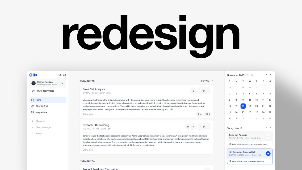
In this 2‑hour live redesign session, Charles Postiaux, founder and designer at Babbel Studio, selects a SaaS screen from mobbin.com and completely re‑imagines its UI using Figma. He begins by evaluating the original design’s branding and layout, then extracts SVG assets and imports icon sets (Cool Icons, Phosphor Icons). Using Figma’s auto‑layout, he builds floating panel cards, aligns them, and defines spacing, corner radius, and component hierarchy. He decides on typography scales, padding, and responsive sizing, and generates placeholder copy with an AI tool to populate cards. Throughout the process he iterates multiple design options, explains the rationale behind each choice, and documents the trade‑offs. He then crafts a color palette by adjusting opacity, creates light/dark variants, applies subtle drop‑shadows and outlines, and fine‑tunes visual balance. The video concludes with a polished, cohesive redesign, a brief reflection on his design thinking workflow, and a call‑to‑action for viewers.
Chapters
In this video, I'm going to find a random screen online and redesign it in less than an hour. And if you don't know who I am, my name is Charles Postiaux. I'm the founder and designer at Babbel Studio, where we redesign products for companies that are worth over $200 billion. All right, so I'm on mobbin.com. It's an amazing platform to find designs from actual products. This is pretty cool. It's from Haiti. And something I'm noticing here is it's a lot. Something I really like though is the branding and the aesthetic of it. Another one that could be interesting is Melio. This is lighter, right? Compared to the other one where it probably would be more of a redesign for like the navigation or the sidebar and kind of like polishing the UI. So that could be a, like a nice little redesign to work on. Other AI could be pretty nice as well to redesign. Like for example, on this screen, I think the feeling is that the product is cool, but it doesn't feel like a brand. Like you don't have that premiumness in the product. So for me, it would just be like tighten things up in terms of UI and branding aesthetic. We could go with this one. First step will be to just figure out what we want to do with this, with this design and how to actually redesign it. I'm wondering if there's a way to keep that floating kind of card style for the interface. There's a part of me that does not quite like having the ask or search here, especially since literally you have ask for anything at the bottom. Like, I think the search is still useful. I'm just wondering why it would be there. Like maybe we remove that and we have it here like search. And this way those elements here could probably live right there at the center maybe. I don't know if it could work if it's there. We could try. I don't like having this kind of chat messaging experience with the user icon. It creates kind of like an unevenness on the visual design. And so I'm wondering if we could put that inside of the frame. That could be one way. But the main goal really is to have this take the whole width. We can also hide that. This I would try to redesign. Same for the calendar. And then for the navigation, I think overall it's pretty nice. I don't really have anything else to say about the navigation. Let's try with the floating panels sections first and see if it works. I'm going to grab their logo as well. So the easiest way to do that is just Like you right-click on the page, inspect, then you try to highlight, to hover using this little thing, hover there until you get the SVG and then you can just copy and then it's cut off, but it's copy element, the first one. Yeah, we should have it. Then I use 2 library icons. I use Cool Icons for general icons and then for like specialized niched icon, I use Phosphor Icons. Then I need the bell. We don't really care so much about the colors right now. We just want to Have something that works like an architecture of the product. We can try 12 and 12. So the way I do it is because technically in the code, it's not just floating, it's probably like 2 cards next to each other. And so the way I usually like to do it is just having like one card being like this and then having another card for inviting teammates, and that should do the job. And then to keep things aligned, I keep that same size. Okay. I just remove the color and I can drop the icon and it's centered and everything stays nice and clean. And then with the frame in which both of those components are inside, I just Shift+A to create an auto layout and that's it. We can update the spacing and stuff later on as well. Actually, what I'm going to do right away is change this, remove that, change this to 0 corner radius, and then have a smaller one in there like that. Cool. So we have one right here and then the other one would be the channel. So I can try to do it now. We'll need to make a frame again like I did before, have it inside of it like this. And so now it should be aligned as well. Yeah, cool. We just don't really need this nor that. Cool. We have the icons and then at the bottom we have something like basic. Then I can have a frame. Put it all the way, and then we can add a rectangle, have the constraint to be top and bottom so it scales. If we increase it, it stays the same, it matches the height. And here we can have something like this. Oh, it's a lot smaller as well. We're going to do 4. Something like this is nice. Then we Shift+A for both of them, Align, 8. And then we have the second text. For now, we keep it basic, something simple. And that's it. We have the— This sidebar here. Now for this, I'm just going to come up with like a generic copy and then we can improve it as well. Is it 14 or is it 16? It's 14. 6, and then probably 16 and 24. I think that's it. How's the spacing here? Maybe 8 and then 12 with 24 of padding. How does it look? It looks pretty good. Now I'm asking the AI on a separate window to come up with like Copy placeholder copy that I can use for maybe 3, 4 cards so that we actually have something tangible to use. I don't know how we want to play this out, if we want this or not. Like this, that would be nice. And then we can reuse the text. It might actually be 18, but I'm not a big fan of it, so I will keep it at 16 and we can improve also the text on this. And then I wanted to add the buttons as well, so it's a good time to make the buttons, but I think it should pretty much look like this. Record. With this for the camera, I'm just going to make it a little bit smaller, put it at the bottom. That could be cool. Let's see where we are on this. I'm also wondering if we want to keep things like pretty heavy on the outline or not. Probably 1.5 would be better. Yeah, I think so. Maybe not this one because it's the CTA. Yeah. Oh, they have the search here. You see, I don't know if it's because this example is old. December. This is better, no? We can have it differently here. I agree with the website. How much is it? 24. And then we have the white like that. And then we can have like a nice little drop shadow like this. That could be cool. So I tried adding the copy that I asked the AI to come up with, and I think it looks great. And I was wondering, you know, like one option would be this, but the problem is that it's a little harder to read. The problem is that as soon as you start stacking users, then it doesn't look as, as good. And so my other idea was to put it on the other side. And you see, that's the process of iterating that I always do for projects. And I recommend anyone to do because it's super interesting again, to show the strategy of your design thinking and show the rationale behind it and why this option, why not that option. There are a couple of features that I didn't add, like the thumbnail and those like elements. So let me try with this, for example. I think it's pretty close to it. So what do we have? We have a number and then an icon, maybe like this. I think it's slightly too big. Like that could work, but basically you could have the same as they have. Use this here, this icon to make them float and ignore the layout that we have. And then we could even center it based on that like that. The other idea would be to also have a thumbnail here with the same size as this. So it won't be super, super big, but let's see. So I'm going to do maybe 12, make it look like a thumbnail, something like this. And then we can make a play icon like that. And then if there is someone else like here, then could be added here next to it. All right, so let me stack that up as well and keep using this moving forward. Now we have different ways of going about it. Like we could use the background as a panel, so it wouldn't be floating, the cards would be floating. So let me try to do a few more of those and see where we land. All right, so I came up with 4 of them, which I think is enough to like get the ball rolling on this and could look cool. Now something that we will have to add is this timeline. And I think what they do is, it's fine, it's good. So we could very well do that. Chevron, auto layout, center alignment, 8 of spacing. Then select both, auto layout, gap auto. And then I also want to have another one here. Auto layout this one so that we can maybe have some padding at the top. I might actually add more. Yeah, I like this one. This is probably a little bit too big though. Yeah, this feels better. Cool. And then the last one is just the calendar and then the upcoming meetings. I'm not sure how calendars work usually. We can check on Marvin. So let's look at the examples and see if there's anything that could maybe work. I like that structure of having the arrows instead of having the other months, but we still need that refresh. And today, I don't know if we need that. Let me copy this one and then we can improve it. We basically need a frame so that we can put the number in there. I think like this, it works great. Oh, and we need to center the alignment. Actually, we can just take those, auto layout to 8, and then we duplicate them. Then we can select all of the White background, remove, and only select the day. So this one, nice. 28, so it's the same height as this one. Move it down to 20, 1.5 of weight, and then have the chevron or arrows on the side. And actually reusing that would be good. We center it, 22, 1.5, then 1.5. Perfect. That maybe 8. Same for this, 8 is good. Then again, auto, and then layout again, 12. We probably will have to update those, increase the spacing on those. Fill content, and then 1.5. Could work, could work. So we have this and then we just need the details. Actually, what if I'm thinking for the card again, what if those were connected? How much is the— and then this 52. Oh yeah, I reduced the size on the— even with 8, that could work. Is it too crowded? I feel like this is lighter, but just, it's just a lot of space and this could maybe solve that. And then for the card, we could reuse that kind of component we had. Is it a share button? We could use that. We can add the AI icon I had here. The button is too big, but it feels a little weak like this. 1620. And here, maybe 1420. And then maybe the button for like recording and stuff could become the share. 36. Let's push that here. Just going to update this one to be maybe 9 as well. And then the other one, what if we do 20 for both? I think that's better. Technically, these are all past calls, right? That's why they're here, but can be something slightly different. I'd rather if I— something like this. And then we, each done meeting, join. And this one is 20, so we can make a square. Then just a little red dot here. And then we need this. Today, 18. Oh, now we have an inconsistency regarding the headlines. I would ideally like all of them to be the same, like this one, this one, and this one. Can we do it? Maybe. But we have all of them actually, so that's good. Oh yeah, and this one is the recording. Almost forgot that. This and then circle. Now, do we go with this one or this one? This feels a little more crowded, I would say, except if we were maybe to add a divider on all of them. I could see it. And then 24, we could add a bit more here. Hmm, that's actually not bad. And so again, typically in a project, that would be a new idea while I design and think about it, and then keep this as an option. So it's like option A, option B, and then option C. Which one do we want to go with? I think we go with the last one. The last one looks really clean and cool. So let me just add a spacing for that. 12. It feels a little big now. Like this is 20. Maybe we go with 18 on this. 18, 20, 28. Why not? I didn't add the— oh, there we go. Yeah, that feels better. We have the structure and everything. Now it's just adding some colors and polishing a little bit. I think we're in a pretty good spot. So once I have figured out this, I like to always, every time I have like a new idea, a new iteration, I like to copy the design, duplicate it, and start fresh on another version of it. But yeah, we need to add this frame here because that was the goal all along, is to, it was to have this symmetrical kind of 2 floating panels. How much is that? 20? Yeah. And then having the chat in the center. So we have the wireframe source. Now let's try to polish that and see how we can improve stuff. And the colors, I really like the, what was it, Hedy colors. Like it feels really grounded and similar to the website, I suppose. Like we could apply that same kind of color strategy to our design. So let's auto layout this. Let's add 24 of padding. Then all of those should probably Stick together. I'm not a big fan of the big channel like this because you see like it doesn't feel like general belongs to channels, but they still add like some spacing here. Yeah. What if we add the spacing? I don't know. I don't like it a lot. Maybe because it's in all caps. Okay, we have those so we can add maybe 20 and then auto for the basic stuff. Then do we go 20 or 12? Maybe 12 makes more sense just to get more real estate, especially on smaller screen. I don't like this. I don't know if it's— I don't know what it is. I just, it feels so weird. Actually, you know what we could do? We could just use the icon as a way to reflect what group it belongs to. And then direct messages would be another tag and then another tag for this. I think it's good like this. It's all right. Do we just keep it 12 or not? It feels too weird. Let's just keep it just for reference. Padding is slightly too much. Let's go with that. Let's apply that to here. 20, 20. We need to also do that top and bottom. Then 12. This one as well. And now we just need to keep the same width. We're going to do 392. Doesn't look super cool, but I do want it to be kind of centered. Can we expand that? And then we'll remove this one to be like 1, 2, 3, 4 lines max. I'm not a big fan of this. I think I like this, but I don't like this one. What would you do for this, by the way? 16. Actually, we can reuse that and that should probably be smaller like that. Maybe let's do 28. Oh, and this is 12. Should do 8. That's good. Okay, that's better. I want to try to think about the colors also. How do they do for this? They have the main one here. They also have the background of this. Is that it? This one. And then they probably have a third for like Outline. Yeah, something like that. Is there a way to translate that into their blue color? Blue color problem is it's very, very strong, but there's maybe a way to find a dark blue maybe. This is too strong. This is not strong enough. Could be. Okay, let's try and we see where we land on that. I feel like this is so weird now because it's super wide. The problem is that if it's not wide enough, like 324, then it still works, but it just feels off. Maybe not. I'm going to use the drop shadows for those. Then we can check the colors. Blue, then the light one would be probably this. The darker would be this. EF2. I feel like C and E are same on this. And then E would probably be that one. F2, this one. This is not quite right. Why is there so many colors? You see, it looks too much. So then this one becomes the second one. We're gonna go with this for now. Nice, like this. The play button could be that. The divider, this one. Hmm, maybe we don't need the floating sections in the end. And this probably we can do again. That could be an option as well. I think the problem is that this color is just too much. Yeah, probably like this. What is it? Yeah. Why is it so imbalanced? It looks imbalanced. I'm not even sure if we need this. I think we keep this. That's better. And then for this, for the other one, we can do the exact same thing. That, and instead we have the recording symbol. We don't have join meeting, but I don't know if we need it. Oh, we could also maybe add this to the title. Ooh, actually that's, that's probably even better to make it stand out without being too overkill. Yeah, that's, that's really cool. Oh yeah, we need the deselected as well. We just flip the colors pretty much. And if we use the color that's below it to reduce a little bit the weight of it, maybe this. I mean, this one we keep it the same because these are pretty important. These are secondary but still important to have. But if everything is important, then nothing really is important. So it's good to have that visual balance. Maybe we can have a little divider like this one here, there. And then we can have that 20 like this. We could also add the chevron again. To show, okay, this is what's today and then this is what's coming up tomorrow. That could be a nice little addition to it. So it becomes a bit more powerful and predictable. These ones we can, we need to change the color to be less important. Something like this, maybe improve this. Okay, cool. We have all of that. I'm wondering actually if we could reuse that same strategy as here. Yeah, it looks better. And we can reduce that to, or maybe even 0. That's too tight. 2 is good. It looks a little colorless or lifeless, so we might need to add some of that bright blue that they have to improve it. I'm going to— I'm running out of space again, so I'm going to just go down there and bring my color palette with me. So we have a few options here: record, import, and then I need the— I need this as well. Okay, so they're normal and this is the highlight one. Yeah, we're gonna highlight like they, they do. Not this one. And then use that blue color. Oh no. I like that. Then this could also be for the outline and for this. So the easiest way to create a color palette is just to take your color and then you, on a white background, it's important if you do dark mode on a dark background, and just remove the, reduce the opacity. So like we could do 4% maybe, or maybe that's not enough, maybe 12. Maybe that's too much, maybe 8. And then once we have that, it's still not good yet because it's going to, as soon as you put it on top of like another color, the color's going to change because of opacity. And so then we just make another rectangle, select eye, and then we're going to select a color and it's going to be a filled color this time. So it's all good. And then we can pick that up, maybe like this. Oh, then we need more. So then we have 8, maybe 20. Maybe 20 is too much. Just want to check. Oh, that's good. That's good. We can even add a little drop shadow. I keep, I want the drop shadow. Change the color, very subtle, but it's here. Record. We can remove This, add a drop shadow, maybe add like a subtle outline. This one, like this. Let's stick those together. That could be one way. And actually we could maybe use that for the selected state on this. Yeah, that's cool. Let's try. Ah, that's too much. Let's keep it like this. But I'm still not a big fan of this one. I don't know if it's just because it's too big and I've been relying on that same assumption for all this time. So what we could do. We need to change the height and spacing of stuff. Let's try 36 for now. This is probably too visible for like an empty state. Reduce it down. Maybe 16 would be good. And I don't know if we could maybe have like a rectangle right below it to make it easier to read or to see the search bar like this. We could also probably improve a bit the drop shadow. I'm wondering if the buttons could stand next to it. 105, that would be better. Yeah, this nice. 5, 8. Content already looking really cool. Does it feel too small compared to the rest? Like how much is that? 48. That's 52. That's good. What if we remove this? I think that's better. The 14 or maybe 16 would be better. I think it's less visible, noticeable, but it's still really, really slick and we can Make it a bit higher, but I'm not a big fan of it. We can remove all of that and then maybe have like a, maybe inner shadow, maybe something like this. That's too small. We need to keep it fixed. Then remove this, remove this. 24, 1.5. I'm not a big fan of this. Something we can do is instead add a plus so that it creates like a little menu. That could be fun. Maybe not this unnoticeable, maybe this one, 1.5. Then we change that to 8. We can reduce that a little bit more. Honestly, it's not bad. I, I don't dislike it. We can even add a layer blur that's progressive. The 2 together could work, something like that. It's a little bit less UX focused than this one, but I do like the clean, simple interface and experience and design on this. Or maybe actually, maybe that's the problem. Is it the reason? I think it is the reason. Yeah, that was a problem for sure. And this is the redesign I came up with today on the video, and this is what they have right now. Thank you so much for watching. I really hope you like this video. Make sure to leave a like and subscribe, and I see you for the next one. Bye.