Watch Me Fix A SaaS Website In 8 Minutes
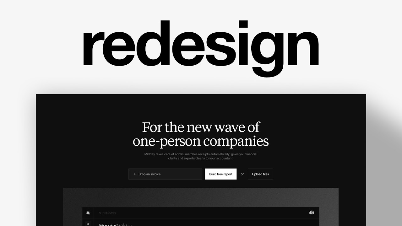
Charles Postiaux critiques Midday's hero section and proposes replacing it with an invoice-upload tool that instantly shows a dashboard preview. He references Opus Clips and Lovable as models, arguing a single interactive hero action can boost sign-ups and activation.
Chapters
This is Midday. It's a B2B platform that takes care of the admin and finances for solo consultants and freelancers. They've been in business for about 2 years. The problem with most SaaS companies is that they're highly dependent on having an optimized onboarding flow, and it all starts with their hero section. If their hero section does not work, the business could basically die overnight. I'm Charles Postiaux, founder of Baboon.studio, a product design studio that helps businesses scale by making their product stand out. Stand out in crowded markets. So let's review Midday's hero section and see how we can improve it. So this is currently the website. I know that they keep working on it and refining it simply because throughout the past couple of days I've been able to see variations in the hero section. So that's already a great thing that they're doing. And right away I think their website looks really clean and cool. They have some clear feature explanations and visuals, which I think always works great. They're clearing the benefits and the features of the product. It's very simple, straightforward, clear pricing as well. So they're doing a lot of things right. Now I want to specifically focus on the hero section and figure out a way to make it more actionable. And I have 2 references that I really like for making actionable hero sections. The first one is Opus Clips and the second one is Lovable. They are very different in the market and product that they have and also in the way that they create this actionable hero section. For example, Opus Clip, it's all about uploading or dropping a video link so that you can get clips out of it. And the visuals supporting the hero sections, as you can see at the bottom here, they help help reemphasize that and show what you can get out of it. For Lovable, it's super simple. You just basically get an input prompt bar where you can write whatever you want to build an app or a website with Lovable. And both options are pretty much helping users build momentum. I think that they're doing something really good here. And so that's what I would like to have for Midday. And as you can see, I have pretty much 3 variations of the hero section. So you can see that they are actively working and iterating on identifying that right kind of mix and balance in terms of copying layout and how to make it actionable for people. And so I think that could be valuable for the product if you can figure out something that is nice. So my focus here is first of all to identify that one key action that users can take on the hero section that would make all of their life with the product better, that would make the rest of the onboarding flow more enjoyable for them. Now, what's already a good sign with the hero section is that they've been iterating on it and refining it. For as long as the product has been out. My strategy to make a hero section more actionable, which will in return get more people to create an account, convert, activate, and even refer other people they know. And so to do that, I have 2 examples here. I have Opus Clip and then Lovable. They make the hero section actionable, simple to understand, and easy to do. For Opus Clip, all you have to do is drop a video link or upload a file and you're going to get free clips out of it. And for Lovable, just type something and you're going to create an app or a website. Very high upsides and you in return have to do very little to get it. I also really like, and I think that could maybe work for Midday, is to have this little gallery of visuals and videos. These are all videos, by the way, and having those little chips here, tags that you can go through to see all the features. When you look at the website, I can imagine having something like this be, for example, at the top here or underneath, and you can get these visuals. I think it would be fairly easy to connect the dots. To say assistant would be this visual here. Inside could be whatever the right visual is. And this way people would really understand the power of the product and how cool it is. By the way, I really like this dashboard design. I think it looks amazing. It's clean, it's modern. Now it already creates that powerful and technical impression for people. It seems at the same time complex and easy to get. And I think that has a lot of potential. I'm going to just make a frame. 1920 by 1200. I'm going to take their background here. Now I don't have exactly the font that they use, so I'm going to just use one, like random one that looks kind of similar. Now we have kind of like the overall copy and structure of what they have on the website. So how do we work from here? The first step is to figure out that one key action. And looking at the website, we need to find something that takes only one step that gets people a ton of value out of it, and that is not too sensitive to share. So for example, when you look at transactions, probably you need to connect to your bank accounts. That might be a little too difficult, high friction for people. Invoices could be interesting. I think it's not so much about creating invoices, it's more about uploading an invoice and being able to see it with the data, with the dates and the table being built for you. And so that could be a really interesting one to have. Reconciliation, uploading PDFs or connecting an inbox could also be good, especially if on the onboarding flow they are able to also connect their account. That's more like an extra layer on top of it that you can get afterwards, but not for that core action. Category expenses and being able to explain changes in cash and everything could be really cool. You could, for example, upload your last year's results and just upload that one document inside of the product. That can be pretty high demand in terms of building the trust with the new users. I think for me, invoices and being able to see an invoice that you've sent, just uploading it, It's very low friction, something that everybody has on their computer that wants to use this product. It's still sensitive, but it's something that I think most people would be willing to share to some extent to understand and see the product in action. So I think we could go with that. So we want to make it actionable, similar to what they have here. I think this is a first thought. It's a concept. There is nothing that I'm saying that is, that can be right or true. I'm just giving one extra option for the team to find a way to improve their onboarding flow. Now we want to make something that's relatively big so people can easily drop it. Or we could say build free report. We could have something like this where you can easily drop an invoice, you can get the free report, or you can upload the files directly. I would even add a little plus icon to make it really clear. And then right below it, I would either have something like this or we could reuse what they have. Then we can add again this. Then we can tighten things up here so we still see a lot of the dashboard would also be, we're also able to get the direct connection between what you're required to do and what you can get out of it. And I would probably also change the copy, but I'm not quite sure what to have, like something maybe actionable related to the task you're asking them to do. And here I would maybe emphasize a bit more like, again, what maybe this very simple copy or something a bit more detailed, like what they're doing. And yeah, I think that's probably how I would do it. Now I can only go so far. I don't have all the assets and I don't exactly know what their entire like onboarding strategy and their goal is. It's pretty big and large. You can understand what it means. I would probably try to figure out something as well with the copy. I'm not exactly sure how to frame it, but probably related to what you can get out of it. But then you would have a really clear connection between the copy that you read, the headline, very visible, you understand what it is. Then you get directly the action that is required to unlock what's being written at the top. And then right below it, you see the visual outcome. You see the process of you upload an invoice, for example, And you get that free dashboard, beautiful dashboard with all of the data information that you get. And so people are going to be much more willing to do a little bit of work, upload the document, upload an invoice, and it's going to help them go through, I hope, a relatively simple onboarding flow. And then as soon as they land on the product, they get that visual, they get that reward of the invoice becoming that table, becoming that preview of everything that they know. And obviously because they know what the invoice is, They can compare and see how good the platform and even the AI to some extent is. And then it's going to build more trust. That's going to reinforce that they've done the right thing here and it will help them upload a lot more, share the bank account, connect other tools, and ultimately refer other people. And even you can upsell them and they can subscribe for a whole year. That's the end of the video. Thank you so much for watching. Make sure to leave a like and subscribe. Also, YouTube thinks you'll like this next video, so if you have not watched it already, go have a look. Bye! Bye!










