Watch Me Fix A SaaS Website In 20 Minutes
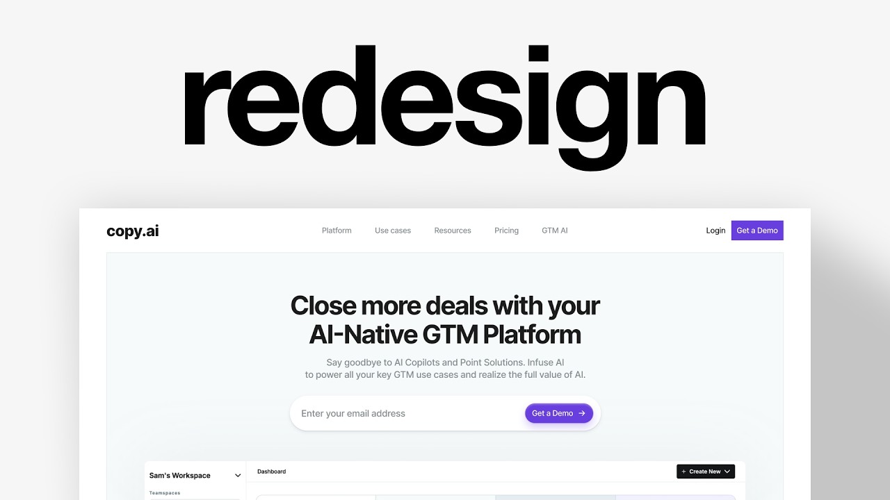
Charles Postiaux audits CopyAI's onboarding and hero section, finding the hero cluttered with too much copy and unclear CTAs. He shows redesigns with clearer headlines, product previews, and single focused actions, then walks through onboarding improvements like progress indicators and consistent branding details.
Chapters
This is CopyAI. It's a startup offering AI-powered B2B copywriting tools. They've been in business for about 6 years now, and the problem I noticed is their onboarding flow. SaaS companies are highly dependent on having an optimized onboarding flow, and if it doesn't work, it'll be difficult to scale and stay at the top of the market. I'm Charles Postiaux, founder of Bubblein.studio. It's a product design studio that helps businesses scale by making their products stand out in crowded markets. So let's review CopyAI's onboarding flow and see how we can improve it. So I'm on Figma. I've got all of their onboarding flow screens here, and there are a few things that I think we could work on and improve. First of all, I think for the hero section, it's extremely important to have a well-optimized and attractive, interesting hero section. The first thing I'm noticing is that there are a lot of text, a lot of copy everywhere, and visuals and things to focus on. People will have to read from left to right, probably, then go down here and then go down there. That's a lot of elements. Something else I'm not a big fan of is this kind of visual representation. It really feels like almost like a Google slide deck presentation or visual. I do like their explanation here, the visual to showcase what it means to use the AI tool and how it can help you get more deals at the end of the day. But it feels a little hard to get. The lines are also a little blurry, which I'm not a big fan of. And most importantly, their get a demo. Is all the way down on like the right side of the screen. It's not easy to understand exactly. Like for people, I think coming there is, it's not the first thing that they notice. It's also not aligned. I don't know how they thought about this kind of visual, like hero section alignment, but it feels a little unoptimized. The thing I really like though is what's at the bottom here with all the logos and the social proof. I think that's really, really good to have that very simple, clean, easy to understand. navigation. The colors are also good. I do like this kind of aspect of having like this, this card or this frame here. I feel like it recenters the focus on this, on like the headline here. You probably will read this first and then you will probably read that and then see this and the visual as well. And so it's not a bad hero section. I just think that maybe we could try to figure out some different directions that could help them get more people through the door because ultimately the hero section is that first, is like the top of the funnel. It's the first door people will have to go through in order to try the product. Here it's a demo, so it's a little bit different, but I think they also have maybe like a signup screen. I'm not exactly sure because it doesn't look like they have anything here, or maybe they have it hidden and they probably want you to do a demo because from what I'm seeing on the rest of the product, they don't want you to use it until you've paid a subscription. And so that might be a blocker anyway, but I still believe that we could make some meaningful changes on this hero section. So I've got a few different design directions here that I think could be interesting to have and that Could match well with what they have. One of the things that I am not a big fan of is I have no idea visually what to expect after I add my email and want to get a demo. I don't know what to expect afterwards. Usually the reason I think most products share their dashboard is because it shares the dream state of people, what they want to have in the future with the product. It builds some motivation and inspiration for people to actually try it, get onboarded, share their email address and all of that. So that can be a really strong asset to have. If they don't want to share that, which is understandable as well, we could do something like Maze where it's mostly just little visuals and cards. You see some like features of the product. And I think that could also work well if you don't want to share the whole product with people. Could just be like some little cards or features of the product that they have. And that would work really well. Real quick, if you're a B2B SaaS founder or a product leader, you're watching this video thinking our product doesn't look or feel as good as it should be. This is literally what I do. I run a product audit where I go through onboarding, product, key screens and flows. And then give you a list of changes to increase product quality, conversion rates, and pricing power. I only take a few of these a month. If you want one, click the link at the top of the description and you will see all the details and a place to book. Back to the video. Another way that could be interesting, I think, is kind of like Shop. It's a little different, obviously. It's a really different industry as well. But I think maybe like that core, like CTA or enter your email address and get a demo, like that could be at the core here with like their logo here. And then all around we could have some like floating features. All around here, similar to what Maze has. And so in that sense, that could also be really, really cool to have. I don't have like design elements that I could use to make them float around for this product specifically, but if they're watching this, that's a— that could be like a really cool, interesting idea to have. Another thing that could work, and the reason I'm saying that is because they already work with this kind of like different layout, almost of a grid system here. Like they have multiple columns with different text around, and so maybe dividing the the space in 2. Like you have, you have a section here and then you have another section here. And so doing that could also help better structure the hero section, help people better scan what it is about and what they can get out of it. It's kind of like Sana also. The only difference is that this is mostly the signup screen. They don't have this on their hero section, but they still work in that same way with dividing the screen into 2. And that could also work. I think that that's a really nice one. Or ultimately, like the classic one I would say is just having a nice little headline here. The CTA is here, maybe some extra features that could be interesting or relevant for people like the core actions. Usually users, when they use a product, it's only for one or two things they want to achieve with it. And so you need to figure out what these represent and showcase them in the hero section. Ultimately, the best possible hero section is the one that's actionable. You give a little glimpse of what the product is about and it's going to help motivate people to actually want to use it and even increase conversion rates, which is really important for CopyAI because they don't have a free trial. The only problem here is if we put the screen showcase so high, we are not going to have this like trust signal section here, which I think is a really bad play. And I would probably try to have it here, even if it means lowering down the dashboard. I think it's still super valuable to have that showing what people can expect after they go through the demo, after they go through a signup is super, super important. 2 examples that I always share with people when I want to explain what an actionable hero section is, I give them the Opus Clip hero section right here and also the Lovable hero section. They're both super focused on how do we get people to actually use and interact with the product before they've even created an account and sign up. And so here for Lovable is just write something, create a web app, create a website, like just write something and it's going to work for you. And that's going to trigger then a way to create your account. And people will have a mission and they will have a goal that once I go through that boring and difficult phase, which I I think Lovable does a really good onboarding flow and I have a video about it. But once you go through that very boring onboarding flow, you get a lot of upsides. Same thing with Opus Clip. You can see that their hero section is made all for dropping a video link, dropping a file and getting clips out of it. And not only do they show this, they also show the state, the dream state, what's going to happen next. As soon as you drop a video, as soon as you share a video with them, you're going to unlock clips. And then from clips, you also see that here you get a ton of features out of it. And that's kind of like emphasizing the whole process. You know exactly what you need to do, what's going to happen next, and what you're going to get out of it. That's the best possible outcome and best possible hero section in my opinion. So if we could do that with this one, that could be super good. They kind of explain it like it's not, they're not doing it badly in that sense because they already show like you can create content, it's going to help with a pipeline, it's going to help execute better campaigns. And then at the end of the day, you're going to get better deals and a lot more of them. So it's not bad, it's just, I don't know how does it work. It's nice shown like this, but how does it actually work with the product? And I'm probably not going to read all of this. It's a lot of text, little text. And so most people are not going to scan it, maybe on like a 3rd visit, 4th visit, but not on the 1st visit. So we could try, I'm going to create a frame, 1920 by 1200. I'm going to reuse exactly what they have. So we just have a reference that I think would be good. Again, I don't really want to modify too much. I think the best way to A/B test on products, on features, on hero sections and websites is just to have a tiny little difference. I mean tiny, like this is the whole hero section, right? But it's just about having an element that can be easily compared with the current state of the product or the feature or the hero section. All right, so I have somewhat similar hero section layout as what they have. It's a little different. I'm just doing it on the go, but I think We have some potential here to make something that could be really cool. So something I always like to do when it comes to the headline is to talk about their, the end goal, like what do they want to achieve? And maybe here based on like their graphics to close more deals. So for example, we could say close more deals with your AI native GTM platform. Then I could reuse some of what they wrote on the description, something short and sweet. I've reused a little bit of what they wrote here and also a little bit of what they wrote there. And this way we get a balanced kind of copy. For the hero section, then we try to center it. Can maybe improve a little bit the typography on here like that. Then we could make something pretty fun here to reuse some of what I liked about shop. Also want to change real quick the gray so it looks a little bit more bluish. And even I think the purple, we could try to make it blue as well. Or maybe we keep everything like this. Then we can create auto layouts. Something like this would be super cool. It's clean, simple to scan, easy to understand. We can improve a little bit the spacing as well, and we could put it right here. And then I have their product screen as well. So we could even drop it within the hero section to create that sense of, I don't know how much space they use here, 150. So we still have a little bit of space. We could do 148. Nice. And so here it feels a lot more like a dream state where you see the product, you get clean, simple explanation of what the product is about, what you can unlock from it, and also a nice easy way to make it actionable. Like what do I have to do to unlock it? Something like this would look really cool, I think, for the product. And you see, once you have that baseline, you could always iterate and think about, okay, maybe we could do actually this one here. And so we can split it in 2. For this one, we remove the background and the color. We can remove the copy here. We can have the visual here, or you can even take the whole space, but maybe control like this. For this one, we have to push everything to the side, and this could actually have this color instead. We could even do 3 lines on this one. We can center it and we could have something like this as well. There's so many different ways to go about it. And it's a good opportunity once you have that strong, solid aesthetic and baseline, you can iterate a ton on that. And then here, even here, you could add some like features ideas here, like some outcomes, some even showcase what they have here. Like all of this could be done here as like a little checklist or process breakdown. I think that would look super cool. And here obviously you would still have the logos. That would be awesome. And then you realize, okay, maybe actually we could still keep that kind of aesthetic of the grid system. So then you would still need to reuse that here. We could remove the one on the right and then we could recenter all of that. And that would still work again, another variation of it, right? Like it's endless once you have that direction and that idea. And so it's all about creating something meaningful and that is actionable, that is impactful, that shows people what they can expect after doing something, after doing the hard thing of creating an account. Even if it's not hard, it's just every time you want to use a new product, you have to create an account. And so how do we make people want to create their account? How do we make them hyped about it? And so yeah, that's, I think that could be a really nice little iteration on that. Now moving on to the onboarding flow itself. I think they're doing a good job. I think it's pretty clean. It's simple. I would maybe try to remove this outline. I feel like we're losing a little bit of that aesthetic. It feels very restrictive, but I do like the fact that there is no way to go back. I think that's great. There's still the logo to create trust and continuity in the experience. You know that we're still in the same product. If we had a little bit more of that branding and aesthetic, I think we could be even better. Same thing for the signup. I would probably try to show email first. I would even go with just having email for both signing and signup. And then depending on if you have an account or not, if you don't have an account, you would be triggered to enter your first name and last name. They would show up afterwards. Or if you have one, you just Put your password and get going, or continue with Google and Microsoft. I think that's perfect. Two options is nice, simple, easy to understand. Then this is nice and simple as well. I would again probably remove again that card here, and I would also prompt them. Like for example, if they sign up with Gmail, then I would have a little like open your Gmail inbox, something like that. Because if you don't have it, then people will have to open a new tab. They will have to go into their inbox, find the email, wait for it. But here, if you just prompt them with the button here, I think that just A nice little gesture and people will appreciate it. And then here, I think this is a little bit too much. Like there's too many things that personally feel like I'm a little bit more worried or I'm losing some of that trust that they've built with me in the beginning. First of all, like again, the difference, look at the difference between the two. Here you have the logo and a white background and here you have a kind of a greenish background and then you have text instead of the logo. Same thing, the buttons, look at the buttons here. This one is filled color and it's purple and then you go here, And suddenly it's green. And I mean, not filled because it's, you have not selected anything, but suddenly the color theme is green. You still have that green here, but you have so much purple everywhere. Like why make this the change? I think you lose people. And again, like you can see on the product, they still use some of that purple. They use some of that green, kind of bluish green color. That's completely fine. But just like you switch from what they had one screen ago, like literally 20 seconds ago. Into another experience and design, that's going to shatter a little bit the trust that they've built with you. So I found some nice little references that I think work really well. Going with the example of removing the outline, I think that a great example, Manners, they do a really good job on this. And continuing, you don't have sign in, sign up, you just continue and depending on if you're registered or not, it's going to unlock a different path in the experience. That's super clean. This one from Visitors. You have this nice little progress indicator right there. It's just one question at a time. Very simple and easy to go through. This one from Linq was actually really nice because what they do in their flow is they first show you this one here. They prompt you with the email, and then once you've entered it, these 2 little fields here show up for you to add more things. I think that's a great experience and great way to unveil extra steps in the process, but make it light and easy. And this one from Brilliant, it's just very clean and simple. I really like it. So we don't have to do anything crazy. We could reuse what they have. We could reuse literally the background from here. Then we could reuse the logo as well. Then we could explain what's going on. Sign in or sign up. We could reuse again the colors that they have on their product. We could go with maybe 520. Now, depending on what you prefer the user to do, it could change, right? Like if you— if people sign up more with their email address, then you show it first. If people use Google and Microsoft first, like more than the email, then you show that first. And so you decide if you want to switch what's showing up first. Like these are like micro details, right? But that's how you make a really good onboarding flow and ultimately a really good product. Every detail has to be strategic. It should not just be because you saw it on another platform that you're doing it as well. It should have some rationale behind it. And so if you have a higher chance of getting people to join the product and use it and to activate with Google and Microsoft, then show that first. So we have that and we could have something very simple like this. I think that works. This one, we could keep it like this, or we could have maybe like not, maybe not this one. So it's, this is a little too invisible, but that could still work. Or we can just increase the logo. But this way you, you get a little bit more of that connection. And to some extent we can even push to have something like we have here. If the rounded, like I use this because you can see on what they have, it's pretty sharp, like sharp edges here, it's sharp as well here. Sharp for the whole outline. Only this button here, for some reason, is with rounded corners a little bit. But you can see that that would be really, really nice to have that as well, that rounded aesthetic. I would probably push to have slightly bigger paddings. And so you see, you just do a little bit of changes here and there, and that already feels a lot better in terms of continuity, branding, and you feel like you're still on the platform. I would still move it a little bit higher because the logo and title here takes a lot of space and doesn't feel like the What you need to use is in the center. And then moving into this little bit here, I think we can still keep that same aesthetic and branding that they've always had. And we, I'd probably, to be honest with you, I don't think we need that. I think all we need is the logo, a little progress indicator like we saw, and then we need the question. And even this, well, I don't know why it's like 2 rows where it's like a grid instead of having 4 options just be next to each other. Like, there is space, so I'm not sure why they wouldn't do it. My rational reason behind it is because they have a card for it, and so they have to take a lot of extra padding for no clear reason. And so then you have to justify it in a way where it doesn't really feel that way. Like, maybe it feels too tight if you have 4 options on like one row. Another thing I would actually remove is this little selector. Like, I would remove all of those, and this way I would remove also continue. You know how many marketers are in your company. If you don't know, then that's okay. But the way they frame it is usually you have a small team or it's you, or you have too many people to know exactly. And you'd say 10+, right? You don't need to think so much about it that you have to click on this and then click on continue. So what we're going to do here is just have those frames aligned on one row. And once you click on it, it confirms it. This way we speed up the process. We don't have to do 2 clicks to actually move on to the next step. It's a boring moment in every onboarding flow of the product. Let's just get rid of what doesn't matter. So to do that, we're going to reuse what I already did. Here we can add the question and then work on the card. We could also expand the cards here. We could even put that at the top, put it there, and then we could have a little progress indicator at the bottom. And we could maybe reuse the purple color like this. We stay branded and keep things organized. We push that a little bit upper so that the cards feel like they're centered and not down. Actually, maybe just one is enough, right? We could do something as simple as that. Another way we could do it is with icons. And this way it feels so much lighter, simpler, even enjoyable to some extent, because all you have to do is click on one, then move on to the next question. You see that there are only 4 questions, and if this one is so easy, then the rest is going to be a walk in the park. And that's it. And so you compare it to what they have right now. Like, let's just compare the design that we've made. You get to the hero section. You either have this option here or that one, and then you can refine, add more stuff to it, but it's very on brand. You see the product. Ideally there is a little more than an empty state, but you see the product and how it looks like. You're hyped about it. You have the dream state, you know what you want. Ideally we also make this kind of hero section more actionable. Like, I don't know, like write a prompt, write something, create a workflow that you would like to have, connect your tools, something easy for people to do, something simple. One action and they get a big return out of it. Then it prompts you to create an account. You can just enter your email address or continue with Google or Microsoft. Signing in and sign up automatically done for you. And then you can get the onboarding flow after you've confirmed your email address and you come back to it. Very simple. One question. Click on one of those options, one of the 4 options. It's visually easy to understand. You just click on one, move on to the next question, and once you're done, you get into the product and you can see that. There is a lot more continuity, branding, and a feeling of safety just because everything is crafted around the brand and around making the experience as simple and easy as possible. Thank you so much for watching this video. Make sure to leave a like and subscribe, and I'll see you for next one. Bye. Bye.