Watch This Video To Design Onboarding Flows Like Lovable (Thank Me Later)
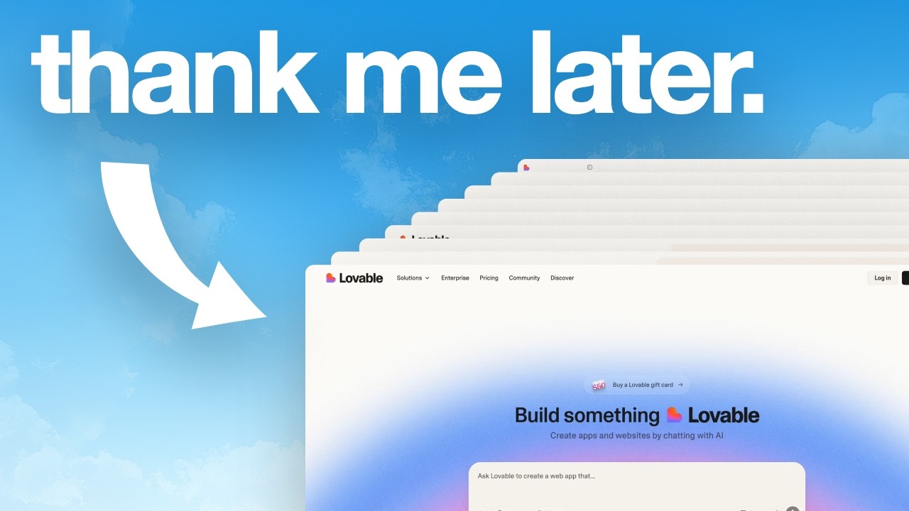
In this video Charles Postiaux dissects Lovable’s onboarding experience to reveal why the AI‑powered low‑code platform has scaled to $200 M ARR and attracted $330 M of funding. He walks through every stage—from the website’s hero section to the final product dashboard—highlighting concrete design choices that lower friction, reinforce brand continuity, and build user goodwill. Key observations include: the hero section presents a single, actionable promise that instantly tells visitors what they can achieve; the signup screen limits options to Google, GitHub, or email and hides the password field until an email is entered, reducing perceived effort; dynamic copy tailors the message to multiple personas; the email verification step proactively offers direct inbox access based on the entered address; onboarding forms are broken into ultra‑simple, single‑field steps with consistent colors and layout, creating a sense of progress and safety; the product UI mirrors the hero’s visual language, delivering on the promised outcome and reinforcing the reward loop. Postiaux concludes with actionable recommendations for any product: keep hero messaging focused, keep signup screens minimal, use progressive disclosure, maintain visual continuity, break forms into bite‑size steps, and leverage the goodwill generated by a smooth flow to encourage upgrades and sharing.
Chapters
In this video, I'm going to break down Lovable's onboarding flow to analyze what they're doing to get millions of users so that you can do the same for your product. And if you don't know Lovable, they are an AI-powered low-code platform to create apps and websites through chat. They reached $200 million in annual recurring revenue in November 2025. They've also raised $330 million in December 2025, reaching over $6.6 billion. So they must be doing something right with their onboarding flow. And that's exactly what we're going to find out right now. All right. So every onboarding flow starts with the hero section. And I think they're doing an amazing job with the hero section because they make something very actionable. It's easy to know what it is about. It's easy to know what to do. It makes people invested in the product even before they get started and create an account, but it also boosts activation and retention because the whole interface, as soon as they land on the website, is made For them to get started with that. Like most products, they always have this hero section and then a call to action, get started, enter your email address. It's not super enticing. It's not super inspiring for a new user to actually use the product because they don't know what's going to happen next. They don't know what to expect with the product. And most of the time you go through a very difficult and long, boring onboarding flow. And so the lesson on this page here, this screen is that users mostly use your product for one or 2 things. So figure out what the main action is for your users and make it your hero section on your website. This way people are going to understand what the product is about. They're going to get invested and build momentum because they want to get started as soon as possible and they can see it right away on the website without having to create an account or pay anything. And that's going to help you build momentum to push them through the onboarding flow. And speaking of onboarding flow, Let's look at the onboarding itself. Once you click on get started, it's a super simple and easy layout for people to digest and understand. A lot of onboarding flows, what they do is they overcrowd the screen. They put logos, they put testimonials, they put checklists of features. That's not the place to do that. The place to do that is the website where they came from. And that's probably why they're on this screen to create an account. What we want with a create account screen and a signup screen in general, is simplicity and a focus on actually creating the account, whether it's continuing with what they have, Google, GitHub, or entering your email. You want the next step to be super clear and remove everything else that is not that. As you can see, they have only 3 actions pretty much when it comes to creating the account. Google and GitHub, you need to know your users to define those. For example, GitHub is probably because they have a lot of engineers and tech-savvy people who have already a GitHub account and are active with And so it's a frictionless option for most users, probably. When you look at the right side of the screen, I'm not usually a big fan of animation and movement and a lot of like visuals, but they're doing something really nice here where they basically have the end of the sentence change. And that is going to help match multiple personas so that they can find something relevant for everyone. If you want to build a SaaS, that's it. If you want to build your portfolio, that's it. That's it. Every single persona can get identified through this. And that's a very light, easy way to show the end goal for users ready to create their account. It reminds them of what they can achieve by going through that flow. Another thing that's really interesting with their flow, and especially the email password experience, is that, as you can see, the email unlocks the password. You don't see the password field until you've entered your email. And so that is a really easy way to lower friction for people to actually enter their email address and continue through the onboarding flow. Because if you have to add email and password, and then obviously with password comes some constraints, then it will overwhelm the users. Obviously it's not a big thing, but it can still have an impact on your numbers. At the end of the day, it's still the top of the funnel. And so optimizing these little metrics here and there can really have a big effect on the whole product. Another benefit that I'm noticing here is that As you can see, as soon as you enter your email, it kind of like becomes unselectable. It locks the email. That, in my opinion, is a really interesting thing to do that I don't see a lot of companies do it this way. Other companies or onboarding flows, they can have like this 2-step process. Here it's mostly like a feeling of progress, of commitment. You're already one step done and you just have to enter the password to create the account and get started with this. It doesn't feel quite the same. Where here it's you're locked in, you have the email selected, it's done, it's ready. Just one more thing to do, and you're good to go. Something else that's really interesting is as soon as you've entered your password with the right requirements, this list disappears, and that again helps with the feeling of accomplishment. But it also reduces the amount of information that you can see, and it makes the next step super clear. It's just to create your account. The lesson here for your product is that you would probably stick to 2 or 3 ways to create an account. 2 quick account creation like Google and GitHub, and then have the email text field visible without the password. And that's also a reminder that don't overcrowd your signup screen with too much information and too many things to focus on at the same time. Make sure to keep their goal in sight and remind them why they're signing up, why they are doing this boring task of creating an account again, because they've probably done it 100 times on different products. Now that's the next step that I think is interesting to note. It's more like a bonus step in a way. I think it's an interesting interaction that I don't see everywhere. I think most companies, they just state the fact of check your inbox. We've sent you a link to confirm or verify your account setup. What they do here is based on the email type that you've entered. They're going to offer you a way to access your inbox. They help you already achieve 50% of the efforts needed to activate the account. There are probably some drop-offs at this point where people just, they don't check their inbox, they don't care, or they're just like, maybe later I will do it. And that creates friction and that creates some drop-offs very early on in the onboarding flow. And so being proactive with that, making people's life easier is always a win-win for everybody. All right. Now they've created the account officially. They've entered their email, the password. They've confirmed the account. Now they're getting into the actual onboarding form. And I think for this experience, they're doing many things right. First of all, they keep the same kind of clean, simple layout. They also keep the same colors for continuity. So you always know that you're in the right place. You know, like for users, every single little detail can be a clue as to whether they trust or not. The product that they're onboarding on. It's a tiny detail, but it can create some confusion for a few users. Apply that to millions and millions of new users signing up, a lot of them might drop out or not convert or not activate. Having that continuity, basically staying consistent with the brand and with the visual and the layout helps people stick to the onboarding flow. It creates a sense of safety and a sense of familiarity with the product right away. And on top of that, if you have a unique brand, It helps people remember it and recall it much faster than an average kind of run-of-the-mill brand. It happens as well in terms of UX and even UI to some extent where you can see the navigation. There are only 3 pages and already in this one you have 2 things to fill out or confirm. The first one is your name and the second one is the theme. The theme is already selected, so you only have one task to do just to enter your name. Extremely simple. Like you cannot do simpler than that. Basically it's the simplest thing you can do. That sets the foundation for what's coming up next. You can expect the rest to be as simple and as light as this screen. And so that creates a lot of peace for people. They don't have to, again, go through boring forms to fill out over and over again. And so they're thinking, if this step 1 is so easy to do, the rest is just going to be a breeze. And you can see that that creates such a relief for people. But not only that, they've probably already signed up to so many different products being extremely difficult to use and sign up and onboard that this creates some goodwill. That's something that I don't see a lot of people talk about with online flows is that you build up goodwill when you do something right and easy for people. If you have an onboarding that's basic, that's boring, that's like everybody else, there's no goodwill that's being built. There is resentment for sure. It's like, You're making me work so hard for this, the product better be good. Here it's completely different. You feel grateful that they've taken the time to actually do something right. It makes you happy to use it and spend time understanding what it is about because they've been nice to you. Now for the second and third steps, again, super simple and clean. They have very consistent visual and design so people can have the same behavior. They understand it once and it's really being reapplied. To the next step, and that reduces heavily the mental load to understand what it is about and what they're expected to do. Also, a nice little touch in my opinion is this could have been literally like 2 dropdowns of what's your role and how many people are there. It could have all been in the same page. It could have all been here, but they're actually breaking it down so much and make it so frictionless. I don't know how to say better than that. It's just low efforts, high rewards. That you have to just click. It sends you to the next page. You click again and you're done. That's the onboarding flow. Like you can see, next screen is the product itself. It's a simple grid, simple text, a little icon so that it's a little visual as well. And people can better connect between the word and the icon. And again, people are going to be grateful for it because it's so nice, so refreshing that it builds again goodwill and makes people want to use the product. So for your onboarding flow and your product, Keep it as simple and bare minimum as possible. Don't overcrowd the screen. If you can break it down into multiple steps, do it. If you can make it visual and light, do it. Remove text as much as possible. Make it more visual so that it doesn't feel like an actual onboarding flow that you don't want to fill out again and again. And now for the final step, the homepage, the product itself. As you can see, it's very similar, very close to the actual hero section. And that's what I talked about. Earlier in the video where you want to take the call to action that they do and put it in the real section. Here it creates a really nice connection between the two. What you saw on the website is actually what you can use for real in the product. Because a lot of websites, they trick you with those beautiful images, those beautiful animations. Then you get into the product and it's nothing like what you've been sold on. Again, some basic stuff. The layout is very simple. It's very clean. The colors are still the same. There's still continuity between— there's actually continuity throughout the whole onboarding flow from the hero section and the website all the way to the signup screen and then the onboarding questions. And finally the product, you know that you're in the same product and it feels safe and familiar. It creates some reward as well because when you start the onboarding flow here, the goal is to, so that you can type and actually create something. And that's why the hero section is so good is because People are driven, they're involved, they have a mission, a goal to achieve, and they can finally get rewarded by doing it right now here on the product. You promise something and then you reward them with what you promised. That's one of the best and easiest ways to have an onboarding flow. You don't have to make it crazy difficult or complex or sophisticated. All you have to do is create a promise that you can fulfill and that people care about and deliver on that once they're done with the onboarding flow. Now to dive a little bit deeper into the product. Interface and experience, you can see the navigation, the sidebar is also really light. You see where the projects are, you see your space, your profile, you see resources that are also really useful because remember you have built a lot of goodwill. And so that's the time where you can kind of cash in on that. So for example, resources, people are ready to learn. They are okay spending more time learning, looking at the templates at the bottom or on the sidebar as well. And you also have upgrade to pro and share lovable. To get extra credits. It's light, it's easy to understand, it follows the same patterns. But again, because of goodwill, people might be willing to try to upgrade. People might be willing to share Lovable, or at least they know where it is. And so for your product, what you can do or think about is that optimizing your onboarding flow is only the top of the funnel. If the first screen they land on feels cluttered, it's confusing, there's too much happening, people aren't going to go through it and onboard and get to use the product. But it's also the same thing if you've really optimized your onboarding flow. If it's a super clean, simple onboarding flow, and then you land on a product and it's confusing, it's not visually consistent with what you had before on the marketing website, people are going to leave. They're not going to give it a shot or they're just going to do it, but they won't care about it. And so you're going to miss on a lot of people activating, referring, converting, and that's just going to be a really bad experience where you lose so much money that you pour into ads, that you pour into referrals. It just doesn't make a lot of sense either. So make your homepage actionable, Make it light and easy to understand. Make your navigation simple and clean, and obviously optimize your onboarding flow so that when people land on the product, they're actually hyped and excited to use it. Thank you so much for watching. I really hope you liked it. Make sure to leave a like and subscribe, and I see you for next one. Bye.










