Browser zoom is the most widely used accessibility tool, used by older users and anyone with eye strain, not just people with visual impairments. The speaker shows three sites that break at 150% zoom: sticky bars that shrink content, headers that trigger mobile menus and consume half the screen. Test your site at 100-400% zoom to avoid losing high-value customers.
Chapters
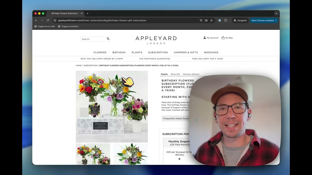
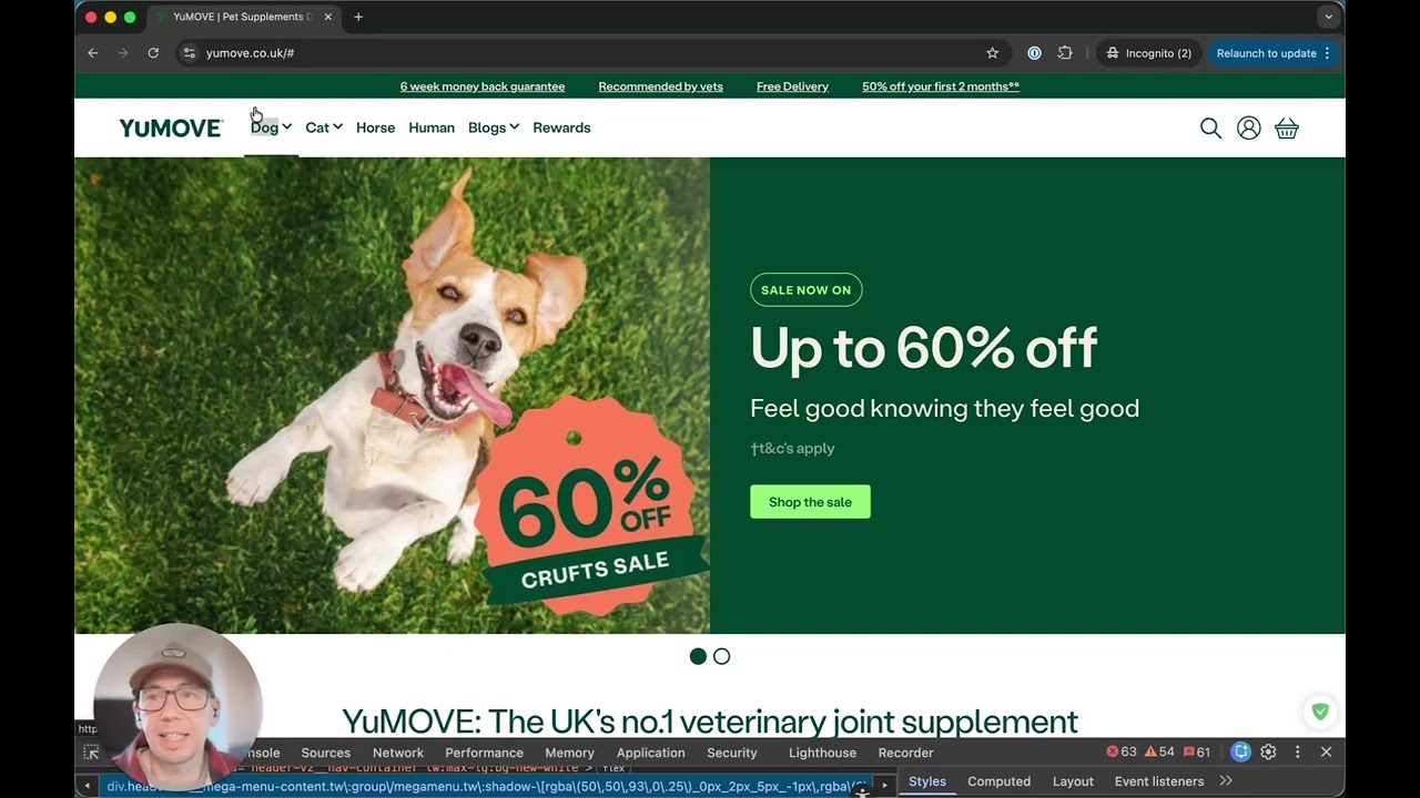
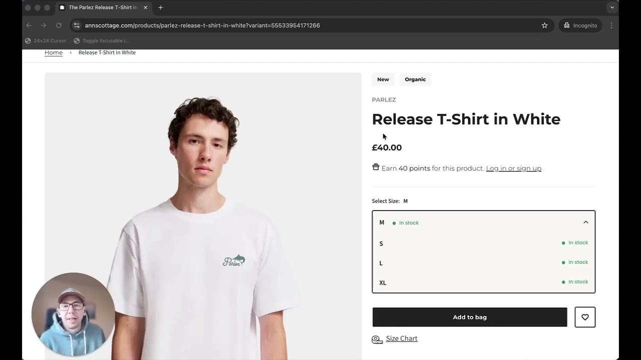
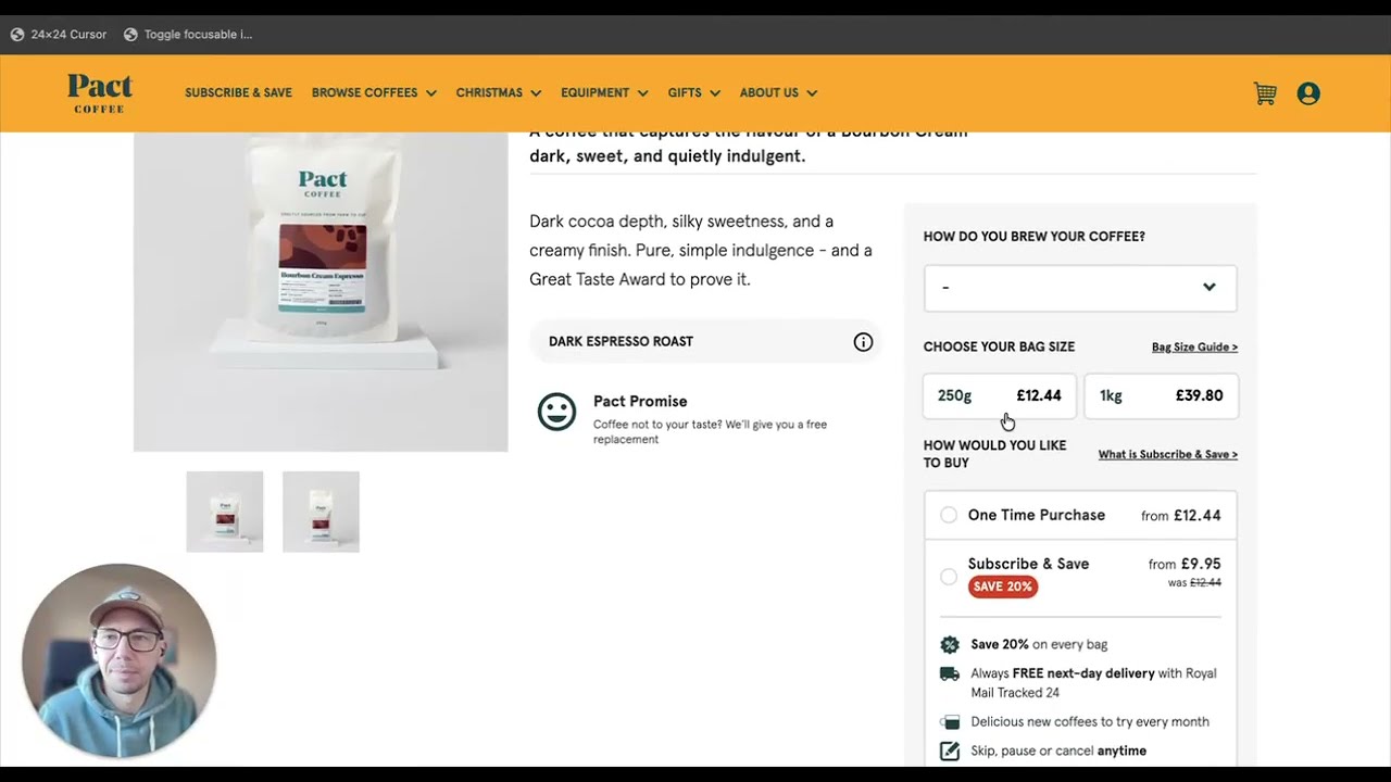
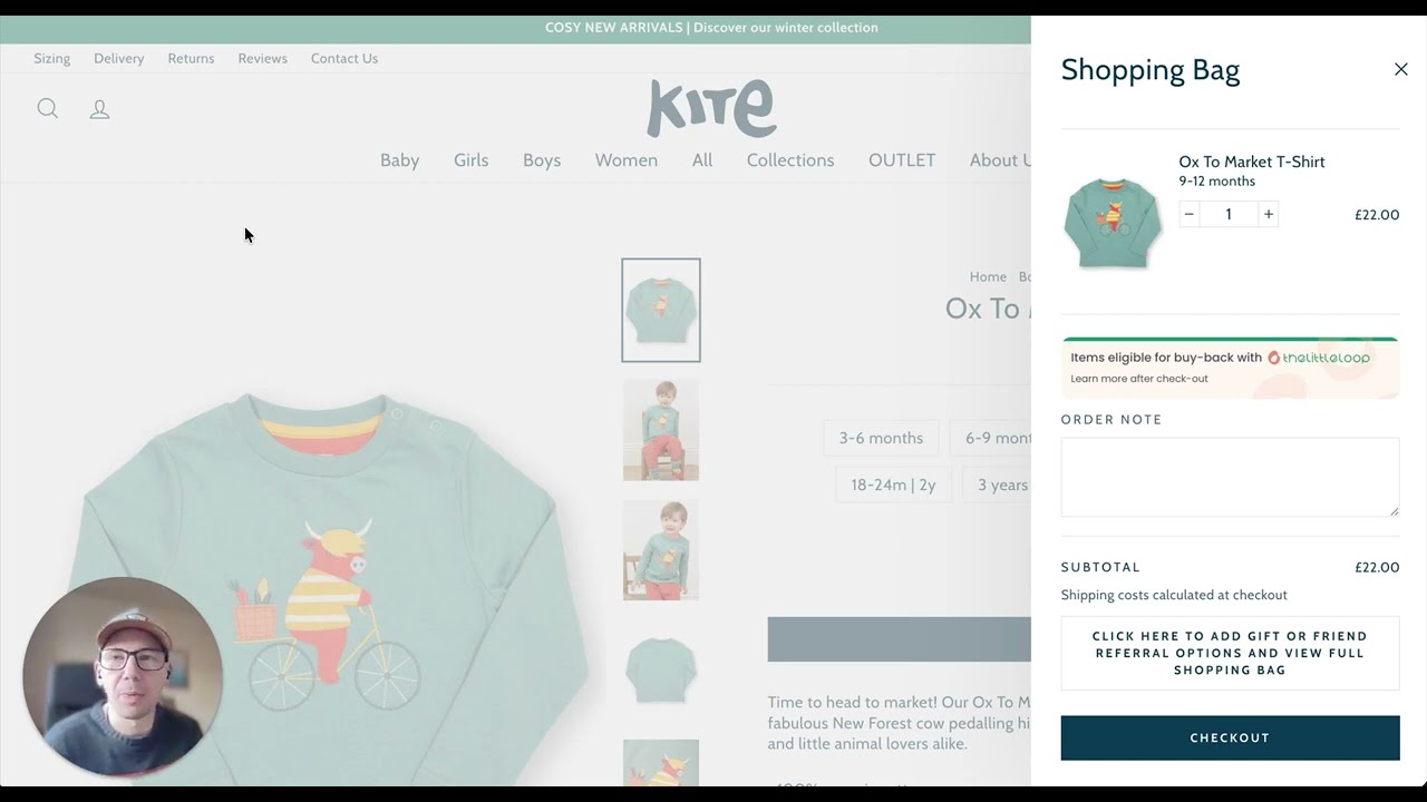
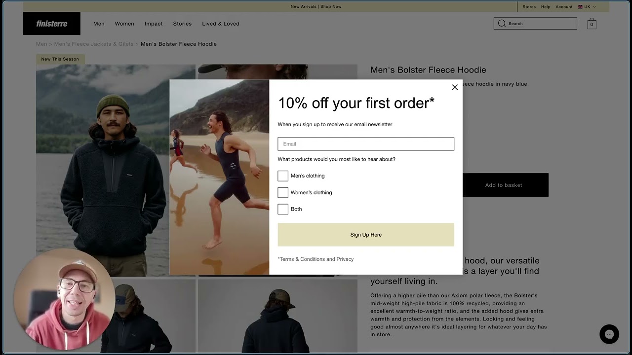
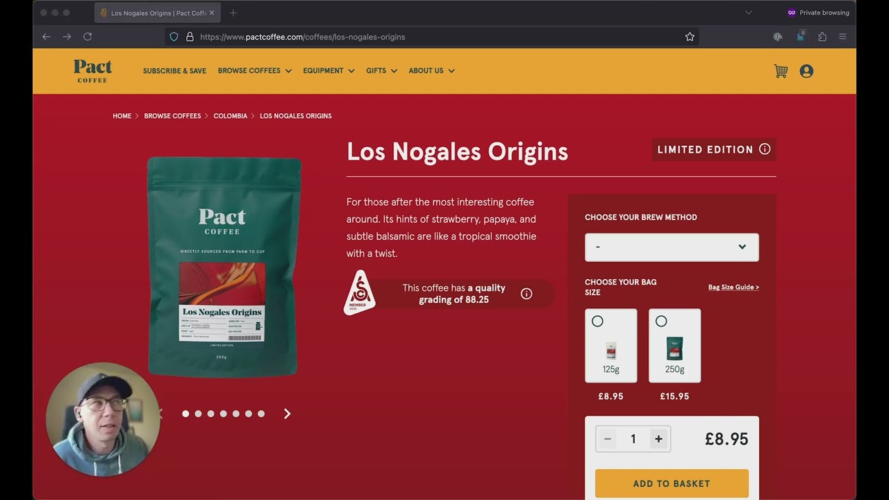
If you haven't tested your website with the built-in browser zoom recently, then you're missing out on one of the easiest accessibility and usability wins for your customers. The built-in browser zoom is the most commonly used accessibility feature, including by people who don't identify as having a disability. Zoom users are not only people with diagnosed visual impairments, they include older users, people with temporary eye strain, and users in poor lighting conditions, just to name a few. And statistically, older users are far more likely to increase the size of the web page through the browser zoom rather than change operating system-level settings or use specialist tools. In the UK, this demographic of people also holds a disproportionate share of disposable income And wealth. So ignoring this is excluding people who are older, wealthier, and more likely to complete high-value transactions. So how do we test this? It's the same in any browser. On Windows, you use Ctrl+ or Ctrl-, and on a Mac, you use Cmd+ or Cmd-. So what does good look like? Well, we'll look at a good example first and then one which could be improved afterwards. Here's a local Welsh coffee company that I found, and increasing their size using just the plus button to 150% makes the website completely still usable, which is brilliant. Everything is still clear. There's lots of space. We're up to 150%, and we can see up here we can zoom into 170, 200, or even more, and the website is still usable. Now, if you've watched any of my other videos, you'll probably have spotted that there are a number of other accessibility problems which could be improved on this page, but specifically We're looking at the zoom here, and you can also use the, the menu and you can zoom in and out that way. Let's then look at an example which isn't so good and could use some improvement. Here's another coffee company that I would like to buy coffee from, and on the whole their website looks really nice. But you'll see that there's this sticky banner at the bottom. And there's also, when you scroll back up, this sticky banner at the top. Now, neither of those are a bad thing in themselves. But when we zoom in, those stay there, which means that the retail space that we've got is suddenly very narrow. And if I'm zooming up, scrolling up and down, and all of a sudden the only space that I've got is very, very small. Now I could remove the promo bar down here, but the point is that it's very important for you to test, uh, with your own websites at various zooms to see at what point the components that you've got on the page start making it unusable. Finally, here's one more example from a B2B retailer. And to be fair to them, I think this is a legacy website and it's probably being updated. But if we have a look here, you can see they've got this very large sticky header at the top. So if we try zooming in, that gets bigger, and their mobile menu pops in, which suddenly takes up half of the available space on the page. And we're only at 150%. If we wanted to zoom in further, then suddenly our available space for information gets very, very small. And if this had been tested with the browser zoom, then that probably would have been picked up. And there are people who will browse at 100%, 120%, 150%. There are people who will browse all the way up to 400% zoom.