Dave Davies audits a UK flower subscription site and finds critical accessibility failures: navigation elements missing from keyboard focus, form fields without labels that screen readers can't read. These barriers cost the business recurring revenue when customers abandon checkout.
Chapters
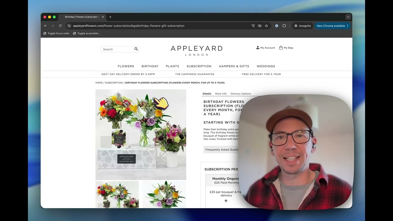
The UK's fresh flower and indoor plant market is worth a massive £2.2 billion a year, with roughly one-fifth of that spent online. Globally, it's a $57 billion industry. And with over 94% of the top e-commerce sites worldwide failing basic accessibility checks, and that pattern also continues throughout the web, The potential here is to exclude 10 to 15% of your audience, and that's revenue going straight to your competitors or just not being spent at all. And in a category here driven by Valentine's Day and Mother's Day, that's a lot of potential customers without flowers. Here is one of the top sellers of online flowers. So let's take a look at what could be improved for them. We're gonna jump straight to a product page because it's not unreasonable to assume that a potential customer could get here from a link they've been sent or straight from Google or even from AI these days. And the first thing I want to do is have a look at the focus order. on the page, because if everything isn't focusable by keyboard, then it might as well be invisible. And I've got a little bookmarklet here that shows every item that can be focused using the keyboard. And you probably notice straight away that My Account and My Bag are not in the focus order. Which means anybody using a keyboard They go from the logo to the search to the menu bar and then over straight into the main part of the page. So they can't ever reach their account and they can't ever reach their bag. And if we scroll down, you can probably see as well that these are not in the focus order, which is a bit unusual because you probably want to be able to choose whether you're having monthly ongoing or pay all upfront. But if we turn this focus order off, and instead scroll down a little bit to adding a personal gift message, or recipient name, and I have another bookmarklet that will show us how a screen reader will perceive these input boxes. And you can see straight away that there's no accessible name on this gift message, on the recipient name, postcode, the address. And so when a keyboard user, a screen reader user, is tabbing through the form, all they'll hear is text box, text box, empty text box, text box, with no possible indication of what's going on, which isn't particularly useful. And at this point, I think I would probably have given up. And interestingly, this is for a subscription of flowers. So while a broken product page, you might be losing £25 once, for a subscription, you're losing £25 again, And again and again for as long as they would have kept up the subscription. So it's more like £250 lost rather than £25. And these are not particularly difficult issues to fix on the page. It's not an exhaustive list, but it is the ones that I found straight away within minutes of looking at this page. And if these were fixed, it would make ordering for everybody a whole lot easier.