A walkthrough of Pact Coffee's checkout reveals four accessibility barriers: missing focus indicators, off-screen elements in the tab order, non-semantic interactive components, and a custom quantity selector. 69% of users abandon sites when hitting accessibility issues. Simple fixes like native inputs and visible focus styles could recover hundreds of thousands in lost sales.
Chapters
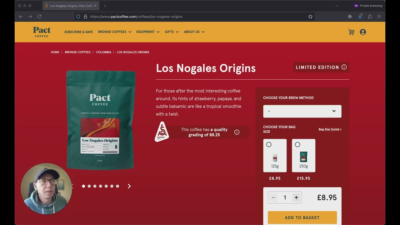
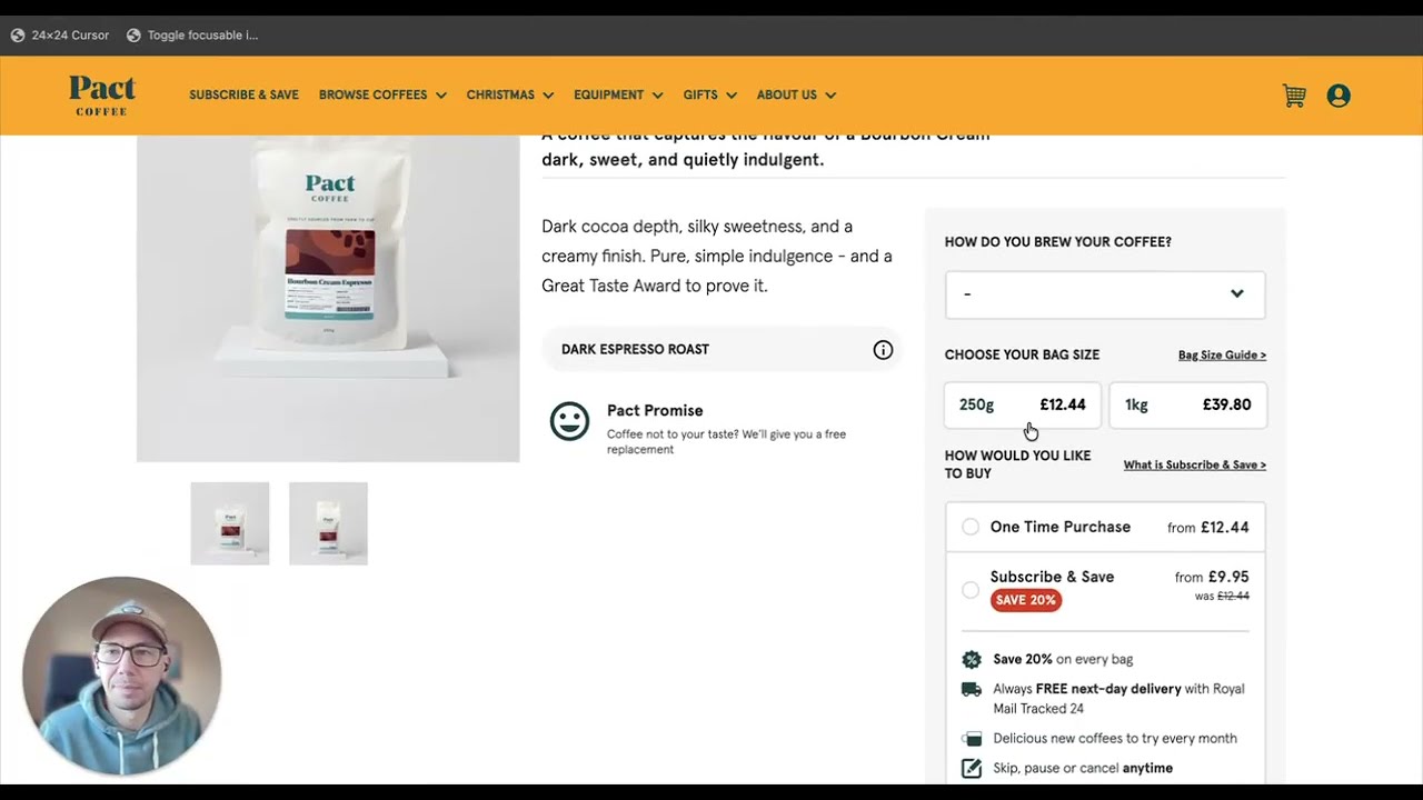
Hi everyone. Today we're going to be looking at Pact Coffee to see what accessibility barriers could quietly be stopping people from checking out. Pact Coffee is a subscription service that delivers freshly roasted specialty-grade coffee beans directly to your door. And Pact is one of those brands that's really easy to get behind. They sell amazing coffee. They have a strong mission, they ethically source their coffee beans, and they're a certified B Corp, so it's clear that they care about doing things properly. Today I wanted to walk you through their online checkout experience and show you how a few small unintentional barriers might quietly be getting in the way of people completing their coffee subscription order. And how I would fix that. Now, when I first land on a site, I'll try to navigate around using just the keyboard, so no mouse. And this is how a lot of people browse the web every day, especially those with motor or visual impairments. And the first issue here is that there's no visible focus state at all. Okay. As I tab through the page, I'm moving through the page between links and buttons, but there's no feedback to show where I am. Now, it's important to say that I know Pact aren't setting out to make their site difficult to use on purpose. These kind of issues normally come from fast development cycles or just not realizing exactly how many people rely on keyboard navigation. every single day. But here's a scary fact for businesses. Around 69% of users will abandon a site when they hit an accessibility barrier. And UK businesses alone are losing over £17 billion a year because of exactly this kind of checkout friction. And this isn't about ticking boxes or meeting technical standards. I know Pact want to sell great coffee to as many people as possible. This is about making sure that nothing gets in the way of that. Okay, so no focus states, and I can't really make an educated guess as to where I am on the page, because when we highlight the focus order in DevTools, We find a lot of off-screen elements in the tab order. I think this section over here is the cart that slides in after you add an item. But until that happens, it just adds some confusion. So what would I change first? Add visible focus styles. You can design them to be fully on brand, so there's no reason to take them out entirely. And they make a massive difference to usability. Step 2, I would clean up the tab order. If something's not part of the current flow, like the cart before it's visible, then take it out of the tab order. The checkout popover is a very important part of the checkout flow. But it's best to save it for when the user actually needs it. So let's imagine now that we've fixed the focus states and the tab order. I would like to choose this coffee. And now I'm ready to add it to my cart. So let's turn the DevTools focus order back on again and see what's happening on this page. Now, if someone is using a screen reader, then that screen reader might announce what's being focused even if you don't have a visible focus state. What a screen reader can't do is make non-focusable elements focusable. And that's what we're looking at here. This design is really nice, but these components over here are built using plain non-interactive elements with JavaScript event handlers added on. And by default, those aren't focusable or accessible. Now technically you can build components this way, and that's fine. But when you do, you also have to recreate everything that the browser normally gives you for free: keyboard support, screen reader compatibility, and focus handling. And in this case, that hasn't been added in. So why would you want to rebuild all that from scratch when native form elements already give you keyboard support, screen reader access, and proper semantics out of the box? And you can still style them to look just like this. So how would I fix this? Here, I would use a proper button styled to look exactly the same, which then opens up the BREW method popover. Inside this popover, you can simply use native radio buttons to create the list. And that way, it's fully keyboard accessible. And screen readers will announce each of these options really clearly. The same goes for choosing a bag size. Standard radio buttons allow keyboard users and screen readers full access to this area, which at the moment they don't have. And then this quantity selector is also built with non-interactive elements, meaning that it Even if I did manage to choose my coffee grind and the bag size, I'm still not able to update the quantity using a keyboard. These plus and minus controls should just be native buttons styled to look exactly the same, and the number itself should be editable as well. So I could just type in the amount that I want. Now there are a few other things I'd look at too, but right now it's simply not possible to complete a purchase or subscription using a keyboard. Or a screen reader. So these would be the first and most important things for Pact to fix. And for a company of Pact's size, it's not unrealistic that this friction could currently be costing hundreds of thousands of pounds in missed conversions. And these are customers who are actively trying to buy. And again, none of this I know is intentional and none of this is a huge rebuild or design. These are small focus changes that remove invisible conversion barriers. Pact has got great products and a strong brand, and these small adjustments would help more people enjoy it and ultimately increase conversions for them too.