Dave Davies shows why ecommerce menus fail for keyboard and screen reader users: submenus appear before their triggers in the code, breaking tab order, and menu buttons are coded as links. The fix is simple: use the right HTML elements, keep code order matching visual order, and test with a keyboard.
Chapters
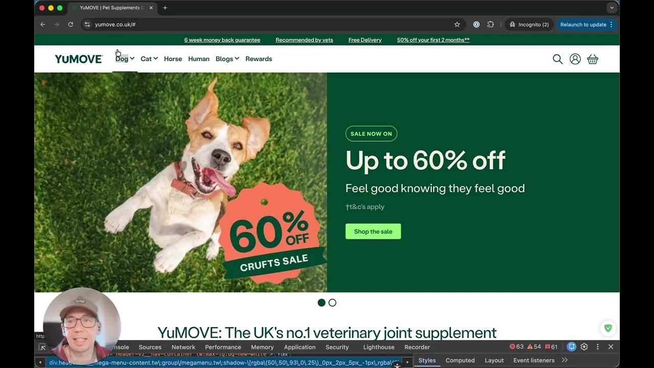
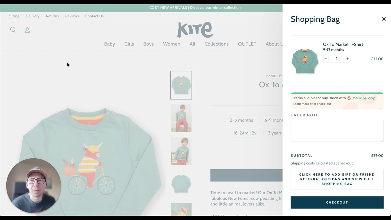
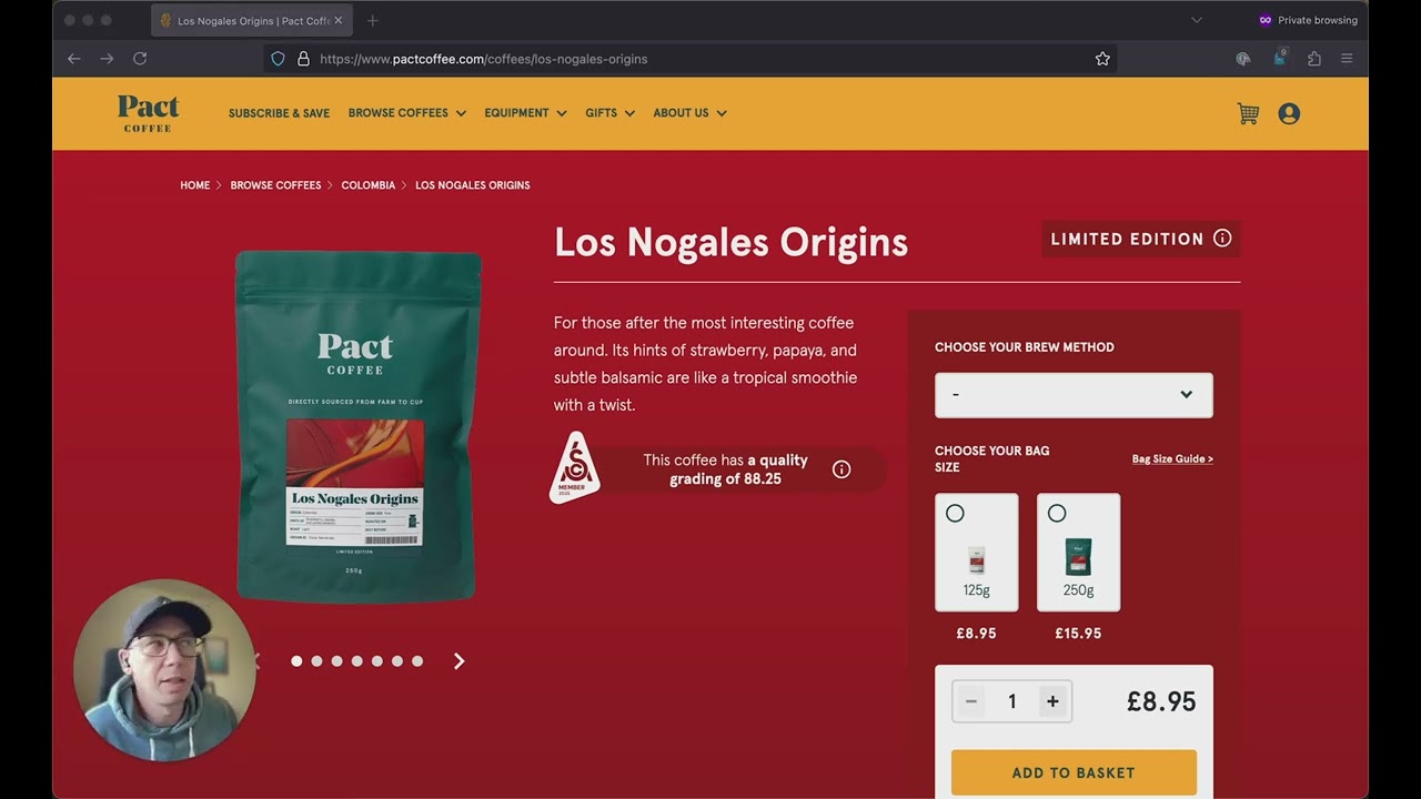
One of the most important and prominent parts of any ecommerce site is the navigation. If a customer cannot browse product categories easily, then they'll never even reach the product pages. In this case over here, the main menu looks clear and polished. But the interaction starts to break down when you begin using a keyboard. And there are 2 main problems with this navigation. The first issue appears when the submenu opens. Standard interaction patterns expect the dropdown to open using the Space or Enter key on the keyboard. And once the submenu is open, pressing Tab should move the focus into that submenu so the user can explore the available options. And then if they decide not to continue, then pressing Escape should close the menu and return the focus to the element that opened it. Instead, here we can see that pressing Tab to get into the submenu actually takes you through to the next navigation item. So the submenu appears visually, but the keyboard user never actually gets to enter it. And that actually happens because the submenu in code sits earlier than the element that activates it. That's the submenu here. This is the element that activates it. And so now the keyboard order no longer matches the visual order on the screen. In practice, this actually means that you have to tab backwards in order to get into the submenu, which is not an expected interaction pattern and something that most users probably wouldn't do. So for keyboard users, this makes the navigation unpredictable and difficult to follow. The second issue is that the menu control itself behaves like a dropdown button. When clicked or tapped, it opens the— it opens the submenu. But these are actually coded. As links. Now this may sound like a trivial difference, but the standard accepted convention here is that a link is used for navigation. A link takes you to a different page, while a button performs an action on the current page, such as opening the menu here, launching a modal, or submitting a form. And when those 2 behaviors are mixed together, assistive technology gives conflicting signals about what this control actually does. A screen reader user will land on the element here, and it will be announced as a link, but it will behave like a button. And that mismatch makes the interface harder to understand and harder to use, and commercially that matters. If a customer can't reliably move through the categories and products on your website, then they can't browse the catalog properly, discovery breaks down before they ever reach a product page. And this is a good example of why custom navigation needs to follow established interaction patterns. The menu here itself is not a complex menu, but the fundamentals do still matter. You should always use the correct control type. Make sure focus moves into the newly opened content, and make sure that the code order matches the way the interface appears visually. When those pieces line up, navigation becomes predictable for everyone, and predictable navigation is what allows customers to explore, compare products, and eventually buy. Finally, here's a great example of a navigation menu that works as you would expect it to. So we can tab through the navigation. If we decide we want to understand more about the community and open this dropdown, this submenu, we can go into it, and tabbing takes us straight into that menu. Pressing Escape takes you back to the item That opened the submenu, and if I tab all the way through, it moves on to the next top-level menu item and closes the previous submenu. This is how menus are expected to work, and with a little bit of testing on the keyboard, it's very easy to get your menu working exactly the same.