First Impressions of Evernote for iOS 10 with Stacey Harmon (Getting More Done With Evernote)
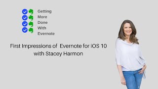
In this episode of Getting More Done with Evernote, host Ray Sidney‑Smith and Evernote Certified Consultant Stacey Harmon give their first‑impression review of Evernote for iOS 10. They walk through the redesign’s visual and navigation changes—sidebar with hamburger menu, consistent cross‑platform UI, dual‑column notes/reminders, and static new‑note button—highlighting how these bring parity with desktop and web. The conversation then shifts to workflow upgrades: full‑screen search with suggestions and saved searches, new filter UI, promoted tags with nested organization, edit‑protection, and a revamped note editor that supports containers (audio, sketch, tables), multi‑color highlighting, and a streamlined tag‑creation flow. They note practical enhancements such as palm‑rejection for SketchNotes, the distinction between checkboxes and checklists, Face ID/passcode lock, and the ability to toggle work‑chat. Missing but promised features (Apple Watch support, iOS 14 widgets, password‑manager integration, business‑card scanning) are listed, and the hosts discuss the evolving Evernote Search—advanced operators, new list‑type filters, and upcoming container‑based filters. Overall, the tone is enthusiastic and supportive, with occasional constructive criticism (e.g., delete‑note workflow). The episode frames iOS 10 as a solid foundation for future feature roll‑outs and a more intuitive, consistent Evernote experience across devices.
Chapters
Hello and welcome to Getting More Done with Evernote, episode 12. I'm your host, Ray Sidney-Smith, Evernote user since 2009, Evernote Certified Consultant, and an Evernote Regional Leader for North America. As you can imagine, I love Evernote, and with Getting More Done with Evernote, I hope to help everyone love Evernote just a little more, or at least enjoy digital note-taking with each episode. And today I have the pleasure of having with me Stacy Harmon, Evernote Certified Consultant and another Evernote Regional Leader for North America. Welcome, Stacy.
Thank you. I'm I mean, fellow Evernote lover here, I'm excited to be back.
What I wanted to be able to do today is for us to talk about the Evernote for iOS release and really our first impressions having used both. You're on the iPhone, I'm on the iPad, and so we have some synchronicity here in terms of being able to compare and contrast the new features and what's gonna go on in kind of the next iterations of the application. What I wanna do is talk a bit about kind of design changes, what the UI and how the UI kind of differs from the prior apps, what is happening in terms of workflow and feature changes, and then I'd like to touch base just as we close out on Evernote Search and the concept of filters that have been birthed out of this new system. So let's start with the design. How is the design different in Evernote for iOS from the old version to now version 10?
[Speaker:ALISON] Well, I'm really, first of all, it's a really exciting release.
Like, let's just start with that, right? It's the first release we're seeing of the new house that Evernote's building with room for lots of expansion, right? So we're seeing the first release where we're gonna have consistency amongst the different apps. And in the navigation is the very first part of that. So to have the sidebar and navigation all come in on the left through the little hamburger menu or icon at the bottom, is super exciting in terms of consistency and user experience for knowing where to go to find your notebooks, your stacks, your tags, your all notes, all of these things that we're used to seeing on the desktop. Even if you're just simply a web user, it's going to be very consistent with what you are experiencing on the web as well. So lots of feature parity and consistency amongst the different clients, and it's— I find it really lovely to use.
I am a big fan of consistency across platforms, and to see the ability to see the content really look the same when I'm looking on one device versus another, and I'm just thinking Mac, PC, the Windows, and then the iPad versions. When I'm looking at my notes, they look the same, and I just really like that function of being able to see everything sync up in that way. On the iPad, the new note button is there in the bottom left-hand corner of the application, and you have the ability to then rotate the device and it just stays in the same place. And I really like that function, that it's not really moving all that much in terms of your normal use of the application. It's just kind of, it's static. And I like that ability for you to basically rotate the device and for the new note button to be in the same natural place. That's been really good for me. And I like the ability to slide out the drawer and see all of the pieces. Tags have now, a nice fluid function.
And they're nested.
And they're nested, right? Exactly. So we can really do all of those things. And I really like that slide-out drawer access to the settings features now is under that gear icon, which just seems so natural in every other application. It just brings parity to that idea of, oh yeah, I wanna go to settings, I'll click on the gear icon and be taken to my configuration and all those kinds of things. So it really brings that piece, 'cause every time I tried to explain somebody on iOS how to get to their, account settings and so on and so forth. It was a little bit of, okay, you've got to look for the little guy with the head and shoulders. And it was a little confusing.
I think what you're saying is, um, that in addition to consistency, which has been something that Evernote has discussed is a primary concern of the, the redesign, but the intuitiveness— I find it very intuitive, and I think that that is a big win for Evernote.
You also see the, uh, dual column at the top of your all notes. So now you can see all of your notes and how many notes you have.. And at the top of the columns on at least iPad, you could tell me about iOS, you have Notes and Reminders kind of side by side, and you can see those pinned notes in essence, or those that have a reminder date associated with them, and you can toggle back and forth between them. What I like is that they also tell you the date and time of the reminder in blue in the list of notes. So that's really helpful for you to be able to note, okay, this was due Yesterday, this is due today, this is coming due, and giving you that kind of subtle hint as to when that reminder is coming due. And I really like that as well.
Yeah, I think the visibility and the use of design elements to communicate clearly through the app has been nicely done. I agree that it's, it's very easy to tell.
I mean, you wouldn't necessarily—
I didn't even observe that that's what was working for me, is the font color change and those types of details, but I just— it's very crystal clear. What the primary element you should be looking for on that screen is. And so I think that's been very well done as well.
I also like the ability for you to have now search in a full-sized window. So when you click on the search icon, it takes over your screen and you're able to go ahead then and see on one side what they call suggestions, kind of like notes and reminders. There's these two tabs. One is suggestions, one, says saved, and those are for your saved searches. And it immediately looks at what I might likely want to search for. And so I can see here, you know, I can, I can see a person's name, I can see a search that I frequently do, and then it has these go-to options. And go-to gives us kind of a quick, uh, link to notes it thinks I want to jump to, not just searches but specific notes. And then it gives me a set of filters below that, and in my case it's showing me all tags that I could filter by, but it can show me other kinds of things, uh, to, to basically filter by containers, other kinds of things. And is, is that the way it looks like on your screen as well?
I see similar as well. It's interesting to note that I think the filters—
I have a more—
I have a larger array. I've got some email addresses of some people so that I've been interacting with. So clearly it's adapting to how you're using the app and bringing up in the suggested area things that are going to be most relevant to how you're interacting with the app. So really kind of fun. Obviously you're using tags more than me, which we know is not a big surprise, right?
But you'll be using it more now, now that we have the ability for it to give real equality to tags in the Evernote ecosystem.
Tags have been promoted.
Exactly. Yes, I've been looking forward to that. And so So that's the suggested side, and you make a really great point here, Stacy, which is that we now have the ability for Evernote to really be paying attention to what we're doing and to provide a better sense of search because of that. So it's really trying to understand how you're utilizing the application and then surfacing searches that you're likely to do and content that you're likely to interact with. And that's just very powerful. It's going to do a much better job of that now that we have what is considered kind of the conduit, this master set of data that it's managing all within the cloud and on the devices themselves. We then have the Saved tab, and that's where all of your saved searches are. So they're no longer buried in the interface. It has its own clear full screen. You can see all of your searches, your saved searches, and scroll through them and select the ones that you want. When you do a saved search, it actually also populates the field with the full advanced search operator setup. So I can now tap inside of this and the whole search is done. Like, I have an any colon search that is very complicated, you know, as I'm want to do. And so I have this very long search, and now I can click in the search and I can continue adding on to the search from the interface, which is just so wonderful because not only am I learning to do saved searches in a way that is helpful to me, I can extend and adapt the search right from that screen. So I no longer, I can say, okay, well, anytime I wanna look for a set of these things, I can then filter based on those things just by continuing to type words. So I can find a set of tags and say anything that's tagged with any of these tags, but I also wanna find Stacy's name in that set of notes.
And now I can just— Are easy to do on iOS.
Exactly. So I'm really, really, I'm very excited to see this feature just come about. And I like seeing the full search in the search box, because it tells me exactly what's happening, and as I want to say, I'm a little bit of a control freak, so I like to know those things.
Well, and it emphasizes like from just a general user perspective, we want to find things. We don't want to search, we want to find things. So it talks about the emphasis on Evernote's perspective about being able to retrieve what you're looking for. And I think this is a great step towards clarifying that that's only going to improve over time.
I have a little bit of language that I'm going to have to change now, because I tend to think about things as finding and filtering. Finding is going to find something, filtering being limiting your view of things, right? There's, there's two parts to search, right? There is I want to bring more things into view, and then I want to remove things from view, and search encompasses both of those pieces. I've always called that filtering because it's like a sieve, right? We filter out the stuff we don't want. Now we have filters, and we'll talk about that in a bit, but that now needs to be a bit of language change for me in terms of educating people about Evernote. But I think the ability to do that is much more powerful now, and I'm very excited to see that in the interface. I'll note one more thing, which is that the full-screen editing mode is now unique and different than the old version was, in the sense that you have this little double arrow button that sits next to the note list. So in the top left-hand corner of the note itself, you click on that button, it takes over the full screen, and you see what is inside the note, and you have a blue edit button at the bottom center of the note to be able to edit now. You can of course, click into the note and it will go into edit mode just by tapping into the content of the note. But you do have this new note editor as well. Once you get into the editor, you actually have the full note editing experience that you would normally now see in the Evernote web note editor. So you have font size, you can insert different containers, you can put attachments, links, dividers, tables, record audio, sketch. All of those things now are in the note editor's editing fields there at the bottom of your screen. And so if you have your— an external keyboard attached, it literally floats at the bottom of the screen. If you have your on-screen keyboard, it floats right above the on-screen keyboard. And that has been really, really nice. I love the new colors. Our ability to highlight in multiple colors has been really nice, and you're given 6 colors to highlight, and you can highlight and unhighlight. I've actually been using that in the last couple of days to kind of make a list and highlight the colors of different things in the system just to see how it, how it looks. And I've really liked it. I've liked the ability to see the color match up to my context and my own GTD system. So that has been really nice as well. So in the top right-hand corner of the system, you have where you can share. You'll see a little head and shoulders icon now with a plus sign in it. That is for sharing. And then you have the new tag feature interface. So when you click on a note, you will see that little tag icon with the plus sign, and that's where you'll be able to tag and untag things. Now, we don't have the problem anymore where you used to have to like run around in circles, tap your nose 3 times to be able to create a new tag in the system. There is now a new tag button, and that's the only way that you're going to create a new tag, which limits the capabilities of miscreating tags. There used to be a problem where people would sometimes type in a word or something like that on the desktop version and accidentally create new tags. I think that going forward we're going to get some cleanup on that level, because when you create a new, a new tag, at least on iPad as I'm seeing it, you click on New Tag, you type in the tag, click the Create button, and the new tag is created. If you're looking for an existing tag, you can search for it in the Find Tags field and then go ahead and tap on the on the tag that you want.
You actually triggered a kind of a parallel, something that supports the fact that we'll probably see some additional development here. There's a new setting called Edit Protection for your notes that you can have as well. So you can actually turn that on. It's off by default, but you can turn it on to protect your notes from accidental taps. So you have to actually double tap the note to edit it. So that's a new setting that we're seeing in this iOS 10 version, which I think is kind of interesting and probably pacifies a certain group of users. And so it sounds like there's, there's some safeguards in place for maybe both tags and notes now in order to control how you're, how you're creating those elements.
Absolutely, yeah. And then last but not least is your more options button in the top right-hand corner of the interface. And when you click on that more options button, you'll get a slide up, basically a slide up drawer, and that has a duplication of the share note icon that was— that's visible in the interface, as well as your tag options. But then you can add a reminder, you can go ahead and add to shortcuts, add a note to shortcuts. You'll see your note info. You can copy your internal note link, as well as move, duplicate a note, or create it as a template. And then last but not least is the delete note option. Now, I actually delete notes quite a lot, and what I would like to see is that feature brought up a bit or giving us a little bit better way to delete notes faster. I find myself consistently clicking the note, the more notes options on the iPad, and then I have to slide up again in order to get to the delete note option. So it's like I'm in the note, I've got to tap the more options, then I've got to slide up, and then I've got to click delete note, and then I have to tell Evernote, yes, I really want to delete this. So, you know, while some people need some note protection, as you just talked about, some of us wanna just delete the note. And so I'm hoping that we get some options there to be able to more quickly delete notes. But for the most part, I'm really, really liking the containers. You'll see these new containers inside the interface, like an HTML content container or an audio container or those kinds of things, and the ability to move those around, they're fungible. So you can just move those kinds of items around in the interface. And generally, all of the operations of the system are just intuitive. I haven't noticed anything where I thought, oh, this is out of place. I don't really, I don't know why they put this there. Everything is really thoughtfully placed, and I've really enjoyed the experience. Is there anything in the iOS interface that was different for you than how I explained it in the iPad?
Yeah, so, well, not necessarily in the iPad, but for iOS users, users that aren't coming from the Android app, the new note button is much more in alignment with how it was over on that platform. So that's, even though it's very intuitive, change. It's a— it is a difference for us who were iOS-centric, and it's actually really nice. So the green, clear, new note button at the bottom of the interface is now the same and going to be what we see in all kinds of locations. And you can hit the little up arrow in order to access different types of notes that you want to create right off the bat. So if you want to start recording into your note immediately, or you want to initiate a note from a photograph, those kinds of things can be done by hitting the up arrow. And that is much more consistent with how the Android interface interface has been. So this is a bit of an evolution in the interface for iOS users. Really nice. And then we didn't talk about actually a fun, it's actually, I think it's just like a fun interface feature. And that is on the left sidebar now, when you pull up the tray that slides in from the left to give all of your information, you can now see when you joined Evernote. So they tell you how long you've been an Evernote user underneath your name. And that's kind of just, I've noticed a lot of people find that an interesting feature. Interesting piece of information. So it's kind of a nice little detail that I think users are enjoying.
So moving forward, I want to talk about some of the feature and workflow changes. Obviously, with any new rewrite of a software, Evernote had to make some tough calls in terms of what it would initially launch with and what features would have to come in later versions. And in last— in the last episode, episode 11, when I talked to Ian Small, he talked about the fact that, you know, they're gonna really work to ship new features and so on and so forth in the, in the upcoming year. But of course, right now their goal is to be able to bring parity between the old versions of Evernote and the new rewritten versions with the new applications. And so there's just going to be a trade-off here. I understand that, and we're all going to have to recognize that some things are going to be in the system and some things are not. And so I want to talk a little bit about some of the features that have been added because they're using new technologies that they weren't able to do before. Now they can just turn them on. The things that are coming that they've really noted that are coming to the system. So I'll start first with the Evernote for iPad. They have palm rejection in sketchnotes. This is amazing. Oh yeah. I know that others have been using palm rejection on their iPads for many years, but not having it on the iPad for some people have just been really a struggle. Now I happen to be a hover writer, and so I never actually experienced that problem, but now I find myself just really glad that clients of mine who did struggle with that can now easily annotate documents and so on and so forth without concern of their palm smudging and writing or moving notes or those kinds of things that were happening to others. I had one client who you know, just would start writing and would move from one application to another. Somehow they would just like trigger the iPad to move from one application to another mistakenly. And now that all has gone away. They can place their hand fully on the screen, write with their Apple Pencil, and no issues there. I've noted this in the Evernote discussion forum, and I know Evernote's working on this, which is that there is a little bit of a kind of a granulation when you are writing using sketchnotes. That hasn't impacted me very much, but I know that some folks are, um, are looking for that to be cleaned up, and I'm assured that Evernote will fix that so that when you are writing, it's a fluid and, uh, kind of beautiful experience as you would expect on iOS. Uh, so, but I'm, I'm very happy to see palm rejection. What other features have come to iOS that you've been excited about so far?
Well, he highlighted it in one of the early behind-the-scenes videos, but they talked about the evolution of checkboxes. And how we were going to have, uh, in the previous version of Evernote, you had checkboxes, so you could insert something, and when you click on it, it checks it off for you. Now we have an evolution of the feature. I think it's an expansion of the feature, and we have now a distinction between checkboxes and checklists. So they have new terminology, and we have new functionality associated with those. So I did a quick free training on this that you can link to and find in the show notes, but the feature gives us the option to now now have, say, a grocery list where you have kind of a bulleted list of items with checkboxes, and when you click on it, it'll strike through the text to the right. So a lot of people really like that in terms of to-dos or tasks and showing the completion state. And I think this may highlight some things that we hopefully will see from Evernote coming forward. Maybe it's to what Ian said in your great interview with him, you know, towards remember everything, accomplish anything. I feel like this is a step towards that in maybe, hopefully, Evernote tipping their hat is what they're looking at. Again, I don't know for sure, um, just reading between the lines. And then we still, for users like myself who I use checkboxes, I don't want it to always strike through the text to the right because I use checkboxes as a time blocking technique. So I'm actually, uh, putting multiple time blocks. Uh, one checkbox equals a Pomodoro for me. And so I say, okay, I'm going to allocate 2 Pomodoros to this project right now. And I'm going to check off those as I go through it. Um, now the checkbox feature allows me to still utilize, utilize Evernote for that purpose. And you can add another common use case for this. And again, the video tutorial I did gives you a visual to the differences between the two, but you can now put multiple checkboxes. We always have been able to do this, but you can still put multiple checkboxes inside, say, a table cell, for example. And you could also put now a checklist. And then to kind of pair that with one of the features that you discussed earlier on, Ray, is now we have this filter where we can look for either checkboxes or we can look for lists. So interesting options and expanded functionality and really just these tools that you can use to create different workflows that are expanded from what we had before.
Absolutely. And so other things that I think you have, you had mentioned to me kind of pre-show, which are that Face ID, you can unlock with Face ID now.
Yeah, so in the settings, so I've come through all the settings and I've looked at those and many people don't ever look at them, but simple things like we can turn passcode lock on and we can use unlock with Face ID. So go ahead and turn that on if, obviously privacy, security, great concern. And we have these features built into iOS and Evernote now integrates with those. So certainly something to take advantage of if that's important to you.
Right, and definitely within the settings, right? So if you click the, the three bars icon in the bottom left corner and then open up, click on your gear icon, you'll also have the option to turn on and off work chat. I know that some folks had come to me and said, my work chat's not here, why don't I have work chat? You do have the ability to enable and disable it, and if you for some reason you had it disabled in the interface, it's not going to show up in the, in the new version either. So just go into your settings app and turn on work chat, and you can go ahead and see your work chat stuff there in the, in the left navigation drawer when you open it. So that's just really, really helpful. What other things are missing and coming soon to Evernote for iOS?
So I think this is a great question because I'm watching a lot of conversation about people who like are quite angry that something might be missing, right? And I just thought we should point out that actually on Evernote's website, when they talk about what's new in iOS, they also have a section that says what features—
and the vocabulary is very important—
it says are not yet available in the new app, which says to me that they're coming. Okay, so, um, and notably, uh, and Ian again reiterated this in your interview with him, how important capture is to the Evernote process and how Evernote is the top capture device on the market. And I think there's very little dispute about that. Um, but they used to have Apple Watch support, and it's the first thing that's on the list, right? So that's an important capture and retrieval location for a lot of people, and it is not yet supported in iOS. But again, back to the vocabulary, not not yet available, I hope you can express some patience with that. And it does sound like it's on the roadmap. So in addition, the interface with new iOS 14 offers a lot of expanded widget options, and Evernote has yet to release their opportunities with that. So that's on the list. And Ray, I assume you'll link to what the full list of features, but it kind of tells us that Evernote is working on those things and that they are coming. And none of them, for, for me have been, uh, mission critical. Uh, and so I'm guessing that Evernote has looked at kind of what the, the broadest used features are. Um, it doesn't mean it's not critical to other users, but hopefully you can find some relief in the fact that they're on that list and coming to the app over time.
Yeah, I'm really looking forward to their ability to integrate with other password managers. I know they're looking at being able to get that up in the system soon. And then of course you know, business card scanning is a big feature that I know a lot of people use. I know that in the current state of affairs, not many of us are out there networking in person and sharing business cards, but it is still something that I know that once we all go back to hopefully a normative experience of the world, we'll be out there networking again, and business card scanning is an important feature. So they have lots of features planned. I'm very excited about that. And just like in closing, I wanted to spend just a few minutes talking about Evernote Search. And the future of Evernote Search, which will hopefully be unique and better. And the, the notion here is that we are currently seeing a new search environment when we're using Evernote Search. So you may be experiencing a little bit of a different search pattern when you type in searches in Evernote Search, and that is on purpose. So you'll see these little filter options that are now showing up, and there are a wide variety of new filters that you have available to you. So So just know that that is coming, that you're going to have the ability to now look at the various containers in the system and then go ahead and filter based on those, both in the interface, right? So you'll see those in the search itself, but also you'll be able to do this using advanced search operators. So I'm very excited about being able to utilize advanced search to be able to always and consistently find the things that are contained within apps. You, you were able to use this using the old advanced search operators. Well, this is really bringing it up to date and giving us a better capability there. The additions are that you'll be able to look for typical things like, you know, used to be able to type in source: and find web clips, things that you've emailed into the system, and many other formats like attachments that are PDF, attachments that are images, and so on and so forth. Now we're capable of looking for more bespoke types of information, data types, addresses, phone numbers, email addresses. We're going to see more of those kinds of pieces in the interface. And so you're going to— you're seeing those filters now in the interface. And you noted that, Stacy, that it's showing you an email address of someone that you have been emailing with recently. We're seeing those types of filters now surface in the interface. But I think we have a lot more that's going to be coming to Evernote Search and in the advanced search space So we can create really clear advanced searches, save those searches, and then be able to utilize them for our own productive uses.
Powerful stuff. I mean, clearly it's a powerful foundation, and I'm excited to see what the evolution of that is too. And like you said, it really is a transition period in terms of it is a new way, and learning the vocabulary of this new search is, is a learning curve for all of us, but it's not unintuitive. It may require asking questions. So even myself in prepping that checklist video, I'm like, how do I search? For a checklist. And so I was putting check in the search and it wasn't coming up because the filter is called lists because there's actually 3 types of lists now in Evernote. There's bullet lists, checklist, and numbered lists.
So list is like, now that I get it, I'm like, oh yes, that's exactly intuitive.
But I was looking for check and so it wasn't coming up. So just those little nuances will, will become more commonplace as we get more familiar with it. But it is exciting that we have I think it's safe to assume that if we can put something into a note, that we're going to be able to search for it by that type of a thing, like as a general rule.
I think we have reached the top of our time together in terms of things I wanted to talk about in terms of changes to Evernote and kind of our first impressions about Evernote. Was there anything else you wanted to talk about, Stacy?
You know, it's just so interesting. One of my observations is how quickly I've adjusted to it. It's been less than 2 weeks and already everything in the old interface looks very dated to me. So you really, once you start to play with it, it becomes very comfortable to you. And I think it's an exciting foundation that Evernote's working from. So I think we should be excited about the future of the app and looking forward to the continued feature releases and expansion of these items to the other platforms.
There is more to come with Evernote, and I'm just so excited to see the first steps of us moving into a new era with Evernote. Evernote, and it's going to be potentially a year, maybe a little bit more than that, before we start to see really the new paradigm of using Evernote in productive ways, but it's coming. And I just, I think that this first release of iOS is our first step up many stairs of the staircase that is toward kind of the apex of how we're going to be able to use Evernote in more productive ways, and I'm just really excited that we are finally here. You know, it's been a long wait, and I know that we've all been waiting for Evernote to be better. And they're doing that, and that's really the best part. So with that, thank you, Stacy, for joining me here on the show. My pleasure. So that was Stacy Harmon, Evernote Certified Consultant and Evernote Regional Leader for North America from Harmon Enterprises. I will have links to Stacy and her tutorial on checklists and filters in, in the show notes, so you'll be able to find that. And so again, thanks to Stacy for joining me here for this discussion. That's all for now. To learn more and follow me, you can visit gettingmoredonewithevernote.com. I'm Ray Sidney-Smith, Evernote Certified Consultant and Evernote Regional Leader for North America for Getting More Done with Evernote. Here's to your productive life.
More from Raymond



The Checklist Manifesto by Atul Gawande MD Productivity Book Group Made by Headliner
First Things First by Covey Merrill and Merrill Productivity Book Group Made by Headliner