Lean UX Enabler (Concept & Lo-Fi Designs): Wireframes & Prototyping
Ritzie Williams and collaborators build a lean-UX prototype in Figma, designing screens like sign-up and feed with components, auto-layout, and prototype flows. They create a navigation bar, hero section, and form fields, then test interactions and identify gaps like missing password-recovery flows. The whole enabler takes one to two weeks and often leads to more work.
Chapters
Start designing.
Okay, so this is what we're gonna be designing.
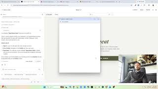
I tend to like to first start off adding a frame, obviously. Now I actually like to lay out the screens kind of pretty much knowing what we need to have. So this is desktop, I'm gonna use this desktop layout here. I like to keep my file organized, so let's move this here. And we are—
let's see if I can close this. Nope, that doesn't close it. Okay, it doesn't matter. So this home, and we have sign up.
Then what do we have?
Discover people.
Oops, that's not how you spell people.
Feed. Then we have profile, settings. And then we have update account info. Okay, so I also like to order these from top to bottom.
Now, this is where we start designing. Depending on what you have already built, you saw we already had some of the components built out here, so we can turn on—
there's this components, let's use that.
We'll see how well this already, you know, this kind of works.
So I know we have a global nav. And it doesn't look like what we have in the live site. Alright, so looking at the live site, it looks something more like this.
So we want to kind of rebuild that into something like that.
So I'm going to detach this, go back to my layers. Got a header container, it looks like it is separated into Let's check out some of the other pages. Looks like it doesn't necessarily ever stop expanding.
We can check. I'm just— I'm looking at the responsive behavior. Is it in a container or is it not?
So we go here. So we make it bigger.
So it always goes to the end.
Cool, so that's good to know. Let's move back here. In that case, we can just move this. We don't need this. We do need some spacing on the side. What did I have here? So this is all logo.
We'll have this in the middle.
Boom. So that's kind of where we're at. This logo feels small. 32. Let's make our spacing 24.
Full.
It looks like quite a bit of spacing on both sides. It might even be more than 40. No, I think 40. And then 24 feels small too. Oh, that's why, because it is fixed. We need to hug the elements. See, that's much bigger. Too big at this point. That seems a little bit more appropriate. 16.
Okay.
And we have links instead of buttons, and both these buttons are not even components, so this makes it pretty easy. So home, news, Support. And you see the, uh, wheat is moving over, which we don't want. So contact, which we don't need, not realistic for them, for us to have some of these things in the header.
Oops.
Both of these non-componentized buttons.
So Home, News, anything else that's authenticated.
And for these, these are not bold, they are regular. 18 is right. Let's create a text style. Let's call it, um, let's see if we have a text style. Looks like we don't, but we do have a paragraph. That we can break, add an underline. Is that how it looks?
Oh, yep.
So it has an underline when it's active.
Okay.
So you also are paragraph regular. So Home and News.
And then on the other side, we should have some kind of sign up, maybe a Get Started. We have our social, but we can also have, you know, get started, something like that.
So I'm going to hide my face for now. Let's add this to the left side. Oops. Right side, left side.
Now you see how it's not depending on what happens.
What we're gonna have to do is change our auto layout to not space between.
We're going to need to make both of these filled. Fill container.
You're gonna also need to fill the container too. There we go. So fill container. You to the right, you to the left, everything's good.
This will always be in the center. We can add a bunch of these, boom, boom, boom, you know, so that's fine. Home, News, these we might use icons.
I actually have a global icons that I use because I have multiple teams. So icons, navigation profile, or I actually want a login or, or a button to get started.
Don't need the news, just the weather.
Okay, feels weird. Feels like some— oh, that's why the button is not in the right side.
There we go. Okay, now we're centered.
Let's do a hero section F. I actually like to keep proportions, so 1920 by 1080. I know, obviously that's really big, but then I can align it like this. Let's just fill it with a color. Alright, this goes behind. Let's add a color, background color to the icon, behind to the header. Oh no, sorry. So this is hero header.
And then we have looking for recipes. Oh, I just realized we're using the wrong—
no, we're not.
So then it says, let's copy paste it. Do we have a desktop H1? Yes, we do.
And we can do this.
So that's two-thirds of it. Looks like there's an extra space there. And we're also going to want our button set again. And what we're gonna wanna do is auto layout. That was not quite what I wanted. So fixed, fixed, 1920, 1080. Cool. And then we move this down.
Sure.
Put the spacing here. 80, 80. Let's say that's 40.
And then we're set.
And then we're gonna build out this whole page, but right now since we have our Hero header or header global or navigation.
Sign up is a flow navigation. You're there. Now we're gonna put that icon. For back. Global Icons, arrows.
Mm-hmm.
Now we're missing a right side again. An empty right side. So that keeps it like that.
I'm doing a— I'm actually doing a deliberate, deliberate bad job of keeping like components and stuff because a lot of that happens at the UI design phase and I really would rather spend more time on that there than, you know, doing it this way. But realistically, like as of right now, what I would do is this.
Oops.
Command+C, Command+V. So I create another one there. I'll move this. So navigation. I will also do the same for this. I'm gonna put this here. Take this here, combine them both as variants. We're gonna call them type. We have unauthenticated Then we have Flow. Component 1's called nav.
Sure, nav.
That uses the nav, that uses the nav. Now every time we update it, it will be everywhere. So we also have a Flow nav here that does not have anything in it.
So that'll be that. We could add other properties to that, which we might when it's, you know, when it's— when we expand.
So we actually need the authenticated as well.
It doesn't matter where it is.
So then we have home, we have news. What was our other ones here?
So we have Home, Explore, and then Activity Profile on the other side.
Home. I actually think we don't need any of these now that we're getting into the layout. Logo, and then we have 3 icons here.
So back to Navigation, uh, let's go with our icons. We have Explore. Do we have a search? Content. We should have a search. Actions. Search. Activity.
Um, that is notification. And then we have profile.
That's it.
That's our whole, our whole navigation right there when you're authenticated. And then you call it authenticated.
You go to discover people inside the feed, authenticated.
And then we also have that for the profile as well.
Flow authenticated settings, it's going to be Flow, but we're going to reset all changes because there's a way back. Same for account info.
So headers are done on all the pages and they're componentized.
Okay. So an area I like here is— well, it's fixed, so we can actually call this a section 2. And I do that because, check this out, so I want to remove this button for this. This is our H1, sign up. We're going to just change all the background information. We're also going to change the height. We're going to put this at, I don't know, 320. Even that might be too big.
200.
What is that? 40 pixels above and below, solid. Sign up.
Whoops.
Feed.
Does it need one? I don't know, because that's like our home. I don't think it necessarily needs one. Profile doesn't need one based on, on that. Settings may need one. Now this one actually has two sections in it, so, and this is update account info, so we might need one. So, account update So now we have a headline on all our pages, which is looking pretty good. And now we start adding information below that. So we do have— I think we have a text input.
Solid.
And if I didn't have these items, I would actually have to create them from scratch, but luckily we do.
Now for this, I'm gonna put it here, Command+G, Auto Layout.
I actually wanna see, do we have a grid on here?
So I will open this.
Ideally, there is a grid inside the utilities that keeps the documentation layout. So they do have container sizes, which is nice. Let's see, for this one, I think it's smaller.
So 720 or 540 seems like a solid size. Command— did I already Command+G this one? I did. And we're gonna have a fixed size. Let's look at it.
720?
Seems like a pretty long input, so maybe let's go 540. We're gonna center this. We'll call it Sign Up Form. We're also gonna add our button. And we actually keep it on the right side.
So what do we have? First name, last name. And this is where you start getting into your, your areas. If you wanted to use these on the same line, which from what I've read gets controversial on whether you should have two on the same line or not.
All right, where you do something like this, fill container, you take both of these, change them both to fill container, first name, last name, email, password, confirm password.
I believe we have a radio button. So we have a radio only.
So Command-G, Auto Layout, we're gonna fill this. It's gonna go 16, text. Text about marketing consent.
Video.
A fun fact, what I've started doing is any grouping of items, I like to call it a container.
So this one will be name container. Whoops.
Sign up, uh, sign up form, it could be a container.
I mean, since it's a form, it's kind of a container, but you could put sign up container or even sign up form container.
But groups, I call them containers in comparison to individual components. That way you know it's a grouping, and then you also have tiers of it.
Uh, so we also have in the last section a disclaimer about terms and conditions and privacy policy, which are both links. So let's do something like this. I don't know if that's really going to be what sort I'm looking for. ADA compliance, so let's do something like this. I see there's a problem with the whole thing. Let's go to paragraph. I don't want this to be illigible. Terms and conditions, Command-B, Command-U.
And this is actually gonna be a full—
dang, I can't do that. Sorry, there's like a little navigation thing on the side that's blocking me. But Command-G, we're gonna auto layout this. We're gonna say it's gonna be 16 pixels. I was gonna say this is gonna be 16 pixels. It's gonna be full screen as a matter of fact. We're gonna keep it aligned in the center top.
To be honest, assume this is gonna be much longer.
And 24, I think we're using 40 for the top, might as well keep it consistent. Now we're gonna fill it with white. We're also gonna have a stroke. It's gonna be just the top. And it's gonna be on the bottom. It's not fixed, but it is going to be— I guess realistically we'd do it like this. And this could just— we could do something like this. Well, let's group it all. 'Cause this is all scrollable content, so we call this section body container. Top might have 40 pixels top and bottom. And that, and that.
So that's our signup. Then we have our Discover People, and we're really just going to go through the design process overall. I'm not going to waste you guys' time going, like, showing you all the steps of this just because it's, you know, we're already quite a ways in. So I'm going to do this offline, come back, and then reshow you, and we'll do the prototyping together, and then we'll review it all and see how it goes. Okay, so I've done some work on the wireframes, so I'm going to show you what I did. I believe in the last video we went over the nav component, went over creating the home section, but I also finished the sign up section. I updated this label from login— from get started to sign up.
We can do the same here. And I guess realistically we can do, probably do this. Two buttons. Secondary button.
Oops, that's our primary. Secondary button.
Something like that, you know, whatever. And we're gonna prototype it together. So we have the sign up, we have discover people, you can see here. And I also componentized this post. So if I wanted to use an image or I wanted to make a change, you know, we wanted to actually name this or something, we can do that. Feed, since we're not going really through the feed, I just put a big text that said feed along with this navigation. Then you have the profile section using a very similar component to the other one, uh, along with some CTAs. So just kind of laying that out. The account settings page, uh, the update account info and update password. So now let's prototype all this together. So firstly, I want to set the prototype.
I'm interested if there is a prototype for this for our size that we used. So we used 1440 by—
I guess the default is 1024. So let's look and see if there is any prototype for that. So 1440, 960, the Surface Pro, that doesn't— it doesn't look like it. And sometimes these prototypes have like specific things that you kind of have to account for.
So let's just go with a custom size, which is 1440 by 1024. So now when we run this, let's make this our starting point.
If we run this, you'll see it creates a frame that's basically the size that allows for scrolling, but basically it's staying at the same, same level. So let's go back.
Did our— if you notice, our header did not stay fixed, so that we're gonna have to fix certain elements. So the nav, fixed position, it's on the top and then centered. We're gonna do this for all of our navigation items. The feed, yes. So our navigation will always be fixed, and that's gonna be the only thing that's fixed unless there's a scroll. So this down here, in case this ever expands, we'll fix it as well. Fixed and fixed. Fix this up here. Okay, perfect.
So scrolling is already prototyped. So now we just need to prototype our buttons together.
So we have two areas of entry here. Sign up. We're just gonna dissolve it. It'll keep the same as the last one. That's great. Back. I'm gonna make this whole section— realistically, this back should have been together, but whatever. The button.
And realistically, we're just trying to get our point across here.
We're not really focusing on all the states, the field state, things like that. We're just seeing if we can create a flow based on our—
the information we have here, if it makes sense.
So that's really what we're doing.
Oh, we also— I also realized there's no way to proceed here, which is perfect because we already created a component here.
You see it, FooterActionBar. So if I take that, I'm going to put this on the bottom. We're also going to expand this a little bit. Set this to hug content, so that does that. I always do this, 154. So then I'll take this, subtract 154, so now it's perfect. And this, is it fixed? Fixed to the bottom. Continue. And then we're going to prototype that button to go to the feed. Still going to dissolve.
There we go.
Some of these, so you notice, actually, I go back to this screen. This has a container that has more objects in it.
I want to add horizontal scrolling, and that's to this master component.
You can see here because it has the four dots, it should apply it to all of them, which it looks like it does.
So now going on to here because this is a different component, horizontal scrolling, horizontal scrolling.
Perfect. The settings I did put up here instead of on the side.
Dissolve. This whole back section to go back. Perfect. We have edit functionality here, password functionality here. Let's give the ability to go back, and if you update, it'll also take you back Same for here, same for update. Boom, perfect.
So now let's test this. I like to reload after I've done like a lot of, a lot of actions just to make sure, you know, that Figma got all of that, all that. So let's go through it. Let's sign up.
Okay, takes us here, perfect. We can go back, we can—
oh, button.
So I like to go here when I wanna go specifically to the screen. Create account. Got that, perfect. So let's create the account. We have that, we have our horizontal scroll. The page scrolls, really nice.
You notice there's kind of a conflict of buttons. Not, not too bad, it's fine. Yeah, there's a bit of a conflict of hierarchy of buttons, but this is still the conceptual phase. This is not the UI, we're not really worried about it too much. So let's still continue.
We're on the settings, actually. Oops.
See, there's some problems here.
Sign up, create account. Okay, headers fixed. Let's continue straight to settings.
We've got a problem.
That's not where it's supposed to go.
And I realize why.
We're using this footer component here that we didn't prototype. Realistically, there's two actions here. One's click goes to feed, the other goes to settings. I'm gonna remove that. Let's start over. Sign up, create account, continue, feed. We're gonna go to our profile. Oh cool, change to fields.
You can see we have that restaurant cooking section, we have our recipes area, uh, but we want to change our settings.
We go to settings. We go here. Let's update our account info. Update. Nice. Let's update our security info. Updated. Nice.
Now, in terms of fidelity, there's a lot more this can be, right? We're missing confirmations. We're missing visuals, right? Like, all of these can be visually updated, things like that. Different breakpoints. You notice there's no, like, indicator separating the header and the content. We can have drop shadows or borders. There's a lot of fidelity we can add, but realistically we're looking for enough to convey this information, to test this. I mean, at this point it's been, you know, maybe a week, maybe almost 2 weeks building this. Like I said, there's a ton of information and more we have to— we should design. We don't have the forgot password flow, we don't have the login flow. There's a ton more to do. So realistically, this ends up taking about, you know, the entire 2 weeks, especially with this one. From understanding to creating a testable concept, it can take anywhere from a week to 2 weeks. That's why we usually schedule it as a whole enabler. As if once we start designing this, we see like, oh, we forgot this, we forgot this, and the scope grows, you may add another enabler to continue doing that work. Because it's a lot of it is exploratory and it is really just finding out what goes in here. But really, that's going to conclude the whole UX enabler part, the lean UX enabler.
So if you look back at our story here, that would be the information architecture— oh, I can move my face around.
Cool. So that would complete the information architecture, The user flows, competitive analysis, user research, and a testable concept. And from there we would move into the next story, which could be within this iteration, it could be within the next one, but usability testing. So I hope you guys enjoyed this. I hope this was helpful in terms of seeing what a lean UX enabler is and all the work that goes into it from the UX side and why it's, it's really marrying research and science to design. And, you know, creating a hypothesis and testing it and getting, you know, getting really, really in-depth with how it goes. So let me know what you think. If, if you guys do work different or there's areas that can be improved, I'm sure like the file structure can be better, especially the one that's in the community that has the template. If you guys want to download it, it's in Figma's community. You can just search for Ritzy. Ritzy, and you can see the design process template. You can download it there. Thank you guys for watching. Make sure you like, comment, subscribe if you liked it, and I will see you next time.
More from Ritzie




I started my career doing lots of graphic design and having to create and edit images.



How to Upload a Project to GitHub (Using Claude + Cursor) | Step-by-Step Tutorial