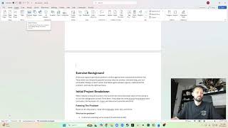
Testing Out Claude Design
Ritzie Williams and his fiancé Maliv Pearson demo Claude Design, an AI tool that generates design systems and full-stack code from a brief. They build a portfolio site and a book landing page, tweaking colors and typography, then compare the output to real portfolio examples and discuss how it fits alongside Figma and hand-coding.
Chapters
All right, all right, all right, your boy is live and direct. Um, I'm looking for where the heck Claude is. Where were you?
Right here.
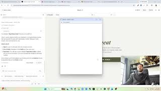
Okay, so what I'm doing today is I'm using Claude to, to, or I'm trying out Claude Design to build my portfolio website. Now what I've gotten so far is I did give it some— I kind of started off with, I want to create a portfolio demonstrating my project. I used HiFi and interactive prototype. It asked me some questions. You can see here, here are the answers to the questions I put. And let's see what Claude answered. I might need to set up a project. So it does have progress, which is cool. That product title Okay, so I did set the pro— the project title to Ritzy Williams Portfolio. Going to set up a design system. That's dope. Then it's going to build the homepage with 3 hero treatment options, build 4 case study deep dives, build about process. I mean, it's kind of a lot. I normally like to take smaller steps, um, but this is nice. It's building out the design system. So far looks great and looks like it's still going. Now the question is, is Will I see it somewhere? It looks like it's— it's funny, it's still building it out in, I guess, maybe in React. It is using JSX for different pieces and content. It's got a stylesheet, so we're still using code to design. We're vibe— we're vibe designing. So I'm not sure why I would do this here instead of on Um, on Claude, but I guess maybe because it's going to default to those steps of creating a design system and stuff like that, which maybe we can then import to Figma and manage, um, as a team. So I'm interested in seeing what the, what the output is going to look like. It looks like you can add new sketches, you can open files here. So it's still got like a a file viewer built in. That's cool.
Um, yep.
Share new sketch. What does new sketch do? Oh, you can sketch on here. That's cool. So if you wanted to sketch and like use it to demonstrate, um, stuff, that's cool, right? So maybe I want to— oh, and then I can attach it to describe what I want to create. Delete that. Import. What is this? Audio. Start voice input. Gonna attach a file. Change models. Cool. Looks like I'm using Opus 4.7. Like, I normally use Sonnet 4.6 or something, but I don't know.
There's a stop.
Oh, interesting. Giving me some random tips. So it looks like it's still building stuff out, so I'm just hanging out in the meantime. I'm really excited to see the output. What does this plus do? New chat. Okay, if I want to start a new chat. Oh, pop up, we've got something loaded. All right, here we go. So this is interesting. Like I said, it still builds it in HTML. Got two tabs, design files, and then the hero scraps. Oh, okay, so this is the sketch that I had. I can delete that. This is cool, nice little file management system inside of the, uh, inside of the file. So let's see, now I had it— I said like, oh, I want some different options. So this probably just gives the option to do that. Yeah, cool. Nice animations. I did tell it like I'm going to be building it on Framer. Let's see, index stacked. Okay, so here's it being stacked or split. Okay, nice. I like the visuals. I'm more— I'm probably gonna— I would change everything to like a white background when I build it. You can do like an ornament density. I don't know what that does. Applies the case layout. Okay, looks like it's finished. What's built?
Homepage, nav, 4 case studies.
Okay, so built it.
URL treatment, next steps.
Swap placeholders with real imagery, refine case studies, case study copy, address, add a resume PDF. Okay, so let's see what we're looking at here. Is there an about? Yep, about was already built. I could tell it to select one of these. Let me go back to the home. I could Uh-oh, where's my little—
there it is, okay.
So out of these, I imagine this will probably use this and this back would be like a video, 'cause I have a video now. So I'd probably reuse that video. Run through, get in touch, view work. This I don't like. This is not bad, but to be honest, I'm not a fan of any of them. So selected work, weird. So this I could do, the stacked view. Because it shows imagery. And then I could do like the, uh, where, where it goes over itself. Oh, sorry guys, I have no video on here. Oh, that's because I don't— oh, I have a chat function too. Okay, so, and then yeah, this is cool. I can do that little fade in. I can do some of these headline texts to slide in. Conversion by conviction rebuilding. So what is this, like more case study stuff? Interesting. This isn't the case study though. Is it? No, there's no way. So let's go here. Oh, it is. So they put it on the page as like a one-page thing. Um, yeah, they just put all the pages. Process. I like it. I like the bold, you know, headlines. I like the everything about it. Affable Summer '26. Oh, you can draw on it, you can edit it. Yeah, let's edit the background to be white.
Okay, so I'm doing what?
Font. Typography mix. Yeah, sure. Okay, okay, cool. So I changed that to white. That's sick. Did it change everything? Yeah, all of those to white. Okay, that's really nice, really easy. Um, okay, what about this? I'm not seeing any color here. It should be more like that.
Let's change—
let's see if we can prompt it.
Let's update the Oh, sick!
So you can see the page here, or like the preview, and that loads it. Uh-oh. Uh, no, it is not white. Okay, so I gave it the specific hex. Let's see if that does better. Paper token. This is not white. Yeah, what's going on here? Are you not sure what white is? What? Let's see, I could manually update this, probably. Uh, how do I see the code for this page? Okay, so the background is paper. Where is --paper? Right here. It is set to white. But it must not be using, um, paper1. Let's see what's using paper2. Yeah, background is a gradient 2, 3. That's the placeholder though. Place all their imagery, and that's it. So, you know, normally I don't think people do all this, but maybe I'm just seeing— I mean, like, why is this a color here? Background paper. See, paper is not white in the actual here. Let's see, you see in the styles, paper is white.
Yeah, so that's weird.
All right, super cool, super cool. I like it. Um, But I think the same— it's the same problem I'm having right now. It's like, yeah, this is nice, this is cool, got a, got a decent layout. Is it— does it match the expectations? Um, what am I looking at here? Example. So I want to look at the best portfolios. Like, let's look at the best UX designer portfolios, right? So now we're doing actual UX work and we're not doing, um we're not doing design work, we can— we kind of need to know what we're designing. And this is where I think a lot of it gets— you know, people can say, hey, go build this, design this, whatever, right? And this is okay, which— but is it going to stand out? You know, like, let's— you know, I, um, I was talking to someone recently and they're like, yeah, we want stuff to look like Apple and and Nike, right? Beautiful websites but completely different, you know, bold text, bold imagery, um, different context, you know. And then you have this minimal imagery. And compared to Apple, similar things, but these are technically e-commerce platforms, bold imagery, things like that. We start looking at something One, if you don't have that imagery, good luck having bold imagery. But, you know, and they'll put placeholders like you see. Oh, there's a placeholder here. Let's go to it.
Cool.
Placeholder, placeholder, placeholder. Let's look at some of the, um, I thought this was—
let me, let me create this in a new tab.
Dang, this guy got on here minimal clean effect. Okay, this is on a, uh, Medium article, that's why. Okay, we've got a million sites up to tell us how the, the best portfolios. So let's take a look. I thought this was good.
Close this.
Let's look at 10 inspiring UX. Kurt Winter.
That's not the portfolio.
Let's view the portfolio. Ah, okay. So this is not the site.
Here's the actual site.
Okay, cool. The product and visual portfolio. So it's got this weird cursor thing that's following. Oh, it's his logo. I see. Is it a K? I don't know what it is, but it's rotating and doing stuff. Yeah, okay, cool. On his hero page, he's got contact, Instagram, he's got links, he's got the time for some reason. Okay, we've got an introduction. This is a carousel. It's a, it's a reel. Okay, what is this? Site of the day. Okay, so some awards, accomplishments. That's really nice. Testimonials. I like his testimonial section. Yeah, I like a testimonial section. I can like reference that for the testimonial section, maybe. Case study. This is how he lists his case studies. Look at this like blankness here. I don't know, me, I, I have this like, I, I like, like symmetry. Like to me this, it's not that it's wasted space, I think the container size is right, but why is it not centered? Now we have that like if that that was sticky, I guess that would have been better, right? If this right here, case studies, would have been sticky up top. So now we're floating and it still says case studies. Um, some of these are okay. So we've got small and big, we didn't go half and half. We've got weird constraints, a lot of like videos or movement for sake of movement, which is interesting. Don't work stand out with unique device. Okay, that's nice. He offers mockups. You know, I will download some. Oh, you got me. I'm subscribed. Okay, and then social medias and stuff. Yeah, sure. Uh, no header, no navigation. I gotta work. Is it all on one page? Okay, so there's a, there's a page of just that section too.
Interesting info.
I assume that's the about. Look at the flip, we've got an experience section. Okay, it's all right. Let's see this Liz's portfolio. Oh, we've got a Squarespace website with a password. That's not working.
Let's check this one then.
I see a lot of these. I'm not a fan of this style. Like, it's like, uh, My fiancée described it as like social media style, like big headline, not headline, but like a whole sentence. I'm a designer, like I hate this. So then what is this? This is immediately getting into the case studies, the links to the work. Yeah, cool.
Let's see this.
Obviously I have a food—
our favorite food places here in Singapore.
Okay, I get it, there's a lot of imagery. Like, I'm not seeing any any like actual UX stuff. Game shelf.
Foodie.
Yeah, cool. Everyone wants to make a food app. No one made the food app except for me. Gallery.
Does it work?
I hate this.
Personally, page not found.
Okay, so I'm looking for something that shows—
oh no, this site's outdated.
Strike 3, you're done. Now let's go back to Claude and say, I need more. So on the home page The homepage does not need the How do I even get to the homepage?
Logo on the top nav.
I keep pressing Enter. I'm so used to Claude on, uh, What's it called? Okay, so let's start pushing the boundaries. I like the overall minimalist, I like the design. This is good. It's fast. It's easy. Um, it, it feels like it's working just like how, how Claude does on, um, you know, on Claude Code with Cursor, like I normally use. So this is nice that it's all on a site. Easy peasy. Um, I can comment on things and update them. So that's really cool. I think this is a really nice experience so far. Um, You know, man, I love, I love Claude. I love it. I love, I love it on like just building stuff. It is essentially doing what I was doing, right? Because I had some things where I was like, okay, I wanna, I wanna design something because I like Claude's output and the ability to like vibe design, but I wasn't sure, like, should I, you know, I know it's coding it, so it looks like that is the, the flow is still coding, you know, coding tools. Um, like it's coding the pages out, it's coding the designs out instead of like trying to lay them out in Figma or, you know, on, uh, I don't know what, uh, Google Stitch does. But here's a question, can I see the, uh, no. So I, I normally what I have it do is I, what I do here, I'll show you. So let me look at— so here is my We Eat. I had Claude code because I liked— I wanted to update the style, so I wanted to get some style reference. I used Claude to like update the visual design, stuff like that. And then what I did is I was like, oh, this, you know, I like the way this looks, give me a— give me a style guide because I'm gonna go build this like for real. So I don't— let me just get some styles, the components, so I can build like a design system. So what I did is I said, okay, Claude, build a style guide. So it built a style guide as you can see here. And it shows the, like the components and stuff like that that I then use to actually build this out. And then I, the way I basically do the design is I have Claude, you know, I'll design out the pages, it's all in HTML or whatever. I didn't need anything crazy 'cause I'm gonna go really build this in a different platform. Um, or I could, I could do a dev handoff where I say, okay, here's, here's this feature. Uh, I'm going to push it to GitHub. And then now there's like a design GitHub that we use. And then we're essentially keeping that design and then the developer can just pull it at a certain point. Maybe, I don't know. I think the collaboration between design and developer is a little interesting right now. Because you're not— you're like, you're giving code, but it's not production-ready code. Like, someone still needs to go link this up and make this work. Um, so I'm not— you know, I've been in my interviewing process and talking to other people in the industry, trying to figure out how that works has been interesting. Um, because like, I as, as a developer would take a lot of this, copy paste it, you know, reuse same classes, keep everything consistent, but I would have the functionality. So say, uh, edit profile— or let me find something, um, that, that has like— that would need a backend. Um, create post, right? So when you— recipe— when you hit publish, this now needs to function, right? It's going to call, uh, the API that's going to create— or that's going to connect to the backend. It's going to create the recipe. It's going to take these things. It's going to fill out the, the data within them, right? So I would need to actually do that. Now, I— to me, if this was built in the way that we were building the front end, say React, mission accomplished. I'm you, I'm taking— I'm pulling this and maybe just taking that section, copy pasting it, updating the stylesheet, 1, 2, 3. I would need to worry about the front end 0%. Um, if I, if, if I was, you know, running this well, and, and assuming the, the— there should be some checks and balances, make sure the code is high quality, right? It's good, it's scalable. Um, but now I can use this, I can publish this. I would just connect the backend data so it sends the data and it, you know, does the whole shebang. Um, but I think what, what does need to be there is documentation on which tech stack to use, how if you are using Claude build, uh, here's how you prompt it to start a new one or pull the, pull an existing project, right? So just kind of some onboarding to make sure that the designer that's Vibe designing essentially is working with the, the same tech stack that the development team is working at. And then you really can do good handoffs. Otherwise, what I'd probably say is do like just plain HTML and CSS, kind of like this is built, and then you can go and like copy and paste certain sections or snippets and then replace them with real components. Um, you know, like you can use the styling, like say you're doing like your real products built in React, uh, you can go here and you can take like the styling for this and make a component out of that. And you just take the, like, the div structure and the styling and you turn that into a component that you'd reuse. Stuff like that. Okay, so now we're done here.
Let's see, pure white background.
So they fixed this, that's good. Cool. Currently, that's cool. I like that. I like that. That's cool. Selected work. These are cool. Let me see, do I have the tweaks? That's cool, you can ask for variations. Design products. On me. So this is like the me section. This is really cool. I love this. I really like this. Now I would probably add some motion to certain parts of it, um, just because that's like big on Framer, but I'm really liking the output of this. I would change some things, like this would probably be bold. Um, yep, so just like we saw before, the, um The page, it's just a page. I would take the on me out. Let's— okay, so this is just the work, just moves me down on the page. That's lame. About, file not found. Is that back? Yeah, that's back. Okay, process just took me to the home page. Contact, just took me down on the page. Okay, so let's, let's see.
Fix background. Yep, nice, nice.
Okay, thank you for fixing that, Claude. Now, always polite, you know. So now I'm doing it just like I'd normally do on regular Claude. Damn it, Sean, you're gonna text me? Use the chat. Okay, so while this is running, it allows me to—
oh, about—
did I say about all updated now?
Get a work page component and build the work. Okay, sure. You do it.
You do your thing there. So now while this is, I can go back to, to doing research. Okay, so let's do this. Oh, this is from IXDF. Let's see the 10 most inspirational UX design portfolio examples in 2026.
Okay.
Product designer and Google Google is this link?
Yep, sure does.
Okay, minimal. I, I love it. I, I've been, you know, I'm trying to get behind like all this like random motion. Oh, previously at Microsoft and Sprinklr, Space Design System, Microsoft Budget Planning, minor movement. Straight to it. So straight to an about and then to the case studies. I'm seeing mentions. Okay, so her portfolio has been mentioned by these things. I see, that's nice. So an award section, experiments. Okay, so we're just showing it's on prototype videos. Yeah, cool. Oh, so the home is the work. Got it. Cool page transitions. Enter password. Enter password. Okay, so that's cool. She says enter password instead of like read case study. Oh nope, she played me.
Okay, cool.
Is there anything I'd like from here? No, not nothing I'd really like to save. Now is Claude done? Yep. Oh, that's cool, so it shows a check mark so you can go do other stuff. So now let's go to work. So now, cool, it's got a headline and then— yeah, nice. Oh Weird motion. Oh yeah, cool. So now it has the case study. I— oh, sticky. I like that. Oh, this is good. This is real good. I can get behind this. I can get behind this. Can I get back? There's no way to go back. I guess I could always just go back to work here. Nice. Mm-hmm. Okay. So here's the thing, right? Like we said, like we did before, this is real cool, but I need to build this. So this is fantastic. Create a I'm just gonna call it a style guide. Hey, Maliv, you wanna come on stream and take a look at this? Okay, cool, I can show you. Special guest appearance, everybody, a round of applause for the one, the only, Tiana Ritzey's fiancé, Pearson! The crowd goes wild! There's so many people watching. I know you can see the 2,000 out of my 7,000. So what I'm checking out here is, uh, this is called Claude Design, claudeai.design. So Claude, you know, the AI tool that I use for building stuff. They released a, I guess, a design program. It's on the web. So very similar to how I do it for code. It's, it's doing it on here on the browser. So I was like, let me try it and let me try to build out the portfolio. And so here's what it's got so far. And I'm kind of digging it. It's kind of got a good mesh between some of the stuff we looked at earlier and, um, some of the, the other things like the Art Deco style. Uh, it's got this, but maybe we can, you know, animate this a little bit more. Cause I know you were talking about the header. Um, but big bold text on here. Got some details. View work. Um, then I like this currently, you know, Founding Designer, kind of cool. Selected work. So here's the work from it. It does feel like this— these section blocks are kind of interesting. Maybe I'd make them bigger or something, but I don't know, like, because I'm like, okay, we've got underline here, underline here, now we've got underline here. It's getting a little weird. The 2 and then the 1, I'm not quite sure what that means. So these are old, resume now, and this is chat. So these are 2 different projects, number 1, number 2, 3, 4. And I can make these move or something.
Uh-oh, uh-oh, this is a different page.
Let me go back to here. So visually kind of nice, obviously these will be pictures. Not, not this. I just placeholders. On me. I don't know why it said on me. Yeah, I gotta like it too. On me. This is who I am. What's on me? And this would be the about me section. It's a little lower down the page. Oh, Brooklyn, New York. From Brooklyn apparently.
I'm just kidding.
Los Angeles all day. Oh, revenue driven. That's cool. Product shipped. Full bio. Download resume. Clean, kind words. These are my testimonials, which I do have. And then a bottom. So that's sick, right? The work page, it just takes you to there. Here's what one of the pages would actually look like. You go here, there'd be like a header image. Go here, this is context, problem. Clean, right? It kind of is a good balance between the stuff we've seen and the, like, my kind of Art Deco vibe, right? And, and I'll add the motion too, right? Like, this will still do the countdown, you know, the stuff. Um, some of the images, some of the, like, the hover effects will be better. I think on some of these, um, like on the work, instead of doing it like I would do it like this and it would be bigger, whole section float up like we saw. Um, so stuff like that, I could take this.style and then do it. Now I did have it create a style guide for me. Let's take a look at what it looked like.
Go to the design files, style guide, open, Brandmark.
This is my logo, doesn't really matter. So here's the colors, typography. So we have a display Excel. Display large, display medium, display small, body large, body, eyebrow, JetBrains, Roman numerals. Oh, the JetBrains is the font. Okay, interesting. Motifs, that's interesting. I don't know how I'd get these. So rules and spacing. Spacing scale, yeah, sure. Buttons, there's this default filled gold, so button accent. Editorial elements, quote. Metrics. Placeholders, doesn't matter. Work card. Oh, the work card like this one. And then chapter card. Testimonials. Okay, so that's cool. Most of the stuff I'd need is really the— these things, and then I would build the other things out as I go using these. And it's not bad.
Yeah, thank you.
I also like that. I like that a lot. So that's something to incorporate. I think right now it's being done a little weird on here where it's got like 2 and then it's got 1, 2. Like, I think this is saying it's the second section. What is this? MM— I know this is 26, but— oh, 2026. It's 2000. 1000, 1026. That's kind of cool. I like that. Yeah. Oh yeah, fits my vibe for sure.
Yeah.
So I like the style and I'll translate this to some of the more visual. So I'm really enjoying this Claude Code, uh, I mean Claude, yeah, it's Claude Design thing. And I'm not sure how much usage it has, but I probably, um, I'd probably use this.
What do you want to add?
It'll update it. What are you gonna add?
No.
Uh-uh.
What are you gonna add?
You wanna create your own? You should, you should create a Jester's Heart. Let's do it. Let's see if I can walk you through. Okay, so let's see. So I have, where's my projects?
Your design's cool.
Let's do a new one. So project name, yeah, let's do it real quick. Gestures part, um, landing page. We, we, we could. So let's see, let's go to create.
Let's Anyone can do them. That's nice.
Okay, so start with context. We can add a screenshot. So let's tell it first.
So we're creating Fairytale, Venetian. Yep.
As he, uh, what does he do?
He competes.
Whimsical is a good one. How do you spell it? Okay, so now let's see what's gonna happen here. Okay, so there's some quick questions. I like that it does ask some questions to get some more context. I'd say showcase the book and author.
Just forward color direction.
Which one? Uh, just one. I like the last one too.
If you prefer to name it Oh, if you prefer to name it instead. Masquerade.
Yeah, yeah, that's the best part. Okay, yeah, that one's good. No, but I feel like that's gonna be too much like written and not enough imagery. I almost like— I almost like Masquerade.
Yeah, okay, Elegant Serif Display.
I think that is how it is.
We don't have black letters now.
Let's explore a few options. Which selection should the page include? You know, and the FAQ, why not? What imagery can— do you have book cover? Author's side direct, I'll say that. How much motion?
Let's do this one. How should I present options?
Which tweaks will be most useful?
What are you doing?
Oh, your book on the screen. Anything else? Pull quotes, release date, author bio.
I'm open to— Okay, let's go to it. Let's get it.
So now it's building it.
[FOREIGN LANGUAGE] —now we're making the webpage, is this what we're doing? Yeah. Maybe? For that book, so that there's some background. So they know what's going on.
And this is us doing it from scratch. You know, they're— with just a few— we told it what we wanted, we answered a few questions, and we'll see what comes out. It's going to take a few minutes. I don't know if it's 2 days. Oh, did we? Yeah, it comes, it ships 2 days after it's ready.
It's still creating it. So it's gonna—
what it's doing is it's gonna do the scaffold HTML and component files. It's going to build a hero and cover, synopsis and character intros, excerpts, book spread styling, uh, praise for the author, buy, newsletter, cursor effect, ambient Tweaks. Okay, okay, it's built the style guide, so now it's going to lay out all the scaffolding, what it's saying.
Yeah, he'll be there too, he says.
Yeah, and this is the cool part, like, like normally though, this does take like— you, if you were doing the design if you were doing the design, you'd still— here, I'll call you when it's ready— you'd still have to set up the file. You're going to have to set up the layout. You're going to have to set up all these things. So it's not like these things are skipped, like the waiting periods are skipped for design, but it's— it feels different because you don't actually have to do anything. Like right now, I can go get a drink, I could walk around just while this sets up. And a lot of times it's much faster than this, but But the, the good thing is that you don't have to, uh, you know, you don't have to work. Normally you're like locked in work. I'm starting to create some components or pull some components, or I'm doing stuff. At this time you can be doing research and looking at other stuff. Speaking of which, I will probably do that. We can go back to looking at our portfolios. Okay, so let's take a look at some of these. Oh, we were looking at these earlier. Uh, this one right here, Selena. So see how this is like full page? And look, no header, full page transition, full page transition. Go to portfolio, it's like the same, right? Full page. Oh nope, we do have different, different layout here. Oh yep, he's here. Still not ready. Okay, still building. All right everyone, we have explored Claude Code, or Claude Design. Um, overall really enjoy it. Um, but I gotta go. Until later, see you guys.
More from Ritzie


I started my career doing lots of graphic design and having to create and edit images.

How to Upload a Project to GitHub (Using Claude + Cursor) | Step-by-Step Tutorial