Lean UX Enabler (Concept & Lo-Fi Designs) - Day 2: Research Review, User Flows, IA & Drawings
In this recorded UX design session, the presenter walks a cross‑functional product team through the second day of a Lean UX enabler sprint focused on onboarding for the Wheat web application. The session begins with a competitive audit of recipe‑related apps (Provetchio, Recipe Keeper, Cooklist) and a broader inspiration review of Pinterest, highlighting their landing pages, sign‑up/login patterns, and the lack of functionality compared to Wheat. The presenter then audits the current Wheat web app and its design system (named "Delicious"), noting existing components, templates, and page structures. Secondary research on onboarding best practices from 2022 is summarized. Using this research, the presenter builds an information architecture (IA) and maps user flows for authentication (sign‑up, login, forgot password), account updates, and discover‑people steps, adding hypotheses and acceptance criteria. The IA and flows are transferred into FigJam where lo‑fi sketches for a desktop‑first onboarding experience are created, covering home, sign‑up, account info, discover people, feed, profile, settings, and related navigation. Design rationale for a whole‑page desktop flow versus modal, inclusion of confirmation steps, and considerations for responsiveness are discussed. The session concludes with a description of the Lean UX process: moving from research to IA/flows, to lo‑fi concepts, to prototyping, usability testing, and finally Hi‑Fi implementation, emphasizing the collaborative, iterative nature of the sprint and the need for low‑fidelity work before committing to higher fidelity designs.
Chapters
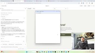
Okay, so I have done some research. I've gone through and I'll walk you guys through what I have done here. So just looking back at the documentation, then I'll have this area for app analysis. So this is the one of the first apps I looked at, um, called Provetchio. It's, um, pretty good UI for creating recipes. So I just looked at theirs. They have this landing page that has some, some product highlights. Some information about their products, just basically a home screen. Then there's a either become a creator or a sign in. So if you sign in, you just log in and go to your dashboard. There's a profile section that allows you to update it. There's also from signing up, or I guess this is the login but you log in, or you sign up. So I think I have this order a little wrong. Yes, I do. So this is there and this is there. So very similar initials, initial screens here where it's assigned an email and a password, but this has a forgot password and don't have an account. You can sign up from sign up. It's just email password, and if you have an account, sign in. Next, it takes you to a username and then a— if the username is available, it confirms it. And once you create an account, it takes you to your dashboard. So that was one I saw. Here's the login experience. Looks like I already had that on the other one. Recipe Keeper is another big recipe keeping app. Theirs is all just highlights, product highlights. And then it's got the, the main call to action is to download it in either the App Store, Google Play, Windows Store, or Mac Store. So it's all applications, they don't have any web experience. Cooklist is a really cool pantry keeping app, very similar. So it has you get the app and do all the work in the app. So a lot of the, I guess, my competitors are really pushing towards the app experience, but These competitors don't have all the functionality that Wheat does. So I started looking at a similar non-specific food-related app, and that's Pinterest. Pinterest has a homepage that has information on, you know, some of the product highlights. When you get to the bottom, it says sign up to get ideas. It's also got like a footer. It's got all the legal stuff. Uh, if you click sign up or log in, it kind of pulls up this modal that allows you to do one or the other. So you sign up, it asks for email, password, age, then it says you have an account. Once you click next, it asks how you identify, your language and country, so your locale, then asks for some interests. Then also it has like a CTA to download the app and then go into your home, you know, your home screen, which is like your feed. If you click the profile up here, it takes you to your profile, which has information including share, edit profile, your pins, other ideas. And if you click edit profile, you can see all your ability to update your profile here. So that's what— that's the inspiration. I also looked at what currently exists for WHEAT. So we have our current website. It's the homepage. It already has some of the product highlights. It's got news and blog posts. It's got, you know, kind of a description of what it is. Then I looked at the native signup flow. So currently, how do you sign up? There's a, you know, native— the home screen, a welcome screen. Depending on whether you sign up or log in, it takes you through a flow, pretty straightforward flow, error state. Then it asks you if you want to follow certain people with the amount of recipes that is associated with their account. Then it's a home page. The empty state didn't really load, but you can see it takes you to a feed. Besides that, you go to the profile, which is on the bottom. It shows you your profile and a bunch of information, all the, the categories associated or posts associated with your profile. If you go to the settings in the top right, it takes you to the settings where you have account security, support, about Wheaton, logout. And if you click account, it takes you to this form. And then if you log out, it asks if you're sure. From the login experience, it's just email, password, login, forgot password. Once you log in, it takes you to the feed. And then the forgot password flow asks you to enter an email. It says, uh, it's, you know, confirmation that you entered your email and then you get a password. I also looked at some standards and best practices. This is secondary research. So I found 6 onboarding best practices for '22 from Chameleon, top 9 onboarding practices for 2022, which is UserPilot, and a guide to effective user onboarding best practices, which is Topol. And then I also looked at what patterns exist that can be used for the design. So you can see here we have the WETE design system called Delicious. And it's got the components, templates, and pages. So if we look at the design system, we can see what already exists. And this will be helpful for when we're doing our layout so that we can see if there's any layout or exploration that's already been done in this regard. So we can see app header. We see avatar images. We see that we already have a few basic level components. I think we also even have some web components as well. I think it's called site header or global header or something like that. Yeah, global nav. So you can see there is kind of a larger navigation item or global footer. So there are— there has been some exploration that's already been done from the component level. Template level, we can look, we see it's all, all mobile. From the page level, we also have all mobile. Screens as well. So that's what was gathered from research. Now from there, I would go into the next step, which would be information architecture and flows. So you can see here the documentation and research. Now we go into the concepts. I'm going to use FigJam for this. So this is an area I'm still exploring how to connect the two. I really wish there was a better way for this, but Going into FigJam, I'm initially gonna start with what flows there need to be here. So, um, sign up needs to be on here. I like to make this a header. I also like to use the squares in white or like a gray, or since we're wheat, let's use yellow. Uh, so we already know we have our homepage, right? So let's start off with home. Makes a rectangle. From home, we're gonna need sign up, or we can log in, but we're gonna go with just a login flow for now. So sign up, uh, you're gonna need to enter account info. Now let's look back at our research. I'm going to close these so I can easily, uh, click between them. Now let's look at what already exists in our current app. So username, full name, email, password. So right now it's all one. So create account, sign up, account info. Then we have discover people. Then we have your home, uh, feed. All right, so then you're authenticated. Now what we could be adding is confirmations. Like, there could be a confirmation. We saw that on Pinterest, that there's an account created confirmation in between here. I feel like it's pretty straightforward at this point, but I would like to say maybe confirmation plus next steps. So that's where you start getting into like some onboarding. And that's what I'm thinking, like to help guide the user in, in a sense to know now that you've got an account, what can you do? And then we'll take you to the feed, which will show you if you've already followed people from the discover, it'll show you people. If not, it'll, it should maybe have those next steps or something like that. So that's the signup flow. Let's look at the login. I think login is pretty straightforward, but let's play login. Um, yeah, so home, login, authenticate, back to your feed. So pretty straightforward. Next, let's go with update info. So assuming you're already logged in, right, you need to be logged in. We're going to start at the feed level. You go to your profile, you go to settings, and then you go to account information. So once you've updated the information, you should get some kind of confirmation that the information has been updated. And then that should take you back to the account information, which will allow you to navigate back. So let's also talk about forgot password. So this one takes place from home. You go to login. Forgot password, enter email, confirmation. And then we can actually, uh, if we, we wanted to make the flow a little better, if you notice how it was currently done, it sent you this random password that you had to enter. Realistically, what we could do is maybe something better. Once you click the, the email, you still get an email it asks you to reset your password and insert a new password instead of just completely renewing your password. So from here, uh, email sent, email verification, let's just call it email, right? You start from there and we can even put this like down here so you can see it or like this. So then you update password, and then should it take you back to the home screen where you re-enter that password that you just created, or should it just take you to the feed? I almost feel like taking you back to the unauthenticated state and making you enter that new password you entered helps validate that you memorize that password, but You know, here's an area that we can explore more research, right? We just need to turn back to our research, and right here you can see we lacked a lot of the forgot password research in these scenarios. So we might wanna go take a look at that, but just prior to the initial, you know, to get past this, or to get to the next step, let's talk about login. Right, so we can even specify that. I think this has comments. Should this go to login or should it immediate to Kate? More research to be done. All right. So that way we keep a note. So that's our main flows. Now these are very important because I'm really gonna track the screens to these when I'm doing the concept. I need to make sure that we have the home screen, there's a signup screen, there'll be a screen for you to enter the account information, and might— maybe it's on the signup screen, but nonetheless it still needs to have that. There needs to be a discover people screen, then there should be some kind of confirmation, then it should take you to the feed. So then I actually use this when I set up my concepts to make sure that you can click through this flow and see this flow. And in our second— this right now, we're kind of in the transition between day 1 and day 2. This is the, the kind of heads-down work that as a designer I do. But in the next meeting, I'm really going in to present this. I'm going to say, hey, here's the flows I've identified, here's what I think needs to be there, is there any deviation? And we actually can consolidate some of these. So let's do this. All right, and we'll call it authentication. And in an effort to kind of keep everything in one file, I'm actually gonna copy-paste this into the concept section. You can see there is a section for user flows. So let's paste it. Hmm, that didn't work out. I know why. So let's paste it. We're going to group it. We're going to put this in the user flows. We'll call it flow container because we name our layers. We'll move the drawings lower. And then the IA, let's do that now. So we know we have a home screen which inside of it kind of has, uh, Signup. I like to have it kind of tiered so you know that it's inside Home. And then there's Account Info under Signup. There's also Login. Which has— oops— authenticate, and also it has— sorry, I'm probably zoomed real far out— it also has forgot password. So that's our home. Then we have our feed. Well, really we have more. We have feed and a bunch of other stuff, but really at the same level as the feed, we have the profile. And this is actually coming from a larger understanding of, of what's going to be in the app. If we did not have Sorry, I just realized we're missing some. If we did not— if this was just to authenticate, right? At this point, we don't even have posts. Sorry, so if we don't even have posts, we don't even have a feed, right? At this point, we don't even have other— I mean, I guess we might have the feed for discover people and it'll show a list of people. So in that case, let's put that. User activity. We also probably need a way to search users, which we'll call explore. Search users. And then when there is activity associated with your, with your profile, you're gonna need to see that somewhere. So we can call that activity, which will have a list, or I guess, yeah. And then we have profile, and inside that profile you should be able to see that, that data that you've entered. So user info, one of the acceptance criteria was seeing the posts, right? So the ability to see the posts. You also have settings Inside settings you have account info, you also have security info, and you can combine those or not depending on, on the expectation. Right now my hypothesis, and all this right now is hypothesis based on the research that was done and as a designer my thoughts and and what I think is gonna work. Now, ideally, we're gonna test this and make sure it makes sense to the user, but right now I'm saying, or I'm speculating, that we should break out account info and security info, namely because that already exists in the app, right? So if you're familiar with it on the app, it already exists, so keeping that familiarity. Also, as the account information expands, having a kind of a clear separation might, might be beneficial. And is there anything else in this settings section that needs to be updated? The ability to log out, but that's really an action. That's not a— that's not part of the information architecture. But I think generally that is our IA. So let's move all this to here. Command+C, Command+G, IA container. Okay, so now we have this and it is way too much. There we go. So now we can review our IA, our user flows, and then this is where I start turning this right here, our flows, into drawings. Uh, so right now And this is all done between the first and second day. At this point, you can, if it's kind of a bigger feature, you may end up just getting to here by the second day and just saying, okay, let's align on the flows, let's draw this out, and then we'll draw out the UI together. When we were more in person, this would happen, the drawing would happen in the meeting. You'd go in, you'd bring the research, you would bring, you know, kind of how, you'd even go with the flows, that would happen in the meeting too. So really you'd go in with some understanding of the documentation, you'd go in with some research, and now day 2 you're showing up to the meeting drawing the user flows, some of the IA where you expect the stuff to be, and the drawings. So all this is happening really within a 1-hour meeting, but you're going in with all the information. Like the same way you guys saw me do it just now, you would do this in more of a collaborative sense with like the product team and the business team to kind of help align. And help bring those predispositions and those assumptions to light. You know, they said, you know, we need to be able to do this. So you're saying, okay, here, we're checking that off here. Here's how we would accomplish that. And then you're gonna draw it out together. Now I'm gonna draw it out here live. I'm going to use the same FigJam file we used. Okay, so now we're gonna go into drawing. So let's, nope, it's following me. Okay, cool. So I have an iPad. Right here. So we're doing a little digital drawing. Okay, cool. So that moves it. I'm left-handed, so I struggle here a bit. But let's draw some UI. Now, first thing to consider is that we are designing for web desktop breakpoint. And I say that because the— we have a mobile experience and the expectation is that they'll be able to now do this on the computer, so they'll be able to use a computer and use things to type, type, you know, type instead of, uh, enter it in on our phones. So the expectation is that by putting it on the computer, we'll be able to make it faster. That's the whole kind of point of the, the EPIC. And with that, that regard, we'll design it on desktop landscape, especially at the conceptual level, and then test it. And if we feel it starts getting more complicated, we'll also like test it on mobile too. So maybe like recipe creation and things like that. But for onboarding, I think it's pretty safe to say that we'll just test the initial concept in desktop. So firstly, okay, looks like that's working. We have our home screen, right? It says wheat. And let's quickly review what that looks like. So we have wheat in the middle. You've got some links to the side, some social media. Cool. And have our home, which has some text. Now currently the text is in the middle, so maybe we keep it that way, or we can put it to the side. But I kind of like that middle text, so keep it like that. And instead of download on iPad or whatever, we'll have a get started. Alright, so that'll be the text. Let me zoom in here a bit. Okay, so I have to zoom in on my iPad for you to see this. Okay, and then really all the rest of the page is going to be the same, so we'll call it like, uh, product benefits. I think that's this right here, right? The icon section, news, which has like a couple blog posts. Yep. Flitter, you know, whatever. Okay, so from there we're going to go to sign up. So let's call this landing or home. Okay, from there, so sign up to me seems like it would be kind of like in a, in a flow. 'Cause realistically I'm thinking how, like navigation-wise on the header, do I, do you exit the signup process or is it a modal or is it something like that? Now to me, I kinda like the whole page experience. I'm more of a whole page experience person. So we'll have a header here and we'll have the flow header. You're getting into the flow because realistically you're going into the flow. You're gonna create an account, you're gonna enter account information, and then you're gonna go to the, You're gonna go to the— you're gonna go to the Discover People section next, and after that, after that, then you enter. So it is a kind of a multi-step process: create account, discover people, go to home. With login, it's pretty straightforward where you're just going to enter your information. Now, I do think the information can expand, so let's say it's a an X here, it still has wheat in the middle, oops, wheat in the middle, nothing else. So then let's say sign up, we wanna have kind of a big sign up, maybe a description, and I think that can be centered, but you know, we'll figure out the UI later. And then we add our information in there. So let's say, Name, email, alright, password, confirm. So all the information. Now one area we did say is we need is like the marketing consent, or we need marketing consent, we need privacy policy. So we need to put Little marketing consent here. Maybe consent or whatever. We should review with legal whether it needs to be checked or like you need to checkbox this or not. This could be marketing consent. And then we could do something like this. Continue or create account, whatever the CTA is. Put like a disclaimer down here that's got like the terms and conditions. Or whatever, and that way we have this here. So now we have the signup process. Now what's gonna be kinda cool, since we're on desktop, we can kind of elaborate on that discover people, that discover people section. So, oops, keep spelling wheat wrong. Now this is actually, at this point, the account is created, The Discover People is actually an extra step, but the account's already created after you hit Continue. So we may want to kind of specify Create Account at the CTA, so Create Account. And I get, you know, you probably can see that's why, like, I guess Pinterest does the confirmation after this step to tell you, hey, you have an account now. Discover People. So that might be a good idea now that we've started drawing to tailor that, where we do add some kind of confirmation, some kind of celebratory event. But I do kind of— it's interesting. So I'm gonna start off here with just continuing this flow, but we potentially could do like a confirmation and it says Next Steps: Discover People. But it's weird because there's only one step. If there was multiple steps, if this was a longer process, I think it would make sense to have a confirmation, but since it's only one screen, let's say just go straight to Discover People and then maybe we'll give that confirmation. So with Discover People, and we're on web, we can really kind of elaborate. We can put user image, username, username, right? And on web it says like the number of recipes, so number of recipes. Recipes, but now we can actually show some of the recipes if you want, and maybe even take the product details. So maybe having a little list here, recipe name, you know, maybe showing some of the recipes, like the top 5 recipes or something, and then show the next user. We obviously need a way for them to follow them, so we're missing a button there. So it can be on the opposite side of this container. Follow, follow, right? And there needs to be a way to go to the next, the next section. And this is now getting into patterns. Now we can put it up here, but the last one would be the button was on the bottom, but that was like because it was on the bottom of the form. We can put a fixed bottom here, because you can actually leave it at any point. So, let's do something like that. So, fixed bottom that says "continue" or "finished" or something. And so, we'll move down. I'm just gonna go in this, this order, like straight down. And then, you get down to, you get to your feed. So it's weird because we had wheat in the middle of this, this whole time, and realistically it should shift over. So because we are on our navigation, we're gonna have, uh, home, which is the dashboard. It's gonna have explore, right? This is based on our IA. Explore, activity, and profile. Now, if we wanted to keep it very similar to how we have it in the logged out state and how it is now, it looks something like this, right? We, we could put some of the navigation items here like home, home and explore, and we could do icons here, activity, profile. Sorry, that's an ugly bell, I know. But we could do something like that in the navigation. I mean, or we could do something like, you know, the— it on the left side. But you know what, we'll save that for the UI. At this point, it's not really relevant. We just know we need to be able to navigate to those spots. So you here, you here, you here, you here to the side. Then we have the home, the explore. So like I said, at this point, if we were to release the, uh, this, this app or whatever without, without the feed, it pretty much would be the discover page, uh, again. And there, at this point, there's no way to, um, there's no recipe entry. So if we only released with just a user profile, there's not even any recipes. So it's kind of a blank screen. There's not even really point to design this. So let's kind of skip to the profile section, and that's where it'd be nice to check out research. Now, just from the top of my head, you could do something like this where you have, you know, a user image, you have the username, which could have the first and last first and last name below it. So you have username, first name, last name. There's a way to enter a description, like a biography or whatever, a bio. And then besides that, we have the different types, the different post types. So right now you see, you notice that there also should be a follow and, uh, followers following, because that is somewhere we're gonna have. So we can say Followers, following. Oh, you notice we're missing settings. So how do I update this? Is there a settings? Is there a sub-navigation? That's kind of a tough one. We do need a way to do that. So let's do missing settings. So a lot— there's a button like in here somewhere. The question is, do we want to have it there? I'm not sure if I really like that pattern, but is settings a top-level pattern? Is it equivalent to profile? And I believe that— who are they? What's that? What's that company? Pinterest has it here after following or before following. So I think it makes sense because this is all the information that you actually are able to update. Alright, so all the stuff above it really you're updating. So, hmm, basically all this stuff. But, hmm, it feels weird that it's below there to me. It almost feels like it should be a part of it. Like, we could space this out, have the button here, like opposite in a sense, so like this. Edit, you know, so you have your username, you have your profile, you have the username, you have edit, this, and then this could like span all the way across. TBD, doesn't really matter. Like, this is all conceptual, it's a lo-fi, right? We'll figure it out when we start doing the real layout. But continuing on to this, we have the, the recipes, the posts, the meals, and how we're going to display those. So that is part of the acceptance criteria. So we have meals, we have recipes, meals, and orders, all of them which can be infinite length. So to me, I think we show a certain top and then we have a view all, which has a whole page dedicated to it. So looking at the hierarchy, we have recipes and on the other side, view all, or it's a button below or something. Actually, I kind of like the button below. So we have recipes, we have some top recipes here. And then we have the view all below it. Same for meals. Now, one thing we're doing on the other side is we're content switchering, if that's a real word, but we're basically separating the cooking and restaurants. So we might want to do something like that here. So let me actually do that. Oops. Let's not get the G. Okay, cool. So content switcher, cooking restaurants, right? So at this point you're sitting here looking at the cooking section like that. And then if you cook the restaurants, you'll see all the meals or locations or something, something, right? It'll show something. To be honest, we don't necessarily need to focus on this part for this feature, but that's where it will be. So when we are talking with the cross-functional team or explaining the scalability and long-term of how this user profile fits in, we do need to kind of expand on that. So now we have the area where the settings section that we need to do. Which could look like this. Now we don't need all of our navigation because you went into a flow, so we do need a back, back to our flow header, wheat, um, no, nothing else. And then we have separate sections. Now we can do a kind of a division where we have account Info and Security, or we could at this point, since there's only one, you know, one section, we could just separate it as part of the page. So header, actually what we should do, Settings, alright, that's the page level, then we have account info. And we can display it and make it all editable, right? So we can have something that says username, right, the name, and then there's an— oh, sorry, if we want to make the whole thing editable, we add the edit at the user info section. And then we say we have basically the data, so we have name, we have all the other information, but then we also have security, however you spell security, and then we have password. Now password you have to edit individually, so that has Edit functionality there, and there might be some kind of divider between these two, but edit, uh, is there any other security? There may be two-factor authentication, things like that. That's why we kind of separating it, um, and we can even look into the app and see what else is separated into there. But you know, something like that. Now you don't have the save here because the editing functionality goes on those other pages. Which will have, and they'll be pretty much the same page, but with, if you hit account info edit, it'll be a page of inputs that you change, and security, it'll have old password, new password, you know, something like that. Old password, new password, confirm password. So as of right now, just 'cause we've been going for a little while, I wanna wrap up the drawing portion, and as we're doing this, we're doing this with the cross-functional team, or if it is remote, like, a lot more recently, since we're working more remote, we have, you know, drawings like this where you may go in and show this. And actually, since we're here, let me stop following myself on here. And you'll want to take this information, these drawings, copy them and move them into your Command-G. So you're going to want to move them into your drawings container. All right, so I have a flow section here. Let me move this, and I don't need this. I'll just call it drawings because you, you get it. It's— well, I guess we get to call it the signup flow. So that's the signup flow. So that's our drawings there, and now we keep it documented. So we also prototype this thing within this page as well, because we have all the information here. All this really is is the exploration and the concept gathering for, you know, for the design that's gonna move into HiFi next. We're gonna move— next we're gonna do an actual prototype, something testable, 'cause that's the end deliverable, is getting something testable. Can we create a concept that is testable and users can get through it and create it. Then we move into HiFi, which is the actual building blocks. Now this right here will get us enough to make sure that our concept and what we think we're designing is usable to the user, but the HiFi is the actual blueprint and that needs different breakpoints. That, that's actually what's going to be built because right now we only have a drawing for a desktop layout, but realistically it needs to be responsive. People are going to be signing up on their phone from a website or they're going to be accessing different pages through their phone, through the browser. So we need to make sure it's responsive. As of right now though, we need to make sure it's usable. So we are gonna design concepts next, which is still part of the enabler, and then we'll move into usability testing. And also, this is what wraps up the second, the day 2 meeting. So as of right now, we did a ton of stuff. We understood the problem, day 1 we understood the problem. We went over, you know, the predispositions between day 1 and this meeting here where we did our drawing meeting. We did research, we reviewed the research, we came up with user flows, we came up with the information architecture, and we drew the initial concept for the 3rd meeting, which would normally be a Thursday. So if you have meeting 1 on Monday, meeting 2 on Tuesday, meeting 3 would be on Thursday, which gives us, you know, some time to turn this into a a concept pretty much the end of this, the day, all of tomorrow, and then the beginning of the day for the next, until the next meeting. So it gives us a little bit of time, but we'll be reviewing this concept. And this is, this, that's going to be more of a demo from UX to functional. Say, hey, based on what we drew, here's the direction we're going. Sometimes you may need more drawings, like there's not enough time. You see, we only got through the signup flow. We might need to go through the login. And we'll stay at this phase really until we all agree on, okay, this makes sense. 'Cause you wanna spend more time on lo-fi, less work. Right now if we say we don't like this, this is an easy change. Really easy change. It gets a lot more difficult once you started building. When I've spent, you know, 12 hours designing the concept for this, it's a lot more difficult to change. So it's much better to stay focused on this lower fidelity and kind of figure out your direction before moving up a level. So next up is getting into the prototyping, which I'm gonna do here live with you guys so you can see how I actually lay out components on Figma, how I create a concept and things like that. So I will see you guys in a bit.
More from Ritzie


I started my career doing lots of graphic design and having to create and edit images.



How to Upload a Project to GitHub (Using Claude + Cursor) | Step-by-Step Tutorial