Navigation Bar Component Exploration
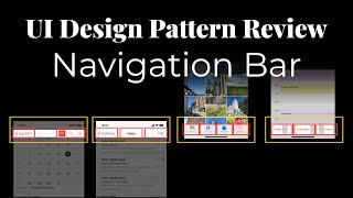
Ritzy Williams builds a flexible navigation component in Figma based on Apple's HIG, showing how a single 375 × 48 px row with five item slots can work as a header, tab bar, or toolbar by toggling status bar and home indicator states.
Chapters
Hey everyone, it's Ritzy Williams. I'm here for another pattern review. This one is a little bit more specific to building, um, building a component in Figma or in actual development, but check it out. So as you can see here, we have the Human Interface Guidelines. This is from Apple around their development. So if you go to their bars, you can see they have a navigation bar, search bar, sidebar, status bar, TabBar, Toolbar. So let's look at the NavigationBar. So you can see here, this is kind of their navigation bar. It has a status, it's got these, you know, 3 icons on the right, and this back section here. You see the search bar is a little different. It's, you know, basically one big component inside of a, a bar, uh, and then inside the component it can have things, you know, whatever. Um, sidebars, this is more for tablet usage, but let's see, status bars, that's the status. So these are the main ones I really want to talk to as well. So NavigationBar, TabBar, and Toolbar. So you'll notice here the, the tab bar, and it has the whole section for the home indicator because it's the iPhone 10 Plus or whatever. But you'll notice there's a tab bar. Also in the action bar, this one has just one thing and an icon, but you can also have, you know, 5 things— 1, 2, 3, 4, 5. And I did a breakdown, so let me minimize this and show you what I did in Figma. So you can see here, the yellow is the full component outline and the red is like the, the pieces, the section outline. So you'll see the whole navbar is, uh, here you have a left accessory, you have a right accessory or piece. I'm calling them accessories or whatever, just the one I heard before. Here you have one with 3, 1, 2, 3. Here you have the full thing, you have one with 4. Here you have the same thing with 3. It could be 5 if you count those middle things, but realistically you wouldn't, wouldn't do those. So I've come to realization— the realization. So with the AppBar, you can have obviously the status bar, which can be notched, non-notched, native. So that's a way to toggle between those three states. Non-native basically means no status bar. Notched means there's an iPhone— it's iPhone X, so you have to, you know, account for the notch. Non-notched means it's, you know, iPhone 8, or this works in tablet if it's, you know, you make sure your constraints are right, you can stretch it to tablet. Now then you have a navigation row, and you may have multiple navigation rows. As you can see here, this would consist of 3 navigation rows: 1, 2, 3. This one has 3 different accessories. This one has 1 accessory. This one also has 1 accessory. This accessory is on the— is left aligned. This accessory is center aligned. Um, I mean, just the text is left aligned. The actual layout of the text is all the way across, but the text itself is left aligned. So toolbar and tab bar, both the same thing. They contain a navigation row and then home indicator, yes or no. And that's just whether it's, you know, iPhone, if it has a home indicator or not. So looking at that, here's that navigation bar from, you know, one navigation bar with 4 different items. Now you can see what type of items we have here. You can have a, I call it a footer icon or a header icon. And these can probably be consolidated into one, uh, one base component with variants. But for sake of demo, now you can see here, here's a navigation row. It's 375 pixels wide and it's 48. So this is roughly equivalent to the tab bar. And you can see it's just 5 footer icons. You know, if you remove one, it's now 4 sizes dynamically. That's perfect. Now let's look at the— this would be considered an app header. So you have an item here, you have a main section here, you have a right accessory. Looking at this one, you know, this is, this is the same thing. So, oh, this is a— sorry, this is the base component, this is the, the icon. So really all I did was, if you notice, I just changed this to the header icon, header icon, header icon, and then I changed this style, uh, of text. And because these are fill container, they'll stretch. So if we type more here they still stretch. You'll notice the constraints just move across. Obviously, if this gets too big, you start wanting to drop it. So let's look at this app header breakdown. So it's missing the status indicator, but that's, that's easy. This whole thing is in an auto layout, but you have your, your row. It has two sections. You have an icon section with two icons. You could have the middle section, but since we have this section here, we don't probably won't have the header here. Nonetheless, it's easy toggleable. You know, we could put it there, we can set it here. And inside this navigation row, it's just a header icon. So this, this one, basically this section here, uh, full width. It's actually under a hug container, but then we just change the, um, layout to be full width, the, uh, icon, or even the accessory layout. And then lastly, you have the navigation row, also with one item. I just changed the— can the— instead of it being a nav item like one of these, a header item or a footer item, which I think it was a header item, I just changed it to a component that already exists, and that was the search input. Actually can bring this in and show you guys the actual layer layout. So you can see here in this navigation row, we have multiple that are hidden. We have the search input that was changed. Now say we want to change this to something like content switcher. We can change it to content switcher, you know, and then change it with 3 tabs. Um, we want to change it back to the header— header— heading icon— the header icon. Reset all overrides. That's the footer. We change it to the header. Fill container, right? And obviously you can customize this header icon to be different, but that, uh, maybe we want to lean this over to the left. There we go. So you really can make this customizable, but really I think the main thing I'm trying to get at is you really only need this navigation bar. Oops. Let me find just 3 of these navigation bars for this, or one of these navigation bars for here. I think the real, the real section you need is a navigation bar with up to 5 items, icons, or yeah. I called it header icons or footer icons, but really it's 5 different items that you can customize. And then you can still go back and create these things using that. So you'll see here, that was just those text, the text labels, 3 of them. Here was the footer icons, 1, 2, 3, 4. You can have up to 5. This one you have, um, the header icon with no icons, icon, and then text. Just text. This one is 3 different icons. This one is text with icon. So really you can customize all of these with having just one of these navigation rows and then having this customized. Now it's very weird. A lot of times what I've seen is people create different components, right? You have the app header and you have the, the tab bar. But looking at it, I'm starting to see that the tab bar is really just the style, the style without this. So it's a basically a footer that holds the home indicator. And a nav row. The app header is the status bar and multiple nav rows or whatever. So you can create one reusable component and use it in the bottom. And really you're just saying this is a fixed section up top, this is a fixed section on the bottom, and you can customize that fixed section how you want with these, these rows. Okay, well, I just thought I'd try that out. All right, let me know what you think. Let me know if you agree or disagree, uh, this makes sense or this doesn't, uh, if you guys need more elaboration. I tried to do it in Figma, but this is my first time really doing a demo in Figma, so let me know if it worked out, if anything was hard to understand, or if this makes sense at all. Um, let me know in the comments. Appreciate it. Talk to you guys later.
More from Ritzie




I started my career doing lots of graphic design and having to create and edit images.



How to Upload a Project to GitHub (Using Claude + Cursor) | Step-by-Step Tutorial