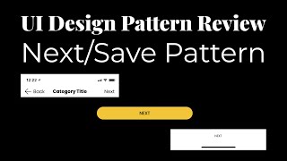
Three ways to place Next/Save buttons in forms: top-right (familiar but easy to miss), bottom of page (aligns with scrolling but requires scrolling to save), and fixed at bottom (always visible). The speaker recommends bottom placement for new forms, fixed bottom for editing, plus keyboard shortcuts to dismiss.
Chapters
Alright, hey everyone. I'm here today to do a little pattern exploration. This is a little bit more specific in terms of actual design of UI, of user interface. So I wanna talk about proceeding to the next screen or flow. And I've witnessed quite a few patterns and I'd like to talk about which one I think is the most usable, which is the best. Before doing that, I wanna take a quick look at the patterns and give a little brief overview. Now, looking at this screen, you see this large list of form inputs. Well, really, there's text inputs. There's a way back. There's a next, which is a way to proceed. Now, there's two real states you may get into these types of forms is initially entering information and coming back and editing information. You know, an example is coming back to edit an Instagram post or a— some kind of about information in which you have multiple input fields on one page in comparison to entering it for the first time. So entering it for the first time, you'll proceed to the next, maybe some kind of confirmation. Uh, coming back and editing it, you may save that information and then return back to where you came from. So the first pattern we have here is this next button up top. In which you can click next or save, and it's up in the top right. Oops. The next one you'll see is all the way on the bottom of the page. So once you finish the input, finish this list, you get a next on the bottom, and that's how you'll proceed to the next page as well. Lastly, you'll have this fixed next on the bottom that you can click on or save, but it stays with you as you scroll through the page, and that's how you can interact with it. So let's explore these a little more. So firstly, you have this, um, as you go here, you click a tappable input, keyboard comes up, blah blah blah, you'll start entering your information, you can hit return, and you know, maybe it'll dismiss the, the keyboard, the this is the keyboard, it'll go to the continue going down. Nonetheless, you'll notice that that next never interferes with the placement of that keyboard. So whatever happens in on the screen, that next or save is, is not relevant. So it stays with you throughout the entire process. So that's kind of one of the pros. This is also a very common iOS pattern. So many of the iOS apps have this kind of pattern where this is up top. But one of the main cons is it's easily missed. A lot of people, they finish something and they expect to, you know, have something on the bottom or something, um, you know, some kind of save or complete, something a little bit more in your face. This being up here, you come down this way and then you go back up top to proceed to that next situation. So that's one of the, the major cons with this pattern. So going into the next one, you have this away back, you'll go through the information, you'll hit next, And then, oh, let's look at the Tappable Input. This information, the keyboard will come up, you'll enter it. And here's one situation is you can utilize this next on the native keyboard to take you further down the page. And once you get to the bottom input, that next can turn into a, you know, primary CTA or a blue action, which that does the same submit as the save button would, taking you to the next page. So the pros are it goes with the flow. As you proceed down in the page, then, you know, you know, you're done entering that information, that next is prevalent to go to the next page. But the cons are if you are not in that initial edit mode or initial creation mode and you want to come back and update something, you now have to go to the bottom of the page, right? If I just wanted to update the name, like right here, you know, this first input, and then I need to, you know, scroll all the way to the bottom. And if that's a long form, a long, you know, long page, it could end up being quite a few scrolls before I end up hitting that save. So there's no way to immediately direct, uh, take action directly after editing an input. Looking at the last one is having a fixed input, uh, fixed next button on the bottom. So as you proceed through this page, you see that next stays with you. It's a little bit more in your face than the first action. Um, but it's, it's still there. So I think this is, this is probably a better solution for that, that save input. So say we go through here, we can also go through that same action where you go through. You potentially can have a way to dismiss this keyboard. I've seen a done button up here. I've seen the ability to swipe down. But you would be able to now utilize that next once you get to the bottom or save. To be honest, I think the best situation is having a pattern for both, right? When you're going through that initial, initial input, the initial flow of creating, you know, going through and adding, creating something new. I'm creating a new post, creating a new meal, creating a new recipe, creating a new service. Is adding and creating a new account. Having that bottom, that, that save at the bottom makes logical sense. Coming to edit it, now I'm a little bit more partial to this, uh, this being a save or something because it's a little more in your face. Um, and then having an update on that keyboard navigation here to have some kind of way to dismiss the keyboard. So when you do dismiss that keyboard you now can see that, that save button in your face in comparison to the first pattern of having that up top, just because it's so missable. And though it is a pretty standard pattern, still a lot of people seem to miss it from the usability studies I've seen. I'd love to know what you guys think. What's your thoughts? What do you think is the best pattern? How it should be done and when? This is my first of the pattern explorations and You know, I'd love to know what you guys think of that overall. I plan on doing more as I see different patterns and see different things that are around UI design. So I hope to be talking to you guys some more then. All right, till next time. Bye.